PERSONAL PROJECTS: THE NATURAL WORLD
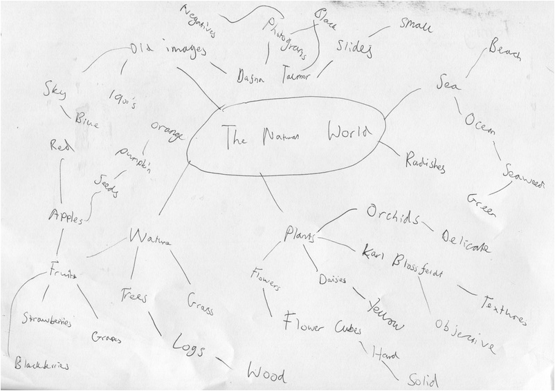
I have chosen The Natural World to be one of my Personal Projects to do because I feel that I can take interesting photographs as there are lots of natural forms in the world we live in.
Edward Weston
Edward Weston is a photographer that was born on March 24, 1886 in Highland Park, Illinois. He started photographing when he was 16 years old and has been famous for taken photographs of natural forms, close-ups, nudes and landscapes. He started his work for these features in 1926. From 1927 to 1930 he started to make a series of lots of close-ups of seashells, peppers and halved cabbages. He started taking photographs of rocks in 1929 when he moved to Carmel in California which has been very successful. Weston's images are mainly in black and white which shows the contrast between the objects and the background.
Weston started to experience health problems in 1946 and in 1948, he took his last photograph of Point Lobos. His work has been featured in the Museum of Modern Art in 1946 featuring around 300 prints.
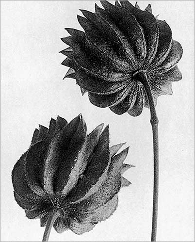
Here are some photographs of natural forms taken by Edward Weston


Weston's pictures are all in black and white and as you can see nearly all these sets of pictures are close ups of natural objects. The lines of the objects are generally organic and curvy. He has a used a range of cameras throughout his life as being a photographer. One camera that he has used is a Kodak Bullseye No. 2 which was his first camera. The lenses that he used really helps his style of photographing, he used a anastigmat and several soft focus. Focus was one of the main feature in his photographs and nearly all his pictures have the subject of the image in focus.
I like the way how Weston's images are in black and white - they make the subject more abstract and unusual. The lines and texture in his images vary a lot, some lines are curly and others are straight which fascinates me as it shows the originality and creativity of his work. Some of images would feel rough due to the objects that he uses such as the mushrooms and shells but others are smooth like the bananas and peppers.
Weston's 4 x 5 Graflex camera that he used in 1933 was much more lighter and fragile than the camera that he used before. This camera helped him take close ups of nudes and allowed him to interact more with models. He also tried to replicate the images that he has taken in the past of vegetables and roots using the Graflex.
I believe that Weston's images are very successful and his style of capturing the natural world is very imaginative and original.
Karl Blossfeldt
Karl Blossfeldt is a photographer that is interested in natural forms just like Edward Weston and his images that he makes are fairly similar to Weston's. Blossfeldt is German and was born on 1865 and died in 1932, he mainly focuses on taking pictures of close ups of plants and flora. Compared to Weston, Blossfeldt is more of a photographer that takes images to investigate the 'science' behind them and Weston is a photographer that aims to take photographs for the sake of being a photographer. Over 3 decades Blossfeldt has produced around 6000 photographs using a homemade camera. Just like Weston, Blossefeld's images are mainly in black and white.
Blossfeldt wanted to study about nature and he taught a sculpture based on plant forms at a school in Berlin. The sculptures that he made were inspired by plants. He wanted to study about plants for a long time and yet they kept dying.
His photographs consists of plants and all his photographs were of close-ups. There is usually nothing going on in the background of his photos and its usually white. All his photographs are in black and white. Due to his photographs consisting of close-ups the composition is usually tightly packed and there isn't much space.
Here are some photographs of natural forms that Blossfeldt has taken


Blossfeldt made most of his pictures using a home-made camera that includes a zoom that can magnify up to 30 times its size, this makes it easier for him to stand further from the object and photograph. He usually photographs in a room which can be easily noticed through the white background in some of his photographs. He is famous as an historical photographer mainly because he started photographing in the late 1800 and early 1900s.
Here is my response to one of Blossfeldt's pictures
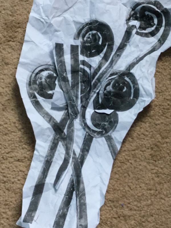
I made this by cutting parts of one of Blossfeldt's photographs up and rearranged them and then stuck them on, on different positions of the image. I've changed the composition of this photograph and it went fairly well since you can see the stem overlapping each other and the spacing of the photo is closely packed, this makes it successful which I am proud of. Next time, I should try to cut up more parts of the photograph and try rotating it next them.
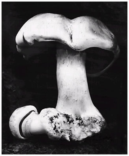
Comparison between one of Blossfeldt's and Weston's photographs
|
|
Similarities:
Differences:
- Both photographs are in black and white and are printed as a positive.
- The space between the images are quite compact.
- The images were taken quite close up to make them look more clear.
- The texture of both objects in both images seem very rough and bumpy.
Differences:
- The image on the left was taken from a black background and the image on the right was taken from a white background.
- The compositions for both image are slightly different - image 2 has 2 flowers with one positioned on the top right and one on the bottom left. The image on the left has a large mushroom and the bottom part of it seems to be cut off and laying down on the bottom left.
- The lines of the image on the right are very pointy and sharp and the lines of the image on the left are more curvy and smooth.
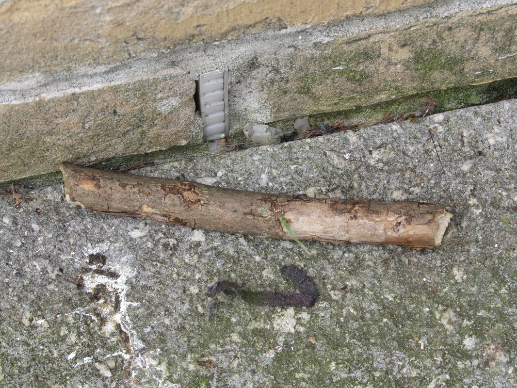
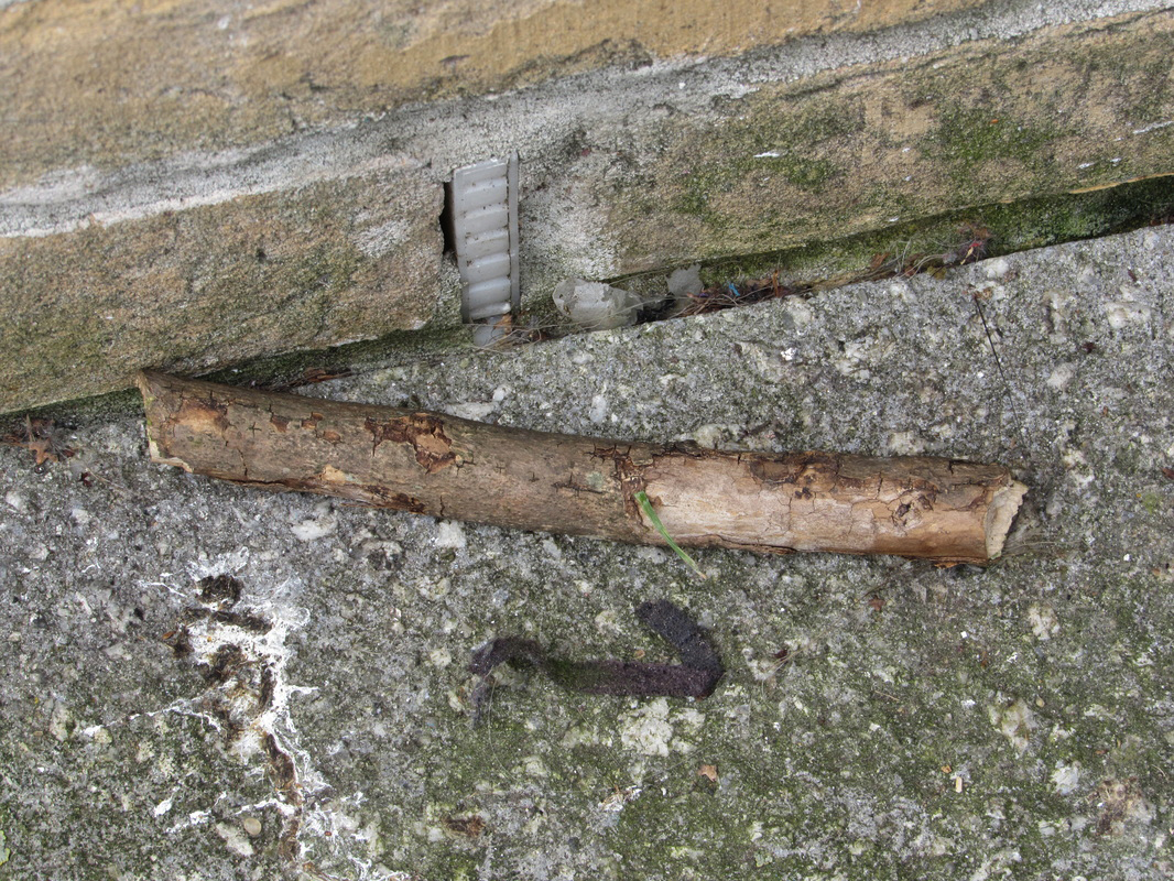
Here are some images that I have taken of the natural world


The objects that I mainly focused on this photo shoot were trees and twigs because those were the only natural objects that I could really find in school. There were some images of flowers as well and a sky and the images of the trees went pretty well. I photographed the trees from a far distance to capture most of the tree and the interesting parts like the leaves. The image of the leaves with a complete white background is very interesting because it shows the contrast between the colours really well. I can improve by finding other objects to photograph and experiment a range of angles and types of shots when photographing the same object.
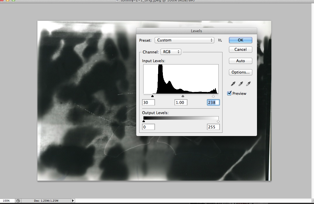
I've edited one of my images on photoshop to make it look better. It is only a slight change however it makes a big difference to the picture.
This is the original image unedited.
|
I've made the image a slight darker by going to Image > Adjustments > Levels and moving the middle line of the histogram slightly to the right.
|
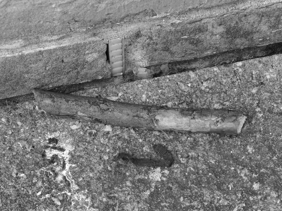
I finally made the image black and white by going to Image > Adjustments > Black and White and then pressing ok on the table.
|
I chose to edit this image because I feel that the colours on the image are pretty bland and dull already so making it black and white will show the darker the tones more.
More images of the natural world


Most of these images that I have taken are close ups of leaves/twigs. The focus on these pictures are very clear and the angles of the pictures are more varied which makes it successful. As you can see, I have tried taking photographs of the same object more than once because two photographs can't be the same and they have worked out well such as the stick - one close up and one long shot of the stick which shows the lines and shadows really well.
Photograph evaluation
The image below was made by Rinko Kawauchi
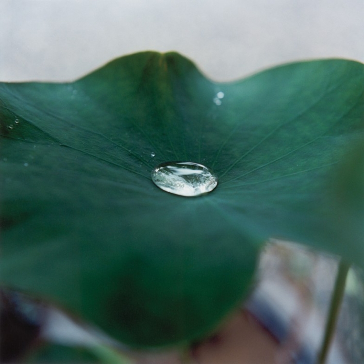
In this photograph, I can see drops of water splashed on a leaf. In the middle of the photograph there is a large drop of water in an oval shape and other drops are located near the edges of the leaf. The words that I would use to describe this photograph are “abstract”, “natural”, “blurry” and “watery”. This is because the background of the image is out of focus and the subject of the photograph is the leaf and the water drop is in the middle. I would describe this photograph as an abstract, naturalistic image of a leaf that is zoomed in to show the water droplets clearly to a person who couldn’t see it. I would also say that the depth of field of the image is shallow as the background is out of focus and the background is dull cloud. There is a stem of another leaf located on the bottom right of the image.
This photograph reminds me of a special plant that has been photographed in order to locate its interiors are colour carefully. It reminds me of any picture that has been photographed during the rain or during the plants time when it’s watered. This image is an abstract and naturalistic image because the main subject of the image is a leaf of a plant, which is natural. The background can’t be seen clearly so there isn’t an actual of way to see what is in the background, you can only predict what is there. The formal elements that seem important in this photograph are focus, line and texture. This is due to the image having a shallow depth of field with the unfocused parts being part of the background and the focused parts being part of the foreground. I feel that the photographer is trying to get the viewer to have a look at the texture and lines of the leaf by zooming in to it so that the whole leaf doesn’t fit the frame. In this picture, I would describe the lines as curvy with some straight and pointy lines from the stem of another plant located at the bottom right of the picture. The shapes are mainly organic even though there isn’t much and overall the colours are very dull and gloomy, they are also washed out from the raindrops. The colour of the leaf is dark green and the clouds are grey making the contrast between the background and the leaf very low. The texture and the patterns are hard to define since there isn’t much shown in the picture. The leaf seems pretty soft and fragile because it is a bit damp. The edges of the leaf seem very rough however that could just be how the image was printed out. The photographer hasn’t really used light to her advantage in this photograph. All I can see is the light from the reflection of the raindrop, which is the lightest tone on the picture. The day that the photographer has captured this photograph is gloomy and dull which is a very unusual time to take a photograph that has low contrast but I feel that the photographer has done this intentionally as the plant images that she takes don’t have much colour. The space in this photograph is very compact and small. The leaf fits most of the image making the space of the background very limited. The space in the middle ground is more relaxed and less tight since the water drop is minuscule. The water drop in the middle in is in most focus in this picture. Parts of the leaf are in focus (the interior) with the edges being out of focus. The whole background is out of focus as well. The subject has been framed so that enough of the leaf can fit onto the image but since it’s too large, the left and right edges are missing. I don’t believe that the image has been cropped but the point was to fit as much as the subject on which it was, it was zoomed in.
The part of the photograph that strikes me as most interesting is the water droplet in the centre. This is because it is very bright and shows a lot of formal elements if you look closely to it such as line, texture and shape. The most surprising part is the background of the image. I didn’t expect the photographer to take a photograph of a leaf on a dull and rainy day because it doesn’t contrast well with the plant since the plant’s colour is mainly dark. I also didn’t expect the background to be out of focus – if it were in focus then the whole image would be brighter and interesting to view. The puzzling part of the image is also the background. I don’t see why the background has to be out of focus because I want to see what the objects are in the background. The mysterious part is also the raindrop in the middle. I can’t believe how bright a drop of water can be and how transparent it is due to its size. The questions that I would ask the artist about this work, if she were here are, ‘Why is the background out of focus?’ ‘Why is the lightest part of the image a raindrop?’ ‘Why didn’t you manage to fit the whole leaf on the picture?’
The title that I would give to this photograph is ‘Wet Leaf’. Due to the raindrops being present in the leaf, this is what made me decide on the title. The leaf also seems damp already due to the colours being darker. The other titles that we could give the image are ‘Reflecting Drops’, ‘Green Day’ and ‘Fragile All The Way.’ All these titles relate to the leaf and the raindrops in on the leaf and they describe the leaf’s colour, texture and the raindrops interior. I think that this photograph is about a leaf’s life after being filled with lots of rain and it’s result after a few hours. The theme of this photograph is clearly plants and water because the plant and raindrop is in focus, which shows that this is the main subject of the image. The theme can also be about rainy days and how they affect plants.
I think that the middle ground of this picture is effective because it shows a raindrop that is clearly in focused which can be a hard thing to do on a camera. It clearly shows the interior and texture of the raindrop. The straight lines that are shown on the leaf stretching towards the raindrop are also effective. Again, it would be hard to photograph this since it is very dark and faded. The contrast between a small part of the plant where the colour is different shows where the water was dropped into the plant and shows that it’s natural colour isn’t so dark. The background being out of focus doesn’t work so well because you can’t see what the objects are clearly and there seems to be some interesting objects on the bottom right and left of the image. If the whole image was in focus then we would be able to see everything clearly and the whole image would be way much brighter, allowing it to attract people’s eyes more. I think that the raindrop is the worth remembering in this photograph because it’s so large and it is so light compared to everything else in the photograph.
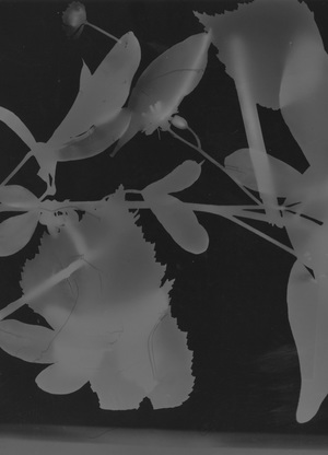
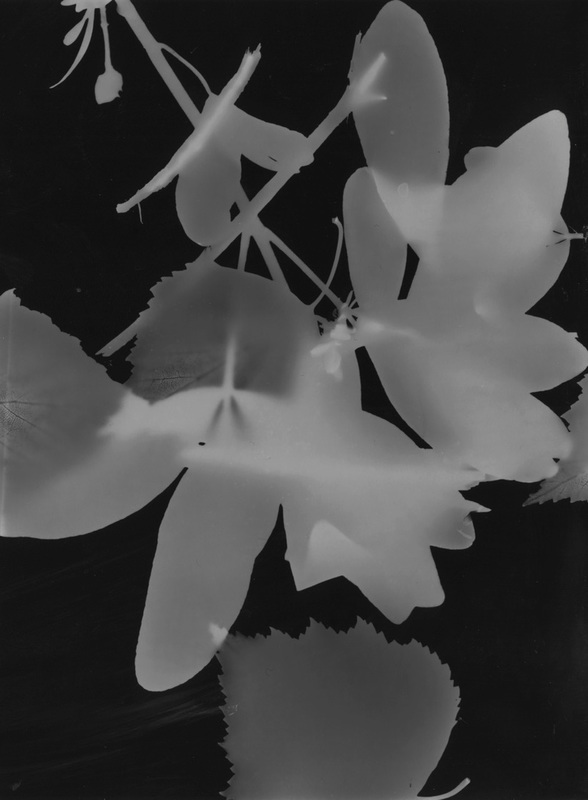
I've made some photograms using twigs, leaves and other natural objects because it shows that I've further developed my photographic skills.
|
|
Both of these images were made through placing natural objects onto photographic paper and then exposing it to light for a few seconds. I then placed the paper into 3 chemicals stop, fix and bath and then I dried it. The image on the left was exposed to light longer than the image on the right which is why it is darker.
I moved the objects on both photograms during the process of revealing the paper to light and the results were pretty good. I like how the objects overlap each other on both photograms and the faded lines that you can see which gives the objects a stronger texture. I also like the contrast between the white and grey on the objects and it also contrasts well with the background. These photograms can be improved by using a larger photographic paper which allows me to add more objects on.
I moved the objects on both photograms during the process of revealing the paper to light and the results were pretty good. I like how the objects overlap each other on both photograms and the faded lines that you can see which gives the objects a stronger texture. I also like the contrast between the white and grey on the objects and it also contrasts well with the background. These photograms can be improved by using a larger photographic paper which allows me to add more objects on.
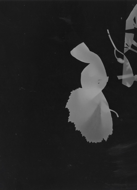
|
|
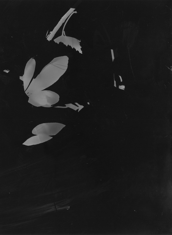
These photograms were made as if it was one photogram. I placed both papers on the enlarger and then connected it together. I then placed the objects on the paper and exposed it to light for a few seconds and then turned the light off and moved the objects around and exposed it to light again. I did this about 3 times and this is why the shapes of the objects are unusual and there is a lot of black on the paper. This makes the images abstract and the shadows shown on some of the leaves increases the contrast. I don't really like how the space is very compact so I can try to use more objects next time and spread them out more.
Below are some images I've made outside of school as I wanted to further develop my ideas about bright colours and other natural forms such as fruit.


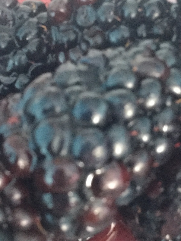


I mainly focused on taking close ups of fruits and plants focusing on the colours of all the objects. The colours are bright and the subject of most photographs are in focus. The picture of the strawberry really went well since it is a clear close up which allows you to see some of the seeds clearly and the reflections from the light. Next time I would need to zoom in more to some of the objects and make sure all the subjects of the pictures are in focus.
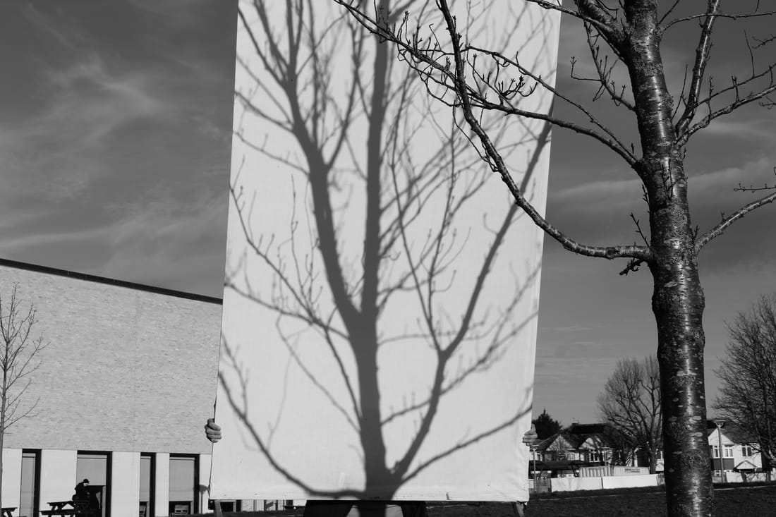
Below are some pictures of shadows of trees. I've decided to take these photographs as it linked to my work on the photograms of the leaves due to the fact that the photograms and these shadows of trees both show a large contrast between the black and white tones.


This time I tried something a bit different and more interesting. I've taken pictures of shadows of trees by bringing a translucent screen and placing it down in the shadow of various trees and then photographing the screen which shows the shadow. Some of the images went really well showing the shadow really clearly with all the lines of the branches. Others were less clear but were zoomed in more which showed an interesting contrast between the black and white tones. I'm interested in experimenting with more shadows of trees and photographing the screen with nothing in the background next time. I'm very happy with the result in this set because it was harder to create these images as I had less control of the lighting.
I've made some photograms using the images of trees that I've taken in the previous set.


I've made these by placing the images onto photographic paper and then shining light to the paper. The images didn't go too well since I didn't shine light to the whole paper which is why the border is white but the mistakes came out interesting like the forth one creating a large contrast between the black and white tones. I need to place the whole paper on the developer chemical next and make sure the whole light is shined to the paper so that I can get a black border.
I've edited these photograms to give them a brighter look, making them more abstract and unusual.


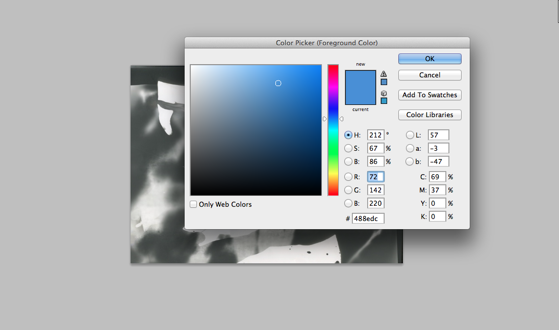
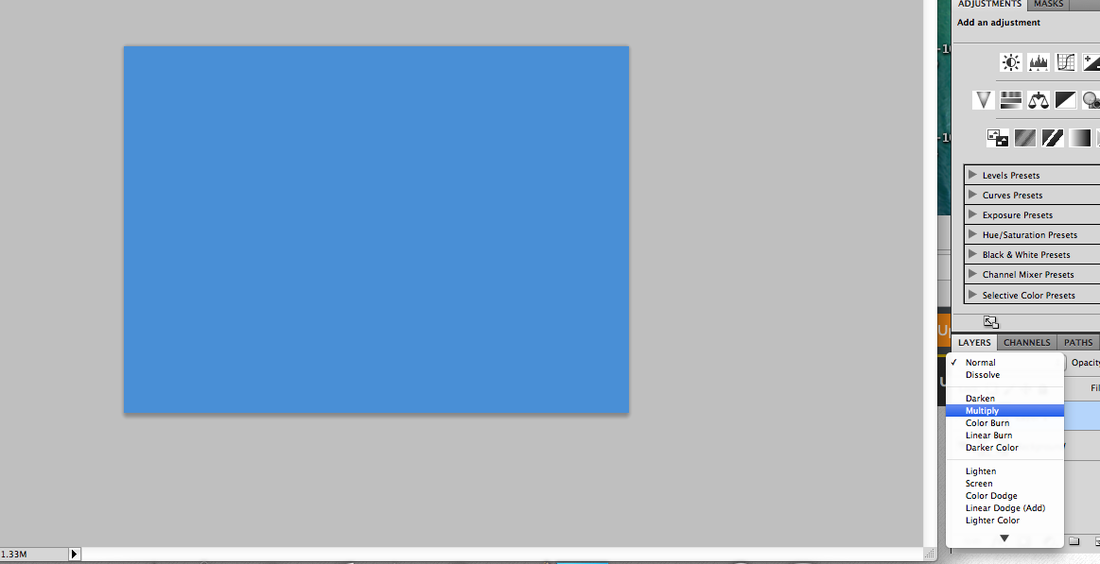
I edited the first image by going into photoshop and then I added a layer, clicking on the paint bucket tool and making the whole layer blue. I then clicked on the 'layers' tab on the bottom right and changed the blending mode to multiply.
Here is how you change the blending mode with pictures:
Here is how you change the blending mode with pictures:
Add a new layer by going to new > layer and then pressing ok.
Here is the result.
|
Press on the paint bucket tool and then change the colour of the background to any of your choice.
|
Change the blending mode by pressing on the layers tab and changing it to normal to whichever one you like.
|
I also made a duotone using the second picture:
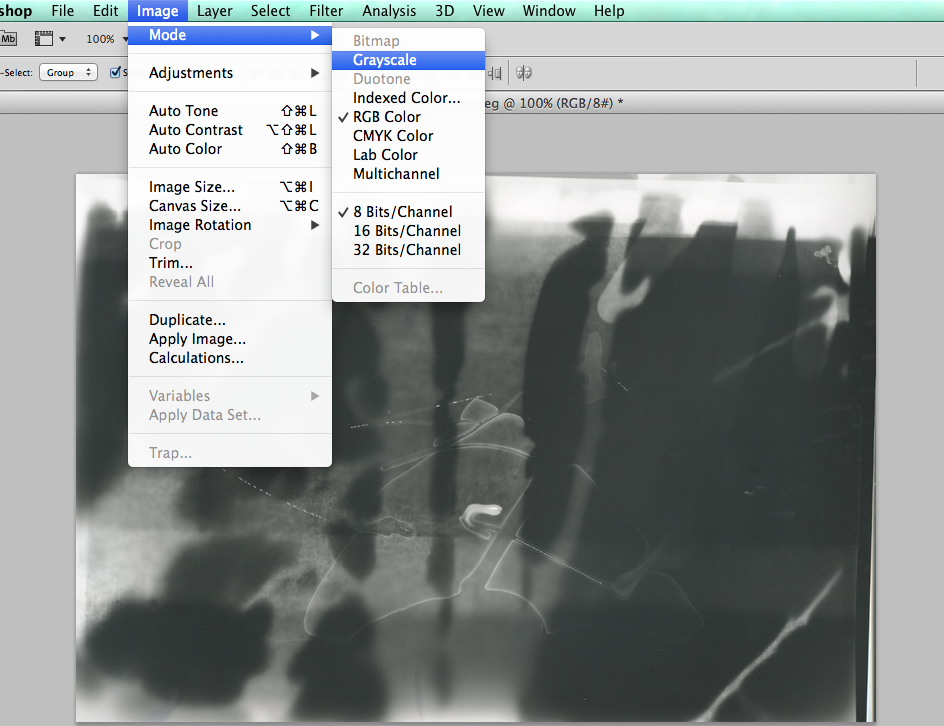
Convert the image to black and white by clicking on Image > Mode > Grayscale.
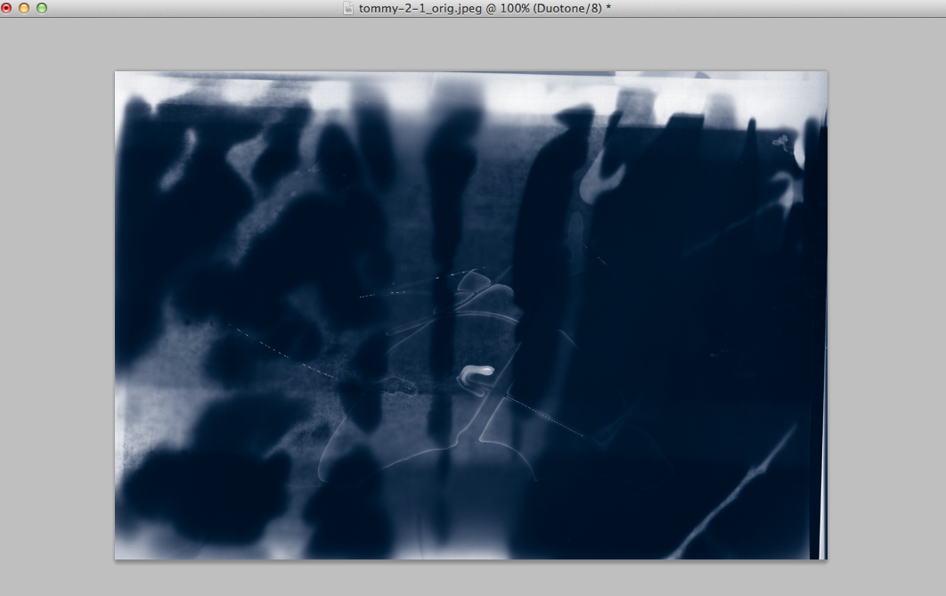
Here is the result.
|
Change the contrast levels by clicking on Image > Adjustments > Levels.
|
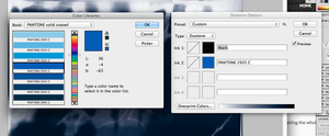
Click on Image > Mode > Duotone and click on the the 2nd colour and change it, you can even do a Tritone or Quadtone.
|
'Constructed Lanscapes' workshop with Dafna Talmor
Dafna Talmor is an artist based in London and she makes photographs that encompasses photography, video, curation and collaborations. She creates images that uses an original technique where she cut up negative images and prints them in the dark room using the photographic paper and chemicals. She combines landscapes that she took from Venezuela, the UK and USA creating an interesting outcome which makes her images very famous.
Below are some images that she has made


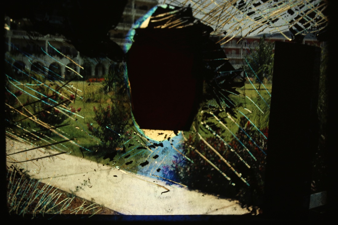
At the end of October, Dafna Talmor came to my school and I've made images using a similar process however we used positive landscapes in slides and cut some parts up and then projected them instead of making a photogram of the negatives. We did this as there would not be enough room in the dark room for everyone to fit in. I used a scalper to cut up the parts of the landscapes placing them on a light box with acetate to protect the box when we were cutting the image. I added ink to parts of the images creating interesting abstracts that work well together.
Below are the images that I made during the workshop


These images went fairly well since they are abstract and represent The Natural World well. All the original images were very old landscapes and I took parts of it and painted others making a new edit of them. Some of the images include natural plants and grass and for the 2nd one I purposely put ink on the humans head to hide their identity so that people would focus on the plants when looking at the image. The diagonal lines that I made by scraping the scalper on the 3rd picture makes it very abstract showing a consistent pattern. I should try make a photogram by placing these images onto photographic paper next time.
|
This is my best image because it shows a range of formal elements such as line, shape, space and repetition. The repetition of diagonal lines are shown throughout the image made by scraping the scalper consistently on the landscape, making the texture of the image rough. The large black parts on the image make it abstract, covering most of the image up to make the viewer ask a lot of questions as to what it is. The whole image is in focus but the most focused part is in the middle where I covered it up with the black ink. The space is tightly packed with objects and nature with the refinement that has been implemented to it.
|
Olivia Parker
Olivia Parker is a photographer that has been interested in photographing still life for over 30 years now. She is interested in a lot of natural objects like shells, fruit and plants. Parker was a painter before she became a photographer. She has over 100 exhibitions in the US and abroad and her work is presented in lots of museum collections.
She is currently using a Canon 5D Mark II with a Canon 50mm macro lens. She has used a range of cameras in the past and she does all her editing on Photoshop printing with her Epson 7800 printer.
Below are some still lifes that Parker has made


Parker's images mainly consist of black and white forms. I really like how all her images have a black background and how some of her images


These pictures went well because they are all colourful and they are all images of close ups. The images show the subject very well including the interiors and they are all in focus. I should try to take images of certain pieces of the natural world in depth next time instead of focusing in a range of natural features.
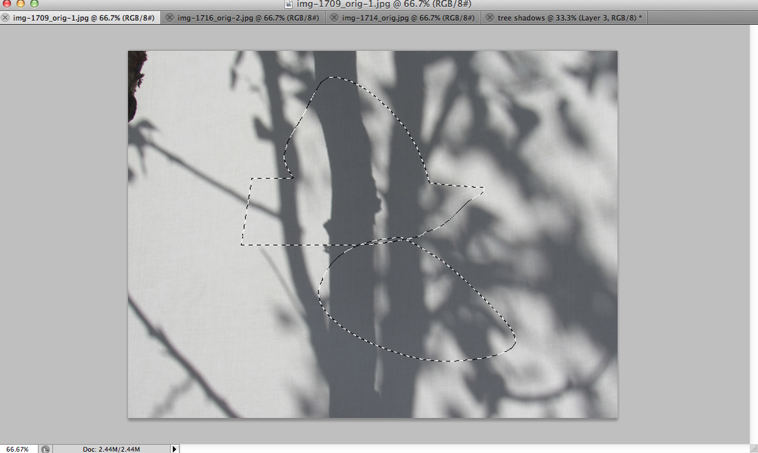
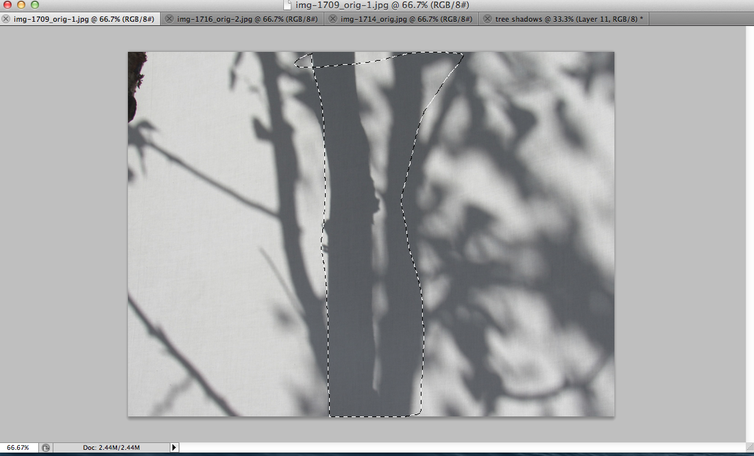
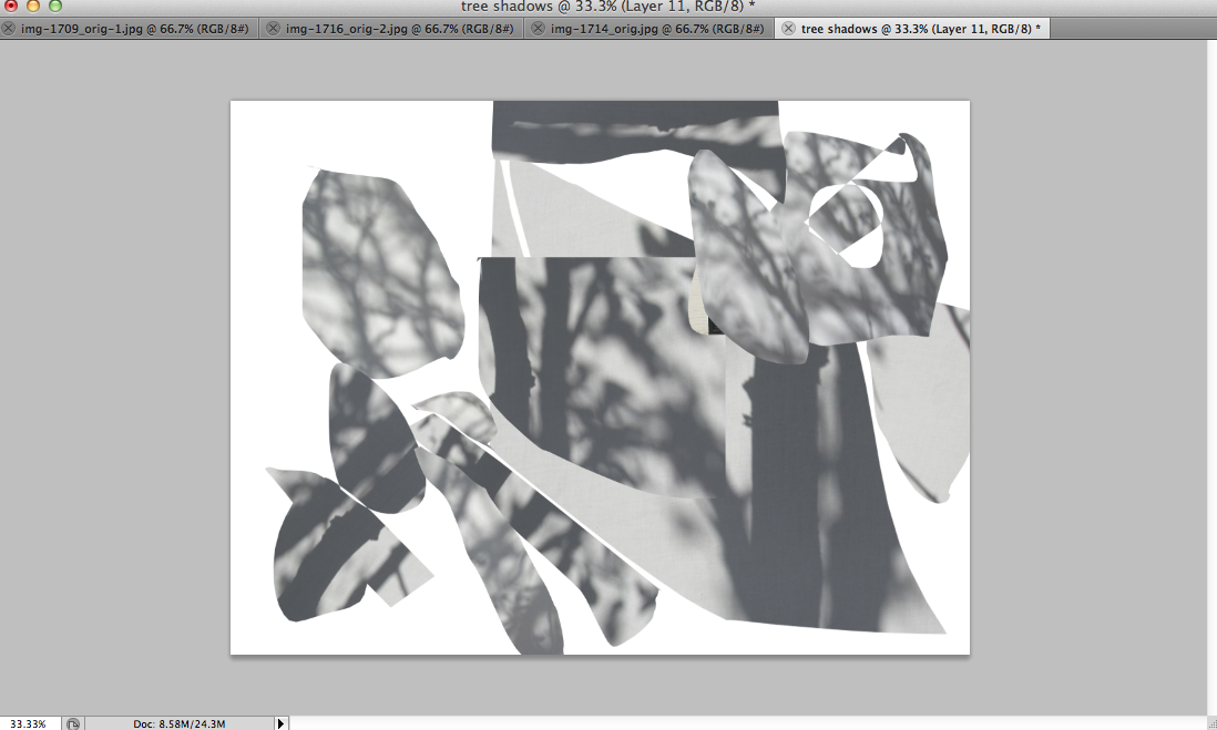
I've made an interesting collage out of my photographs of tree shadows
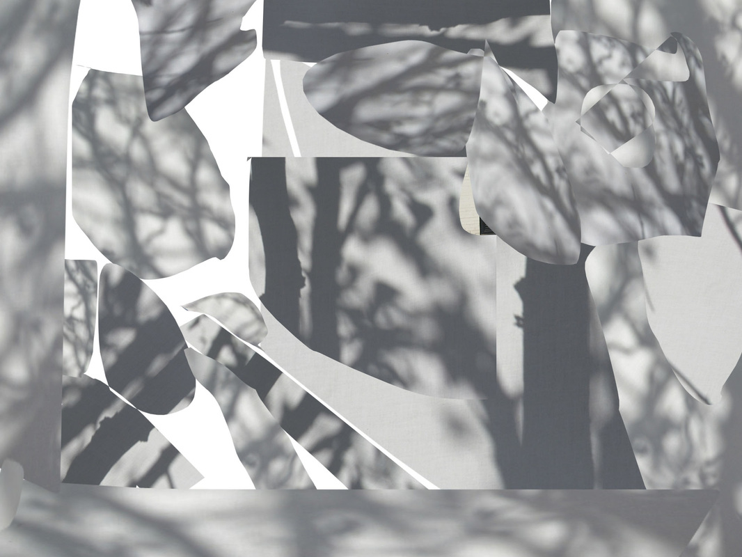
I made this by taking pieces of my tree shadows photographs and then placing them in a new file in photoshop. I then rearranged them to make the parts fit like a jigsaw. Below are some steps on how to do it on photoshop.

Make a new file on photoshop
|
Cut out parts of other images using the lasso tool then copy it
|

Paste the parts on the blank file
|
Repeat previous steps for other images
|
|

|
I further developed this by making the image darker and adding colourful colours.
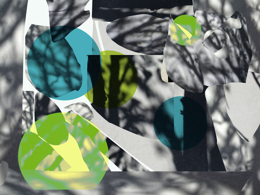
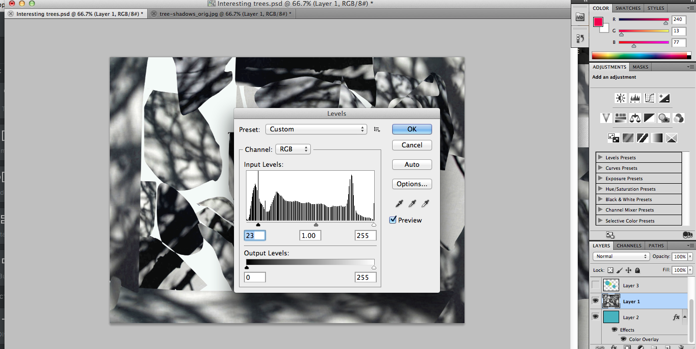
Unlock the layer by dragging the lock button to the bin and change the contrast levels
|
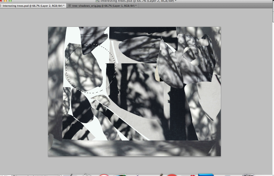
Make a new layer and draw a circle on a image using the Elliptical Marquee Tool (remember to hold shift to the shape is regular)
|
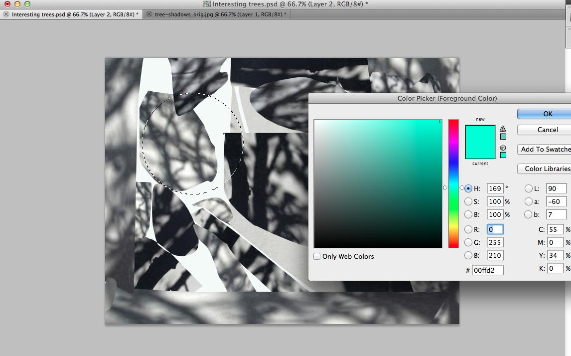
Use the paint bucket tool and choose a colour and pour it on the circle. Then repeat with other circles
|

|
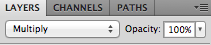
Make sure you change the blending mode (I chose multiply).
|
|

Here is my first final piece
|
|
|
My first final piece went well because it clearly shows all the steps that I've used to create my final images. All the images are an original way of creating natural images because they use unsual methods such as projecting the shadows of trees, photograms and changing the blending mode of the photograms. The images all show lots of formal elements like line, shape, tone and colour. The images are very abstract and conceptual and the final image on the right was a happy mistake that was caused by me not developing the photogram enough.
Lucas Blalock
Blalock is an artist that uses Photoshop to create interesting collages with natural forms out of mistakes while using photoshop tools such as the eraser tool, masking, clone stamp and the brush tool. His images are abnormal and the tools that he uses are very simple. He shows how to tweak analog photographs that were taken with a large format camera by using the tools that I've stated. There is a video of him showing the process of how he makes his images below.
Below are some images he has made


Some of his images seem like a photograph was just taken and no editing was done to it but there was which makes it very unusual and fascinating. All his images show a lot of bright colours and fancy shapes scattered around and he likes to combine texture with all the other formal elements in his photograph to make a complex composition.
I've made some more images of shadows of trees to help me with me 2nd final piece


The camera mode was in black and white which was why the first few pictures were in black and white but then I realised and changed the mode to colour. The images worked well as it features a lot of the shadows of the trees and twigs as I got my partner to lift the projector up.
Some of the images are close ups and others are zoomed out a bit to show the whole tree. I can improve using some of the images and developing it in Photoshop by making more collages.
Some of the images are close ups and others are zoomed out a bit to show the whole tree. I can improve using some of the images and developing it in Photoshop by making more collages.


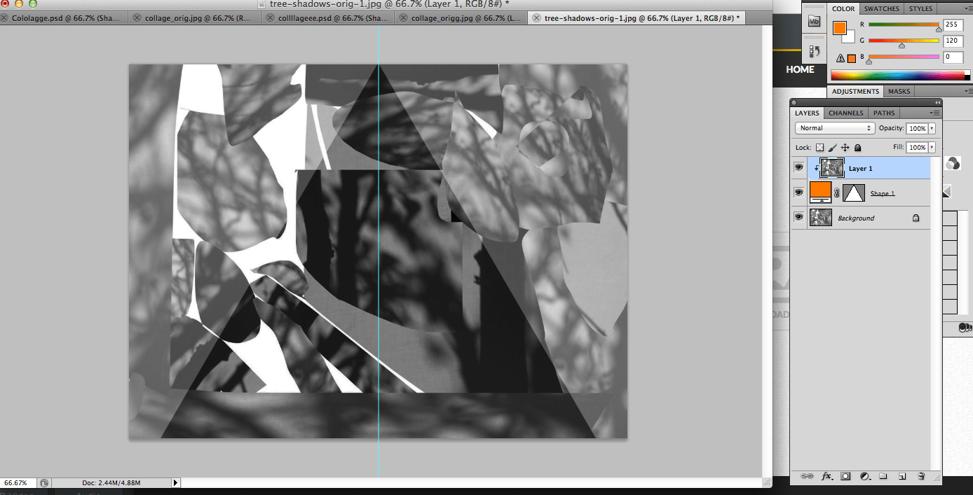
I've made these collages using the same technique as I did for the first collage however the cut up pieces are from the original images that I picked above, not photograms that I've made from the shadows of the trees. I'm going to further develop this by making more collages and using less shapes but make them larger so that they stand out more and that they're symmetrical.


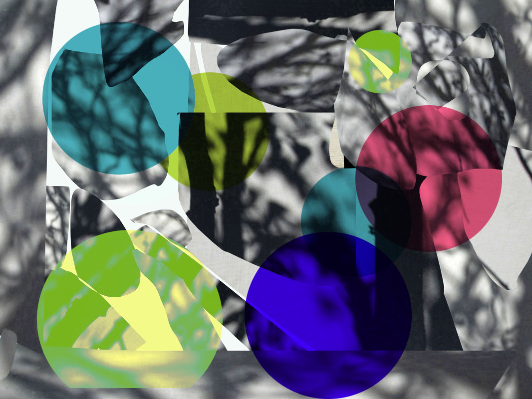
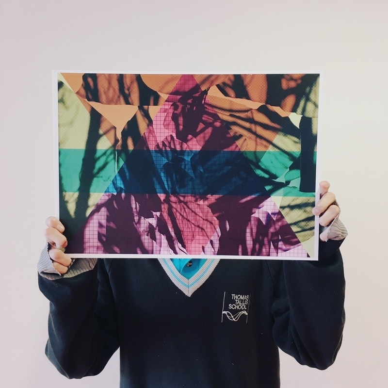
Above are the fascinating collages I've made using mostly large geometric shapes - these will be my 2nd final piece.
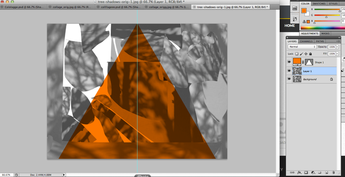
Duplicate the background layer using CMD+J and make a triangle using the custom shape tool with any colour. Go to view > New Guide and select horizontal guide and choose 50% this will help you to move the top point of the triangle to the centre.
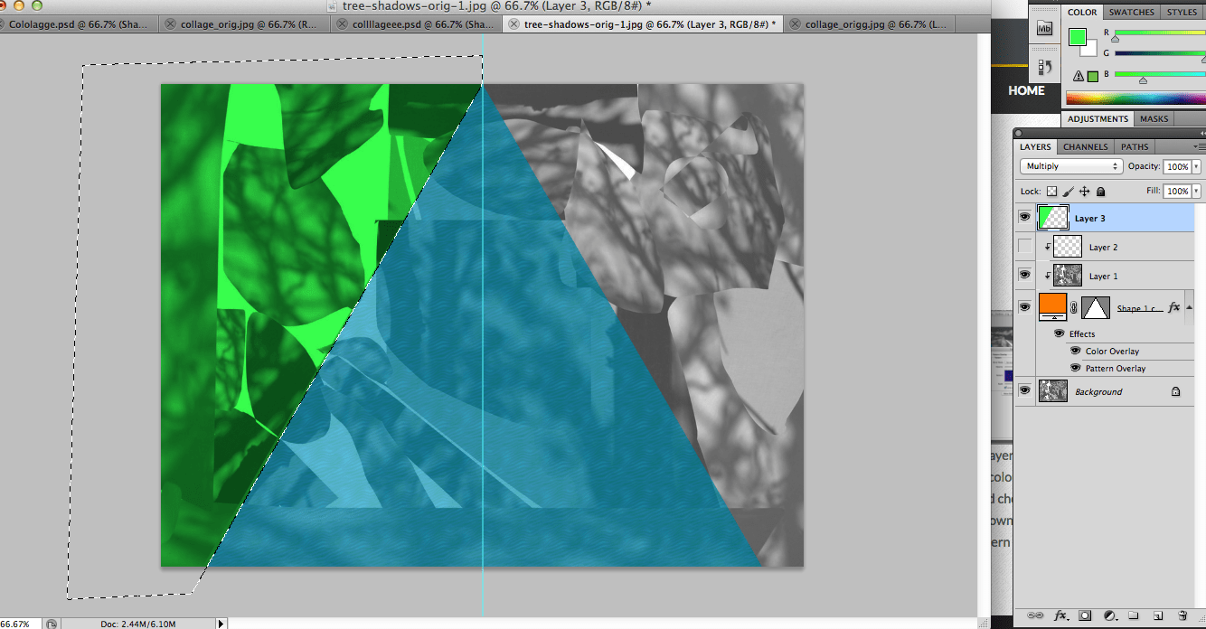
Make a new layer then use the Polygonal Lasso Tool to draw around the edges of parts of the collage where there is no colour. Use the paint bucket to pour a colour onto the selected part and change the blending mode. Repeat this for other parts of the image.
|
Move the layer you've duplicated above the shape layer and clip them together using ALT + left click.
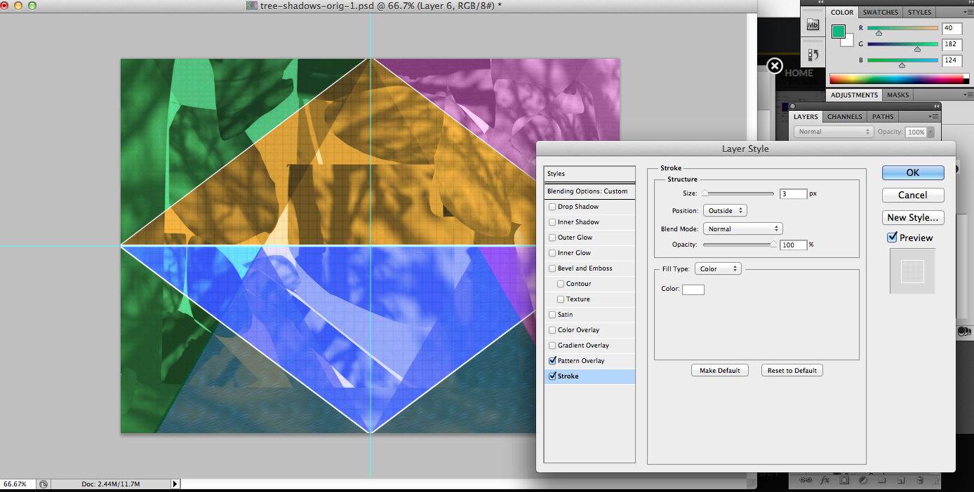
I chose to add strokes on this collage to brighten up the edges of the shapes.
|
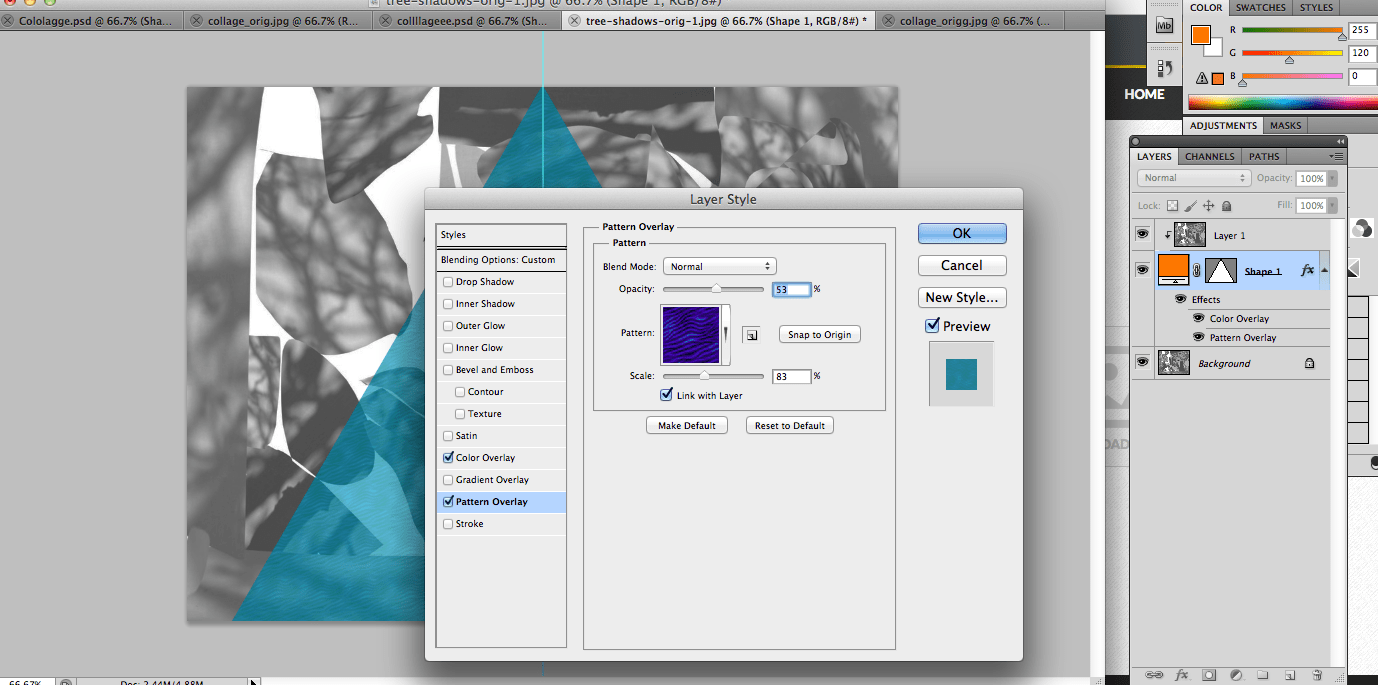
Click on the shape layer and go to double click on it. Change the colour overlay and select pattern overlay and choose a simple pattern. Make sure to tone down the opacity so that the pattern shows.
|
Below is my second final outcome
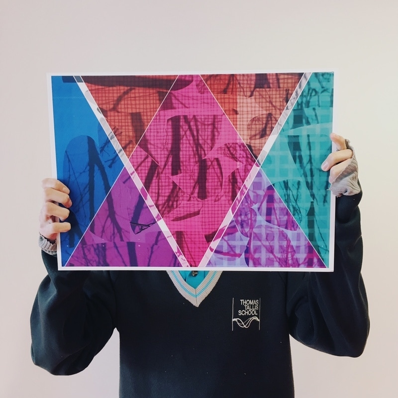
|
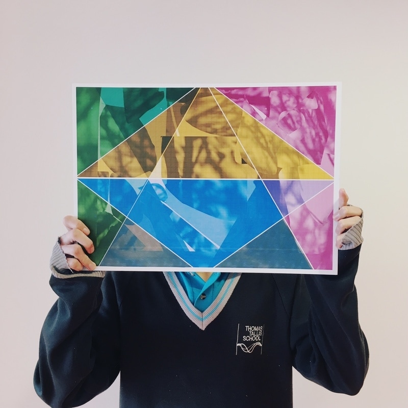
|
|
I'm very happy with my successful final outcome because all the images express natural forms very well. It shows how tree shadows can be implemented into a range of geometric shapes to create an abstract, authentic outcome. My images show a range of colour which I admire as it makes images stand out as well as contrasting with all the other colours. The various use of pattern is shown when I used the pattern overlay which also show the fantastic repetition of shapes and lines that I've used. For the last image I could improve by making the colours lighter because it was originally dark already as the most of the background was black. I chose to mount my final outcomes as the same size because I feel that they all have equal status- all the images are very triumphant.
