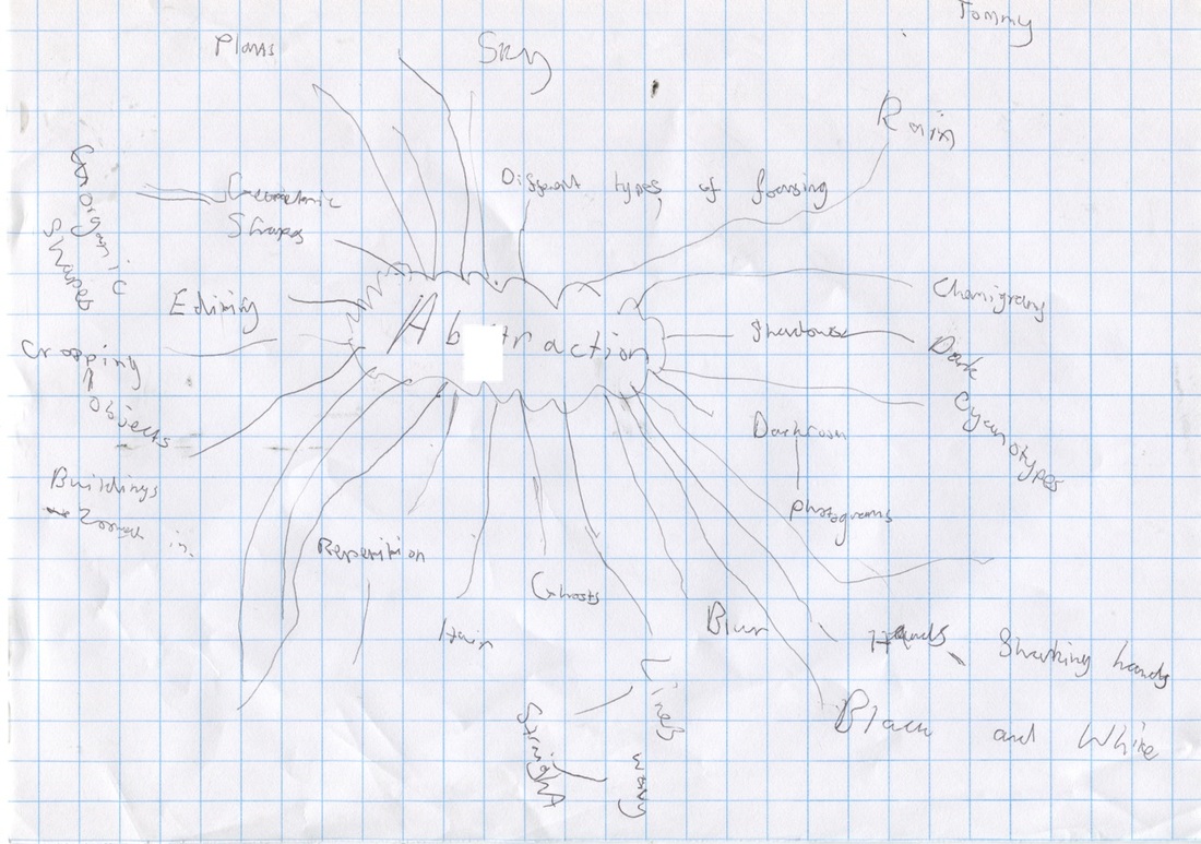
Personal project: Abstraction
Abstract means that an image is unique and different. It can't be recognised meaning that there is no wrong answer to what there is on the image. It is usually black and white because the objects in black and white images are hard to recognise.
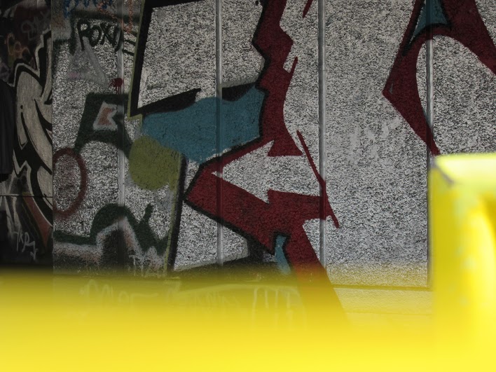
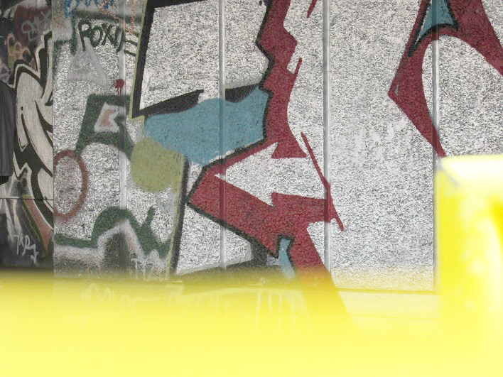
Here are some abstract images that I've taken in school. I was planning to take photographs of objects at different angles to make them look abstract and edit them in black and white. I also took close ups of objects as well.


All the images are very abstract. Some are very unique and interesting because the subject of the image can be viewed as anything. Other images are less abstract because I sometimes move the camera straight away after I take the image which can make the subject of the image change so to improve I can hold the camera still and hold it more steady. Taking these images in black and white make the image more abstract as you can't see the actual colour of the objects in the photographs.
Some images that I've taken outside of school. This time I only took pictures of closeups and chose them to leave them in colour to see the results.


I think these images are abstract because it is hard to recognise what the object is in the image. They are all unique and different especially the sixth one which shows shines of blue circles since the answer you would get from a person of what the image is can be anything.
The Formal Elements
Photographers are usually aware of the ways in which they can create interest in their images beyond the simple fact of the subject. This is what separates good pictures and bad pictures of the same thing. The following list describes some of the abstract elements in any photograph. Below the list is an example of how you can analyse a photograph looking for these things specifically and how this helps to give the image meaning:
|
Focus:
Light: Line: Repetition: Shape: Space: Texture: Value/Tone: |
Which areas appear clearest or sharpest in the photograph? Which do not?
Which areas of the photograph are brightest? Are there any shadows? Does the photograph allow you to guess the time of day? Is the light natural or artificial? Harsh or soft? Reflected or direct? Are there objects in the photograph that act as lines? Are they straight, curvy, thin, thick? Do the lines create direction in the photograph? Do they outline? Do the lines show movement or energy? Are there any objects, shapes or lines which repeat and create a pattern? Do you see geometric (straight edged) or organic (curvy) shapes? Which are they? Is there depth to the photograph or does it seem shallow? What creates this appearance? Are there important negative (empty) spaces in addition to positive (solid) spaces? Is there depth created by spatial illusions i.e. perspective? If you could touch the surface of the photograph how would it feel? How do the objects in the picture look like they would feel? Is there a range of tones from dark to light? Where is the darkest value? Where is the lightest? |
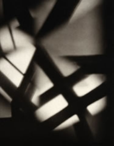
Some abstract images I've made thinking about space and focus. I tried to take pictures that are mainly in focus and represent a lot of space in the background.


All of these pictures show space and focus, some also show other formal elements such as shape, light and line. The 7th image has a good depth to it as it was taken at a far angle. The image is also focused clearly and there is also light and shadows spread across the picture which contrasts pretty well. To improve I can take pictures that have some unfocused parts as well as focused parts in the same image. I can also think about more formal elements when taking these abstract images.
|
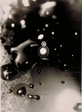
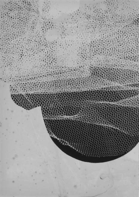
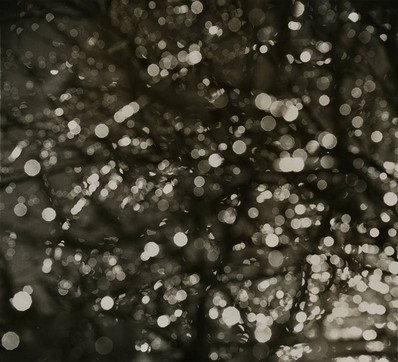
This image has a range of formal elements. You can see some shapes featured around the image which seems to be from the rain drops. The shapes are mostly organic since they are circles/ovals. There are focused and unfocused parts in this image. As you can see it is mostly the edge of this image that is unfocused and the other spaces are focused. The unfocused parts are lighter compared the other parts which are darker. The repetition is mostly from the curvy shapes such as the smaller circles. The tones vary from lighter parts at the bottom to darker in the middle.
|
|
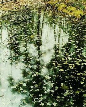
This image has a few important formal elements. The image itself overall is pretty focused with barely any parts blurry or unfocused. The lighting shows a reflection of the light from the sky in the pond which contrasts with the darker shadows near the bottom right (which is probably from some trees). You can tell that the image was taken during the day due to the shiny light reflected. There are a few repeated objects such as the leaves and parts of the flowers in the pond and a greenish/yellow object further away. The parts of the flowers create a pattern across the pond.
|
Photograms
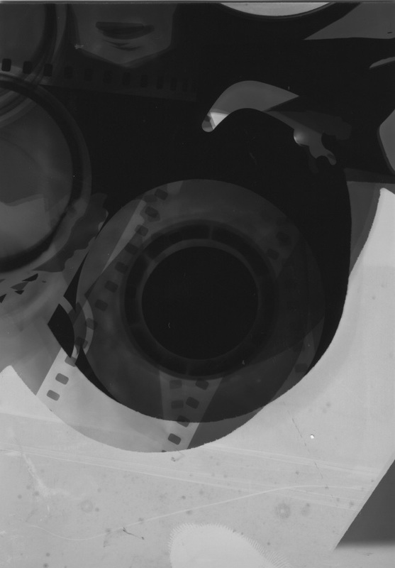
Photograms are images made out of photographic paper. You need to place objects on the photographic paper then expose it to light for a few seconds. The paper then needs to be washed through several chemicals such as fixer, stop and developer. When you look at the paper after making a photogram, there will be different tones. The black part is the negative space which is around the objects and the white part is the negative space which is the object itself.
Here are some of my favourite photograms that are abstract


My favourite Photogram
|
This image is my favourite Photogram because it is very abstract since you can't actually tell what the subject is. The image has a various of different tones - there are darker tones in the positive space at the top where the geometric shape is the shapes at the bottom. The objects that the artist used fit pretty much with the whole paper so it stands out more and gets peoples eyes attracted to the image more. There are a range of geometric shapes that are repeated throughout the image. The objects are placed at a different angle to give some originality and makes it more dramatic. You can tell that the objects that are darker are not actually placed on the photographic paper (or at least some parts of the objects were not on the paper).
|
Curtis Moffat
Curtis Moffat was a photographer than focused on making abstract photographs. He was born in 1887 and died in 1949. The abstract photographs that he made are innovative still life's or society portraits. During the 1920s he collaborated with Man Ray to make some abstract photographs. Curtis opened a photographic studio later in 1925 in London and started creating more photographs with camera less techniques such as chemigrams, photograms, cyanotypes and more!
Here are some photograms Curtis Moffat has made.


Laszlo Moholy-Nagy
Laszlo Moholy-Nagy is a photographer that was born in 1895 and died in 1946. He was a Hungarian painter and photographer that is part of a Bauhaus school. He makes a range of camera less images like the other photographers I've researched. He made abstract photograms like Man Ray (who referred to his photograms as Rayographs). He uses a range of objects like paper that have been cut to make weird looking shapes. It's often very hard to make out what the original objects were.
Here are some of the photograms that Laszlo Moholy-Nagy has made:


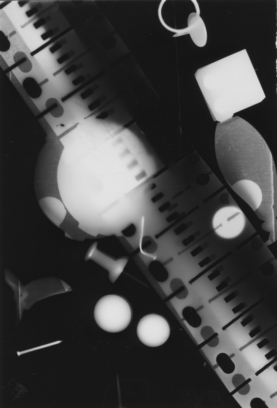
Here are my Photograms that I have made using a range of different objects and on the second photogram I chose to place objects on each other and move them around.
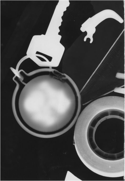
This was my first abstract Photogram that I made using different objects. There are different tones in this image especially in the key ring. There were darker tones on the edges of the circle and as you get along to the centre you can see more shadows of white. This is due to the ring not receiving enough light or it could just be how opaque the ring is. The shapes are mostly organic however there are some geometric ones as well. I can improve by using more abstract shapes since these ones are pretty obvious to guess and using different shapes.
|
This photogram definitely looks more abstract. You can see more different shapes used in this photogram and the shadow that you can see on the rectangular object works really well since it contrasts with the other side of it. You can also see the rectangular object under one of the circles this is because I either put the circle on the rectangular object or moved it during shining light to the photogram. To improve I can use less curvy shapes that are opaque because all you see is a white background and that is boring.
|
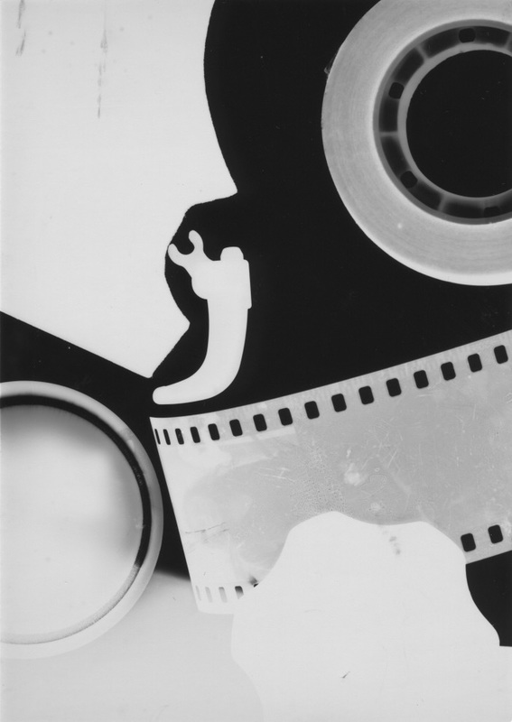
This photogram doesn't show much abstraction however I like the bright tone of the different objects since it was opaque. You can see the shadow of one of the objects at the bottom left which was probably moved or had less light shined on to it. Some of the marks on the top left object is also interesting as well. To improve I can use more transparent objects so that the tones are more balanced across the image.
This image is very original and interesting. I really like the holes of the object because it contrasts with the background of the image because I put an opaque object around the translucent one. You can also see splats of water on the white space which adds an effect to the opaque object. To improve I can experiment with the different types of space using this photogram and putting it on another one to see how it would look like.
|
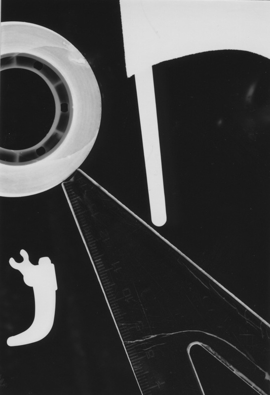
This image might not look abstract at all however the cuts and scratches on the ruler stands out. It shows a range of lines such as straight and curvy which is quite abstract. The shapes are are interesting as well both geometric and curvy. To improve I can use more abstract objects and different types of shapes.

This photogram is very abstract and is the best one I've made. The image has shadows of objects because I've moved all of the objects around during the time that light was shined onto it. It gives you different types of tone especially in the middle of the image. You can see that starting from the top of the image the tone was dark and it got lighter as you went down. To improve I can experiment with a bunch of objects, moving it around more.
|
Three things I can do to improve in my next lesson:
- Bring in my own abstract objects such as cut up paper in different shapes.
- Use more translucent objects
- Experiment with more photogram techniques such as splashing the developer chemical on my photogram rather than washing it completely in developer.
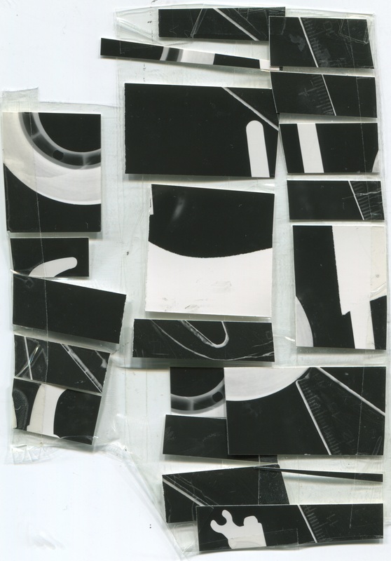
I've decided to experiment with cutting up some of my photograms and placing them on tape and making new photograms out of them.
The photograms below are the original versions that I have cut up.

|
|
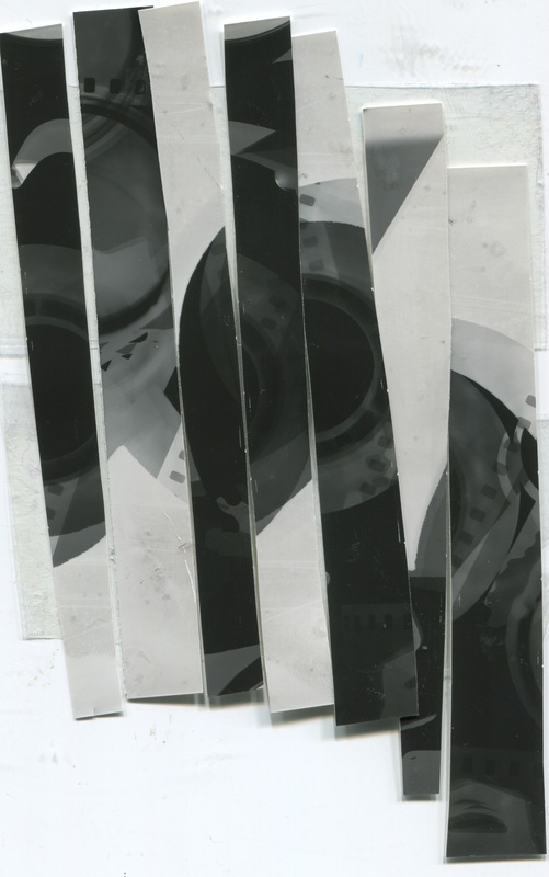
Below are the cut up versions
|
|
I've made the initial cut up on the left by cutting one of my photograms up and placing them in a random order on tape. I then cut the middle of the tape to make 3 small rows of the photogram. Then I added more tape to the pieces I cut up because the pieces and tape were really thin and would possibly fall off the tape. I stuck the tape together with the middle piece to make an abstract composition in the dark room.
For my initial cut on the right, the process was very simple. All I did was cut my other photogram into strips of similar sizes and placed them close together as I could so that I wouldn't get a thick layer of black in between the pieces of the photogram. Then I stuck them onto a tape at a random order to make the photogram look abstract.
I used these initial cuts in the dark room to make abstract photograms by placing them onto photographic paper face down so that the side where the photogram was, would be shown on the new photogram. I then shined light onto the photographic paper for a few seconds and did the normal process of mixing them in different chemicals.
I was expecting my image to be very abstract, because I've placed them in a random order and the original photogram I used was pretty abstract as well. I was expecting to see lumps of black on the edges of the photograph where nothing was on it.
Here are my Photogram cut-up prints
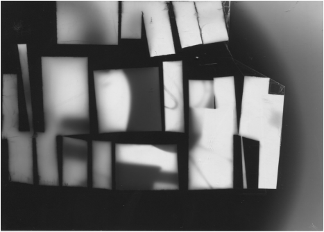
This photogram went really well. I expected this photogram to look like this (where the tape was is where the black parts are). This image is very abstract and I really like the contrast of tones in this photogram. You can see a pattern between the bright and dark parts and there is a small white dot at the top of the image which is interesting. To improve I can stick the pieces on more straight on the tape.
|

This photogram went well as well. There are less black parts between pieces because I arranged them close to each other. I like the shape created by the light tone on the left which is made due to lack of light shined onto that area. To improve I can add more patterns to the photogram by cutting up more photograms into small shapes.
|
Next time I would try using a different technique rather than placing the photograms into the chemicals I would paint it with the developer or just splash some on to see the effect created. I would also use more than 1 photogram cut up and start to move it around during the process of shining light to the paper.
Photogram Duotone
I've decided to experiment more with my photogram cut up prints by adding a layer of colour to it so I learnt how to make a duotone. A duotone is a contrast of two different colours on a print. You can make a duotone very easily by using photoshop. Below will be some screenshots showing you how to create a duotone in photoshop (you have to click on the images to see the step).


Below are the results of both duotones I've made.
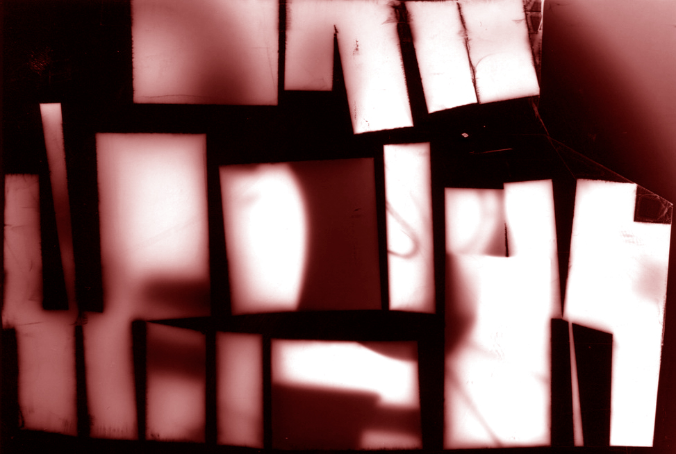
I really like the contrast of both colours on this duotone. You can see the pattern on the left where there are more red as to the right where you see the brighter tone. To improve I can add darker colours to the image to match the black outlines. I can also experiment with more colours with the photogram.
|
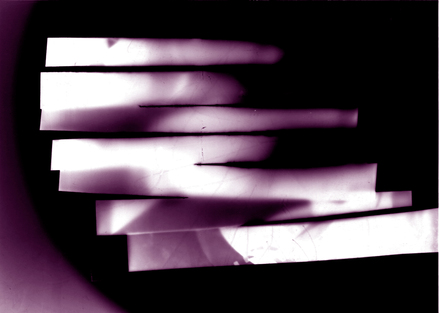
I've decided to use purple on this duotone because the image has more black parts and the purple would contrast with the white and I really like the purple marks with the different tones throughout the image. To improve I can add another photogram to this one to make an interesting composition with a duotone on it as well.
|
Here is my final outcome
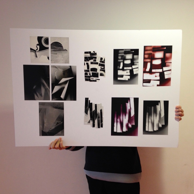
I've stuck my photograms in the order starting from my first photograms on the left and ending on my duotones on the right to show the process I've been through during the photogram idea. This also shows me developing my ideas as time goes on because I've recognised what didn't go well and thought of other ideas to improve my work. My smaller photograms that I've made were on the top left, larger ones in the middle and bottom, my 2 cut ups in the middle, the cut up prints on the top right and the duotones are on the bottom right. You can tell that I've been improving my work because my work are more abstract as you look towards the right.
Research:
Harry Callahan
Harry Callahan


I find it interesting that Callahan can make images with a range of formal elements in his images such as shape, repetition and tone. His images are all black and white which makes it more abstract. I am interested in making abstract images of objects in the world that feature shape, repetition and tone in them each.
Ralph Eugene Meatyard


Meatyard's abstract images mainly focuses on twigs. The background of the images are usually unfocused because the photographer wants people to look at the main subject which are the twigs. His images consist of lots of lines and some shapes with a range of repetition. There are also leaves as well on the twigs. I'm interested with creating abstract images of twigs with leaves on whilst making the background blurry. He was a Zen Buddhist and said that the landscape had a spirit to him and the pictures were taken with a tripod.
Uta Barth


Uta Barth's focuses on space and light when she takes photographs. Most of her images are taken out of focus to make the light the main subject rather than the background, I like the way that all the images are cropped so that the images are more abstract. I'm interested in creating abstract images that involve light and space that are out of focus.
|
This image is very abstract. The image has a range of patterns from lots of organic shapes and it shows some tone that contrasts from the circles and the background. The image shows a great deal of patterns as there are lots of circles arranged in random places and the space is very packed because there is a lot that is going on in this photograph.
|
Here are some images I've taken inspired by Uta Barth. I tried to take photos of objects closeup that are in my house and some reflections and shadows as well.


All of these images show a range of light and space, which is a key feature of Uta Barth's images. Some are very abstract such as the images from the fourth column on the second and third row because they both show light shining from an object which can question lots of people as the background is very dark. To improve I can take more images that consist of a lighter background with light shining from lighter surfaces and make them blurry so it is abstract. I can also take more photographs that use the light from the sky.
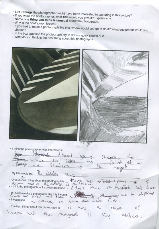
Photograph Evaluation
Ralph Eugene Meatyard
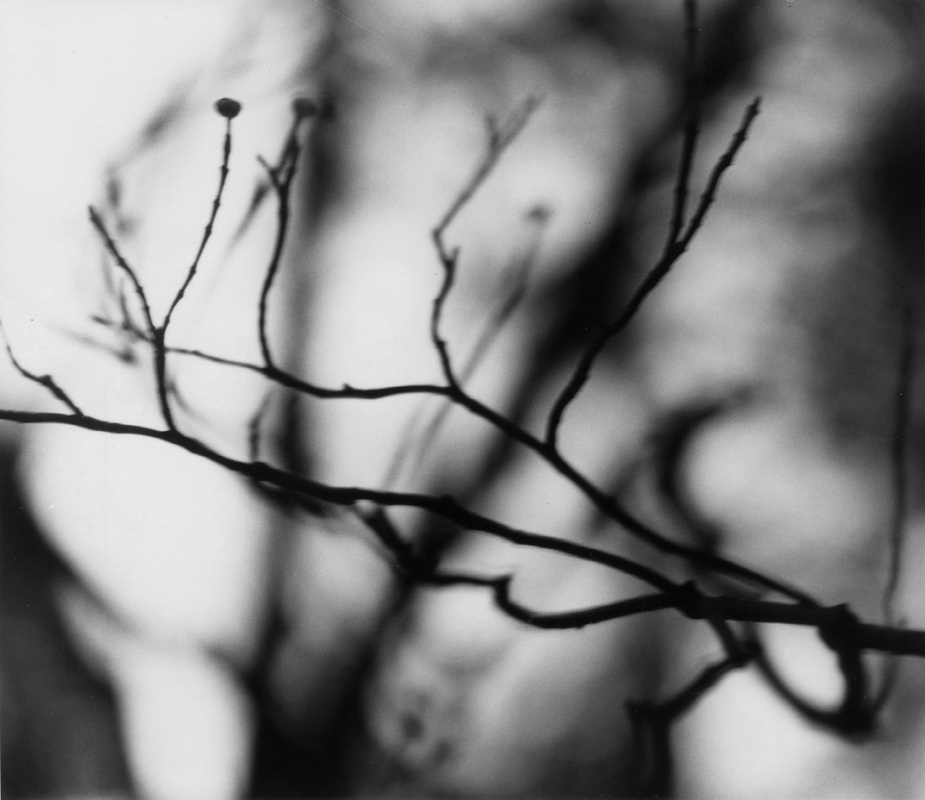
In this photograph I can see twigs arranged at different angles. There are twigs that have been photographed in focus and other twigs are photographed out of focus (which are located in the background, behind the twigs). The image has been taken in black and white to show the contrast between the twigs and the sky. There are black splatters in the background which could be the shadows of each twig. The words that I would use to describe this photograph would be "abstract", "original" and "dull". This image is abstract, even though you can see some of the objects in the photograph, the background can't be clearly recognised easily. The different types of focus used in this photograph make it abstract. The things that I recognise in this photographs are the twigs and parts of trees in the background. The shadows and sky are also things I recognise and the flowers are the bottom. The things that seem new to me are the blurred out figure in the background, in the middle of the image.
The equipment that has been used to make this image is a medium format film camera. The artist has used a fast lens on the camera to make the twigs the subject of the image that is in focus and everything else is out of focus. This affects the way we view it as our eyes will go towards the twigs first, because that is the object that stands out the most. The image will make people question about the blurry parts and why it has been taken in black and white because it makes the objects harder to see even though it is supposed to be an abstract image, there are abstract images that are in colour. This photograph reminds me of a tree that has lost it's leaves and the wind is heavily blowing, making the twigs located at an angle. In this picture, I would describe the lines as fairly straight with some curly parts on the twigs and flowers. There are some geometric and organic shapes such as circles and triangles made from parts of trees and twigs. The tones contrast each others quite well since the picture was taken in black and white it shows a good balance of the colours, twigs and the colour of everything else in the picture. There is a pattern with the twigs - they are all going in a horizontal position or vertical position and two of them have a circular object on top. The photographer has captured the play of light in this image through the shadows of trees and twigs, also possibly the light of the sky. This picture is different from real life as real life shows all the objects in the world as focused. In this image the only figure that is in focus in the image is the twigs. The picture is also in black and white, in real life we see things in colour. The thing that interests me in this work of art is that it is very abstract. It makes people think of what is going on in the image and why the artist has chosen to take the picture.
The title that I would give this photograph is 'Zen Twigs'. This is because I know that a series of images of twigs are called Zen Twigs. The image clearly shows twigs and I know that the artist is a Zen Buddhist and he likes to take pictures of twigs. If I didn't know this information I would've titled the photograph 'Original Twigs' because the lines of the twigs are all different. Some are sharp, pointy and wonky and others are straight. Other titles we can give this photograph are 'Twig land', 'Silhouette Twigs' and 'Shadows of Twigs'. In this picture, I think that the wind is blowing, making the trees and twigs stand at an angle. The area is light making a reflection of different angles. The weather is sunny and the sun is shining at the trees. I arrived at this idea, because there are splatters of black around the trees which seems to be the shadows. The background is full of trees and is also white. If I was inside the photograph, it feels like I am surprised by creatures and dark shadows, because the image is really dark. I also feel claustrophobic due to the lack of space in the image. I think that the artist made this photograph, because he wants people to be aware of twigs more and how they are constructed, since the twigs are the main subject as it is the only object that is in focus. I think that it would be a very hard time to live in this picture, because the space is very limited and it is very dark, making people more frightened. There is also no food or anything to help them survive.
The spacing in this photograph is represented as fairly compact. There is a lot of objects featured in this photograph which fills it up, because the objects are either zoomed in or have a large surface area. There is still some space in this photograph which is located between the twigs and trees. The part of the photograph that strikes me as most interesting is the unfocused objects in the background. This is because the unfocused objects give a good reason as to why this image is abstract. I like to find out what the objects are and hear different responses from other people which could help me find out what the objects are. The questions that I would ask if he/she were here are why did you choose to make the image abstract? Why are the twigs in focus and everything else is out of focus? Why is the image in black and white? What are the black/grey blobs on the picture? Through research, I can discover that the image has twigs and leaves against the background and are also complete silhouettes. The artist likes to make picture of twigs, zoomed in and making them the main subject by focusing it and making everything else unfocused. This new knowledge affects my understanding of the work as I now know what is in the background and it helps me take pictures inspired by the artist.
The thing that is effective about this photograph is the contrast between the focused objects and the out of focus objects. This is because it makes the image very abstract and makes the audience think a lot about it. There is nothing that doesn't work so well in this photograph. I think that other people would be confused when they first see this photograph, because the photograph is abstract and most people are used to looking at naturalistic images. Other people could be questioning the image as they are curious and inquisitive about abstract images. I think that the trees behind are worth remembering about this photograph because it's the object what you don't expect everyone to look at first. It is very abstract and shows a large number of formal elements such as line, tone, shape and texture.
Here are some images that I've taken inspired by Ralph Euguene Meatyard. I tried to make images of twigs using a special lens so that the contrast between the twigs and background is obvious.


The camera lens that I've used to take these images is a compact-macro lens. This lens allows me to take pictures inspired by Ralph Eugene because the focus options makes the main subject in focus and the background blurry. I had some problems at the start with getting the camera to focus however I managed to get through the problem and the pictures I made were similar to Meatyard's and some are more abstract than others. I really like the image on the first column on the second row because it shows the effect of the lens really well (you can see that the big twigs are clear and everything else is blurry). To improve I can move closer to the subject when taking the image so that you can tell which object is the subject and where the blurry parts are.
How to make a photograph like Alfred Stieglitz
1. Start thinking about how you can make shapes and different textures through looking at clouds or any object. Think about the formal elements such as texture, shape, line and tone.
2. Try using a Graflex SLR, if you can't find one then you can use any digital camera with a round lens.
3. Photograph in Black and White
4. Look up in the sky for some clouds and try to make an interesting shape out of it.
5. Zoom into the clouds or any object that you find interesting.
6. Make sure the viewfinder is pointing at the subject you want to photograph because clouds have a large surface area and if you don't get the certain part that is interesting then that could be a problem.
7. Try not to move the camera a lot because you will be zoomed in a lot into the clouds and if you move the camera then the lens could be looking at something else.
8. Make sure the photograph is in high contrast.
9. Make sure the photograph is abstract and looks unusual to the everyone else.
10. Place your finger on the shutter and take the picture.
Here are some pictures I've taken inspired by Alfred Stieglitz


I couldn't really find any clouds that has interesting textures and shapes because the sky was very plain today, there was just a solid lump of grey clouds in the sky so I decided to take photographs of objects with interesting textures and shapes. I've edited these images in black and white making them abstract which works really well for the photographs that has bright colours such as the second one on the top row. The images are in high contrast so you can't see much grey in most of the pictures. To improve I can find clouds that have interesting textures and shapes to create an abstract composition.
In Focus: Saul Leiter
5 characteristics that define Leiter's photographs:
- The images are mainly blurry (they are out of focus).
- There is something covering the subject of the pictures.
- The tone of the objects that are covering the subject of the pictures are usually dark.
- The space of the images are quite tight and compact due to the objects covering the subject.
- The lines are straight with some pointy parts of the objects.
Here are some images taken by Saul Leiter


|
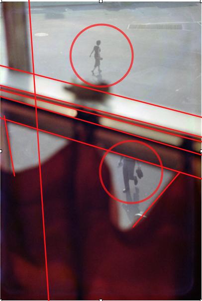
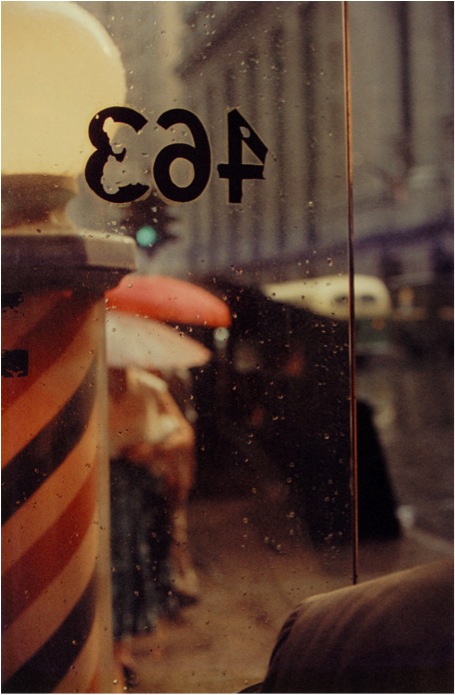
This is my favourite image because it shows that Saul Leiter likes to play around with the formal elements such as line, shape, tone. The image is abstract since it is flipped and itis hard to tell what it is. The only physical thing you can touch is someone's shoulder on the bottom right since the image was taken from a reflection of a mirror. The thing that is surprising or unusual about this photograph is that there is a shoulder of the person on the bottom right since it confuses the person that is viewing the image. The viewer would think that everything in the image part of a reflection but then they see a shoulder outside the reflection. One of the formal elements that are important in this photograph is focus. This is because most of the image is blurry especially inside the reflection. The artist is trying to get the viewer to focus on most of the objects inside the reflection rather and possibly the shoulder of the person outside of the reflection since it is very odd. The blurry parts makes the image very abstract as it is harder to see everything. It also distracts the viewers and makes them think about why the image is blurry.
|
Here is a quote from Saul Leiter that I have chosen
- I never felt the need to do what everyone else did. And I wasn’t troubled by the fact that other people were doing other things.
I've chosen this quotation because it shows that Saul Leiter is a person that makes his own images and thinks of his own ideas even if he is influenced by other people he will always think of his own idea. He is that type of person that doesn't care about other people and what they are doing, he cares about what he is doing. This quote helps me understand that his ideas are independently thought and you won't ever see pictures that are similar to other artists.
|
From watching this short clip, I've learnt that Saul Leiter is a person that thinks that he doesn't look as good as he did when he was younger. He doesn't really care about his appearance, all he cares about is his work. He likes to go out and take pictures because he doesn't know what the result would be since his style is very abstract and unusual. He is that type of person that doesn't rush and takes things more calm and peaceful.
|
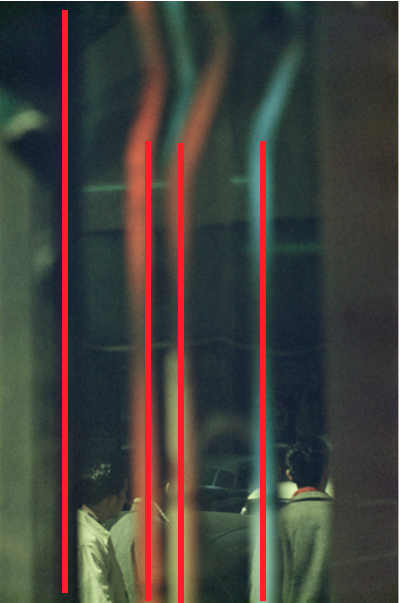
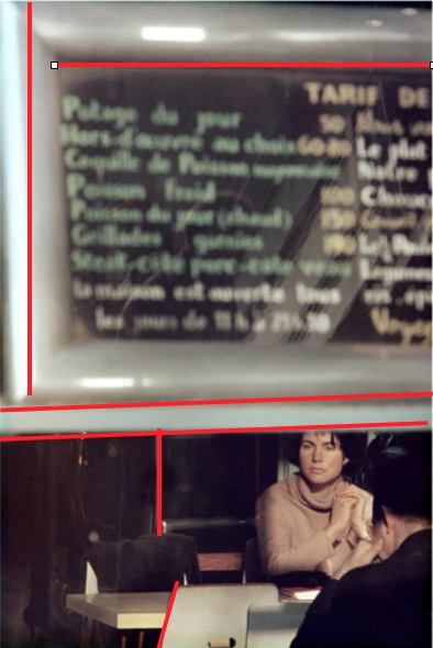
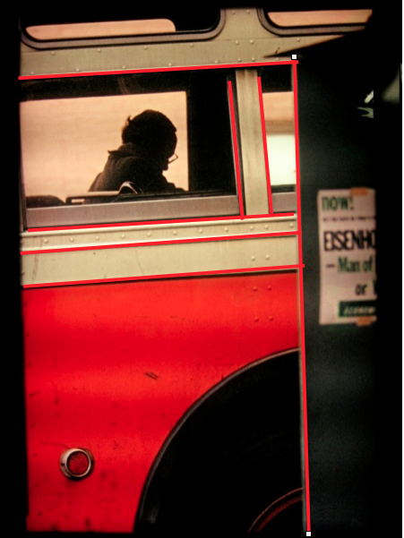
Saul Leiter's compositions
I've decided to draw lines on some of Saul Leiters pictures to show how he divides the picture space. It gives a good view of Saul Leiters compositions in his photos.
|
|
|
|
As you can see most of Saul Leiter's images are composed so that the lines mainly straight however some lines are diagonal.
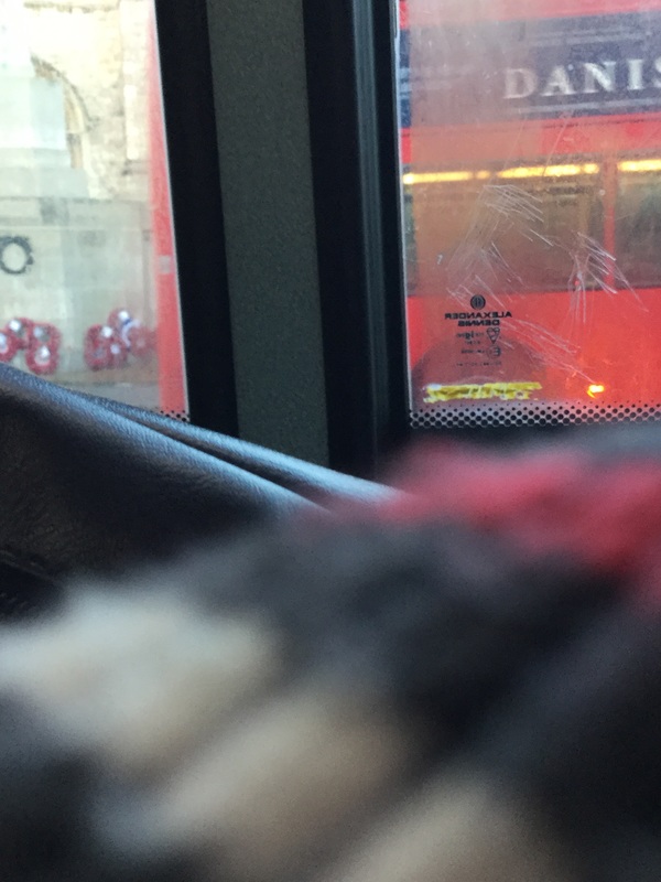
Here are some pictures that I have taken inspired by Saul Leiter outside of school. I tried to make photographs of obstructed views using a range of objects in the world.


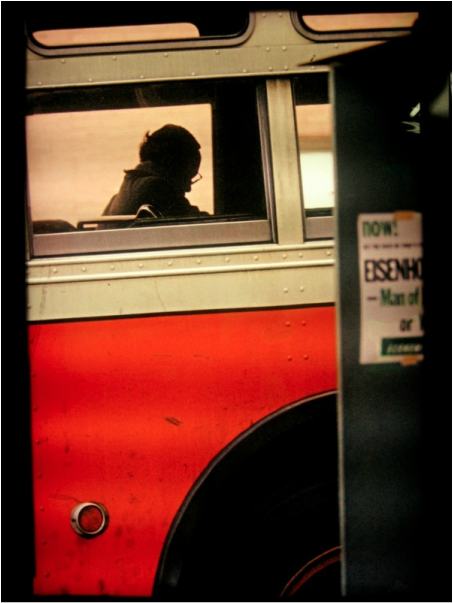
Most of the images went pretty well because they are very similar to Saul Leiters' as they aren't clear of what the subject it which makes it very abstract. I think my best image was the first one on the third column since you wouldn't expect a bus window to be viewed like that because only half of it is showing due to an object being in the way - covering the bottom half of the image. I can improve by adjusting the focus so that part of the image is out of focus and the other part of the image is in focus.
|
|
|
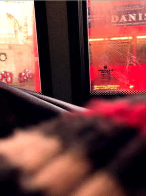
I've edited one of my images to make it look more like Saul Leiters images because it was my best image as it was the one that looks the most like Saul Leiter's images. I've changed the colours to make it more red by going onto photoshop and changing the colour balance of the image. I moved the slider of the red a bit to the right and also changed the saturation so that the contrast of the red is increased. I messed around with the darker colours as well to show the contrast well between the red and black. The colour that I wanted to get is the one on the far right of Saul Leiter's picture.
Big Ideas:
Below are the 2 Big ideas or Threshold Concepts that I've been exploring in this project.
When you are taking a photograph cameras see the world different compared to humans with their eyes. This is because you have to look through a viewfinder which already shows you the world to you but you have to select a certain bit to photograph. We mainly see the subject than the whole photograph itself. All photographs are abstractions as they are always unique.
|
All photographs are abstract and when you compare more than one photograph, they are never the same. This is because it is impossible to get the same composition of a subject in multiple photographs.
|
Here are some paintings made by Saul Leiter


|
|
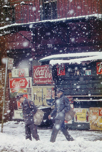
Compare & Contrast
- Both images have relatively straight and pointy lines (especially in the objects of the photograph), however the painting has more curvy lines and the pointy lines are mainly in the middle.
- The compositions of the images are very different. The photograph has been composed so that it is structured in a linear way so the objects are placed in order and the humans are similar. The painting has been structured randomly so that the paint has just been placed on randomly with Saul Leiter not thinking that much.
- The repetition of the photograph stands out more especially with the snow falling down from the sky and the 'Coca Cola' writing on the signs. On the painting there is no repetition mainly because Saul Leiter has painted the painting randomly.
- When I first look at the painting, my eyes focus on the object that looks like the boat near the centre, then it drags down to the messy composition of the contrast of the different colours and then back to the top where the brown is located. In the photograph, my eyes focuses on the coca cola signs, moving to the right to check the 7up signs and down to the human beings. They then go back to the top of the photograph.
Painting Saul Leiter
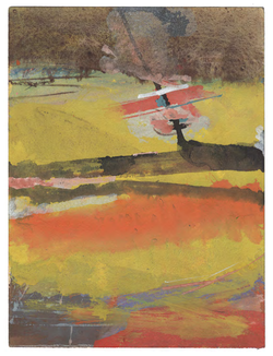
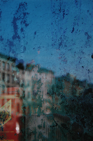
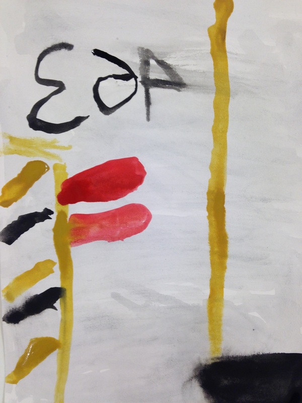
I've decided to paint one of Saul Leiter's images to help me learn how his photographs works and how he composes his pictures. I used a small piece of A5 paper and watercolours to paint his images. The main focus wasn't to make it look exactly like Saul Leiter's picture but to think about the formal elements and choosing the right colours to paint the image.
Here is one of my paintings, the painting is on the right and original image is on the left.
|
|
Evaluation
I chose this photograph because I like the way how the photographer has taken the picture so that pretty much the whole image is blurry. The splashes of blue in front of the sky is very interesting as well, the colours are very simple and there isn't a whole range of colours (only red, blue and black). I tried to make my painting look blurry by adding lots of water to the background before actually putting the paint on however it didn't really go that well because it seems that I have put too much paint on making some of the strokes and lines thick and dark. It was hard to think of what colours to choose for the harder parts to paint such as the lines of the buildings and I could've made them more thin however the top half the image was pretty well painted since the colour of the blue really matches the one on Saul Leiter's picture.
I chose this photograph because I like the way how the photographer has taken the picture so that pretty much the whole image is blurry. The splashes of blue in front of the sky is very interesting as well, the colours are very simple and there isn't a whole range of colours (only red, blue and black). I tried to make my painting look blurry by adding lots of water to the background before actually putting the paint on however it didn't really go that well because it seems that I have put too much paint on making some of the strokes and lines thick and dark. It was hard to think of what colours to choose for the harder parts to paint such as the lines of the buildings and I could've made them more thin however the top half the image was pretty well painted since the colour of the blue really matches the one on Saul Leiter's picture.
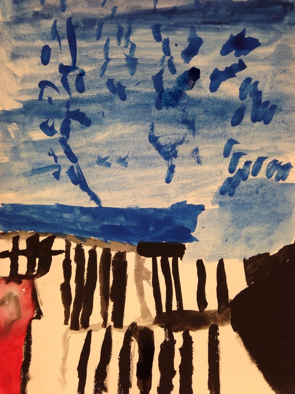
Here is another painting I tried to replicate (for this one I had to rush it because I didn't have much time and it wasn't completed).
|
|
.
Here are some more pictures that I have taken inspired by Saul Leiter. This time I chose to take pictures of reflections through glass.
Here are some more pictures that I have taken inspired by Saul Leiter. This time I chose to take pictures of reflections through glass.


The main focus I was going on for when taken these pictures were reflections through transparent glass. These were a common feature that Saul Leiter has used and I have used the focus option on the camera to make the main subject for the picture in focus and everything else out of focus. Overall most of these pictures went really well because you can see a lot of objects through the reflection of the glass. I really like the image on the fourth row on the fifth column as it shows the reflections of most of the objects behind me and the most interesting part of the picture was the white thing on the bottom left - I think I made that since I moved the camera around which also made the image a bit blurry.
Some pictures taken through glass outside of school. I took more photographs of reflections through transparent flass.


I really like the picture on the third column on the first row because it shows a large amount of the reflection from the area behind me. It went well as the image is abstract and doesn't show much of the area through the glass since it was very dark. The image on the forth column, first row was also successful. You can see more of the objects through the glass and a reflection of part of a car as well. To improve I can try to get closer to the glass to get more of a reflection through the glass.
Obstructed views
Saul Leiter usually likes to take images through an obstruction which could be an object or anything. I've decided to get a piece of card and cut different shapes such as circles, rectangle and squares to make a viewfinder. I then took pictures by putting the camera lens close to the card so that I can have part of an obstruction. I mainly focused the camera on the object rather than the card.


Most of the images went out pretty well since they pretty abstract. For some of the images the colour of the card is darker which makes the image more abstract since it looks less like a card. I tried taking pictures of glass, through the card and pictures of objects. You can see the reflection of the background on the picture on the fifth column, first row. To improve I can make the card more blurry so it looks by abstract by pointing the camera further away from the card and zooming in so the edges are sharper and hard to see.
Here are more photographs that I have taken inspired by Saul Leiter. Taking photographs using a range of techniques that Saul Leiter uses such as obstructed views and reflections.


These images are constructed really well that includes lots of obstructions and blurry parts. I really like the image that shows a reflection of an object behind me of the water. It makes the image really abstract and shows the whole area really well. Next time I can try photographing more abstract images that have more colours that are brighter and make the image look interesting.
Ray K. Metzker
Ray Metzker is a photographer that mainly focuses on one of Saul Leiter's features when taking a photograph which is obstructed and disrupted views. He was born in 1931 in Milwaukee and went to a school from 1956 to 1959 that was known as the new bauhaus a few years before. During his early career, his photographs were highly made of different compositions that were very influential and original.
During the 1960s, museums started to find interest in Metzker's work and he was given a one man show in 1967 in New York of his unique photographs. There were loads of exhibitions of Metzker's work throughout his life and they were normally located in the popular cities of America such as Chicago and Atlanta.
During the 1960s, museums started to find interest in Metzker's work and he was given a one man show in 1967 in New York of his unique photographs. There were loads of exhibitions of Metzker's work throughout his life and they were normally located in the popular cities of America such as Chicago and Atlanta.
Here are some pictures that Ray Metzker's has made


Ray Metzker likes to creates pictures in black and white which is a main feature of abstraction. The two tones show a very good contrast between them and he has probably edited these pictures to darken the black and lighten the white in the picture to show the contrast. He also thinks about shadows and other formal elements like line and shape in his production of images.
Ernst Haas
Ernst Haas was born in 1921 and died 1986. He was another photographer that mainly focuses on one of Saul Leiter's features when taking photographs. Ernst Haas thinks about the use of expressive colours when taking pictures. During his early life, he was a slow learner who learnt photography on his own and his early work was mainly of still life. Ernst Haas also experimented with a range of formal elements such as focus and depth of fields. He said that he was interested in "transforming an object from what it is to what you want it to be.”
Here are some pictures that Ernst Haas has made


As you would expect all, of Ernst Haas' pictures are in colour. He uses a range of techniques to produce his pictures and you can see a lot of bright colours that stand out in his work. The image on the first column, second row is an interesting collage made of lots of colours that stand out to grab everyone's attention. It shows a range of formal elements that work well with each other like sharp and curvy lines, geometric and organic shapes and bright colours. The image below the collage is very interesting as well, there were two cars that seemed to be blurred out and everything else is in focus, his use of focus in this picture is very successful.
Here are some more pictures inspired by Saul Leiter. I decided to cut out some shapes out of colourful post it notes and stick them on the lens of my camera.


I've tried a different approach with using obstructing views and bright colours this time. I've decided to be more creative and stuck some tape with a range of different colours on the lens and photographed with them on. I really like the picture on the last column on the second row because it shows a different range of formal elements such as light, shadows, line and colour. The tape on the lens gives it a obstructive view, blocking the shadow of my head and the light gives a good contrast to the light and the darkness. I can improve by adding less tape on the lens and try photographing more pictures with post it notes on a transparent frame (like the last one).
Photographer's gallery trip
|
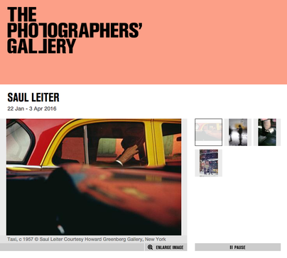
I've visited the photographer's gallery with my class to see more of Saul Leiter's photographs and paintings in an exhibition in Central London. The exhibition had a range of images that Saul Leiter has made that are mainly abstract showing the title and date of when the image was produced. On the right is the website of Saul Leiter's exhibition in the photographers gallery.
|
|
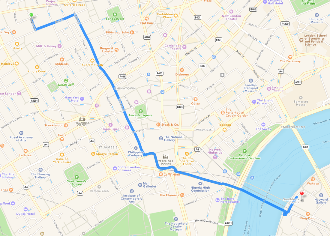
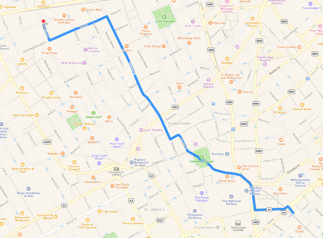
The maps below show the route to The Photographers' Gallery from Charing Cross Station as that was were we got off the train and then walked to the gallery. It also shows the route to the Royal Festive Hall where we did a photo shoot inspired by Saul Leiter.
|
|
Here are the pictures that I have taken on the trip. I took pictures inspired by Saul Leiter using nearly all the features that he uses.


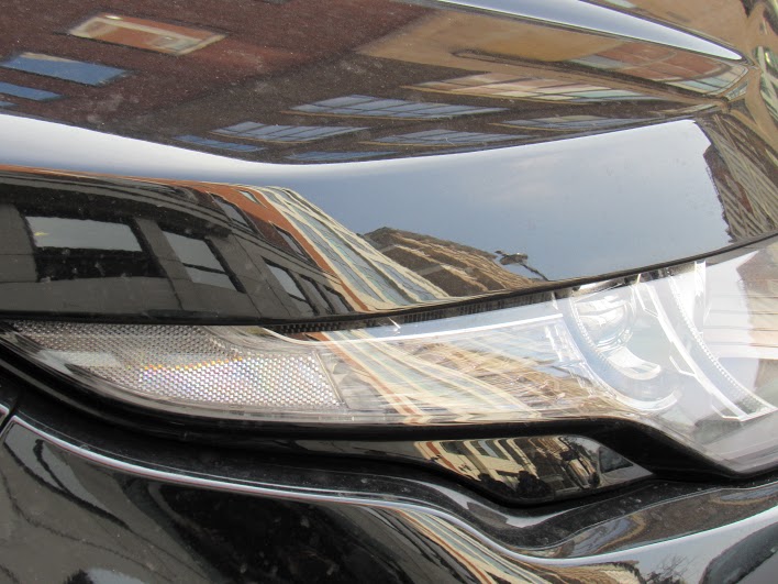
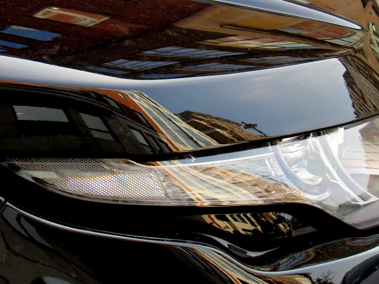
I've taken a lot of pictures on the trip and they all worked really well because they were inspired by Saul Leiter. The pictures that I've taken shows different features that Saul Leiter uses when he photographs such as reflection and distortions, obstructed views, excessive colour and types of focusing. I really like the image of the headlights of the black car because it shows loads of reflections of the buildings behind me and to the side of the city. The image is very abstract when you first look at it because it is zoomed in so that you see less of the background of the city. The contrast between the colours are very interesting as well and it can be improved by turning the darker tones up to make the image even more abstract.
Evaluation
The trip has been very interesting and I have enjoyed it. All the photographs that I have seen in the gallery were fantastic and to see more of Saul Letier's paintings really helped me understand how he has used complementary colours (colours that are opposite each other in the colour wheel like orange, purple and green) in his paintings. In the gallery I found some images created by Leiter that include complementary colours and noted them down. I also did some sketches of Leiter's portraits and landscapes pictures and explored his style and how he has used light in his pictures.
After visiting the gallery, we walked to the Southbank to take some photographs inspired by Saul Leiter, I concentrated on a range of features that I have Leiter has used like reflections and obstructive views as you can see above and the weather was beautiful which allowed me to make pictures with interesting colours.
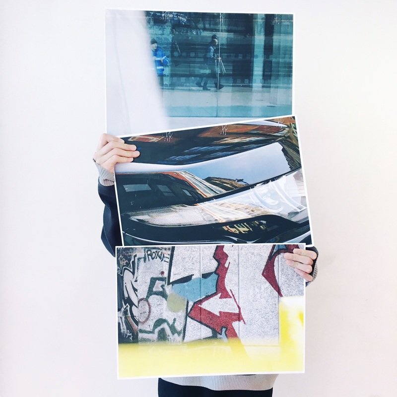
For my final outcome, I'm going to choose 3 (triptych) images that I really like that work well together and edit them with small little tweaks to make it even better. I am then going to get the mounted on a large board.
|
|
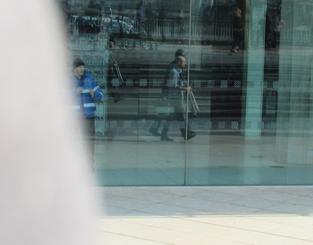
I've edited one of my images that I really like by changing the contrast levels on photoshop to make the black more darker which gives a larger contrast between the light and dark tones. The image on the left was the original one and the image on the right is the edited one.
|

|
Above is another image that I found interesting and I've edited it by making the increasing the brightness so it would stand out more. Again, the image on the left is the original one and the image on the right is the edited one.
|
|
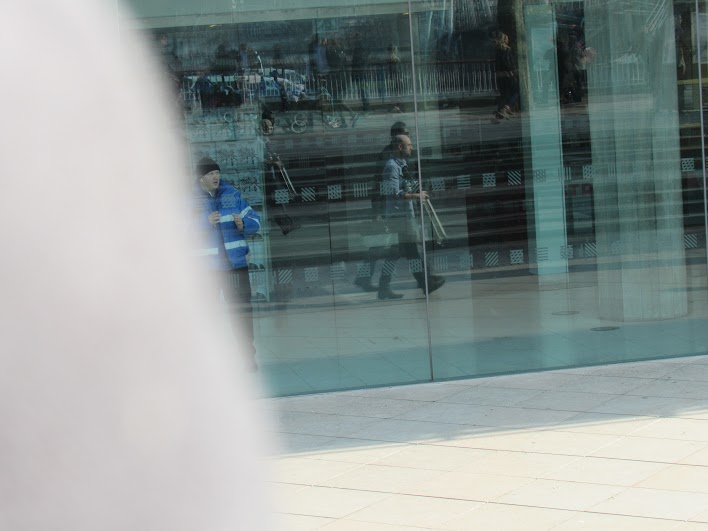
I also chose this image mainly due to the multiple features that were used from Saul Leiter which are reflections and obstructed views. I edited this image in photoshop by rotating it so that the edges of the glass and straighter on the ground. I've cropped some of the top of the image off but not too much since I wanted the people and blurred object to be part of the image as they are the main reason that the image is inspired by Saul Leiter.
My final outcome will consist of the following images above that are edited in the following order:
|

|

|
Overall my final pieces went really successful and so has the whole project. I've managed to create successful pictures that are inspired by Saul Leiter which show abstraction really well. I also learnt that even a small tweak to your pictures can really change how it looks like and how abstract it is just like my final pieces.