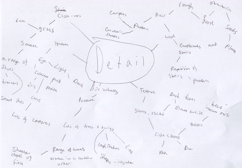
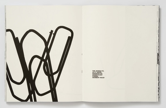
UNit 2: DETAIl
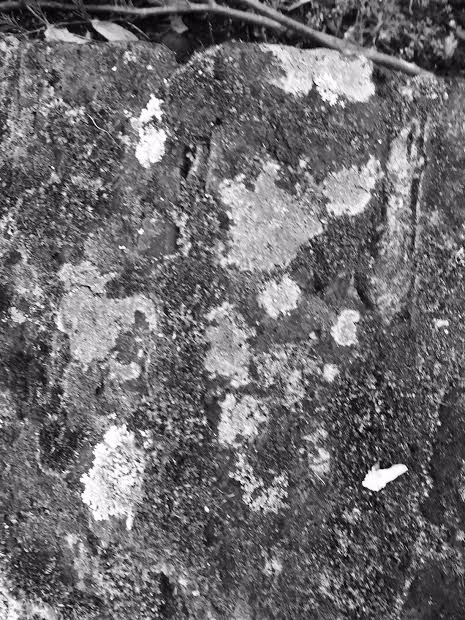
Many photographers have explored detail. Using careful control of aperture, focus, lighting and background, Jo Whaley explores the detail in textures of groups of manufactured and natural objects. Henry Troup and Phil Straus have used camera position and control of depth of field to explore detail in close-up views of features in the landscape such as sand, water and the surface of rocks. Research appropriate resources and produce your own work that explores the visual qualities of detail.
|
|
|

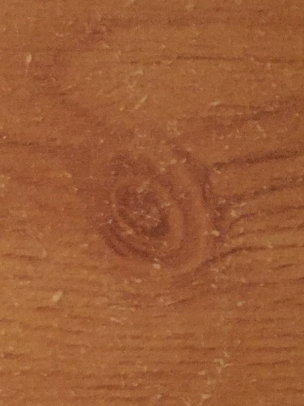
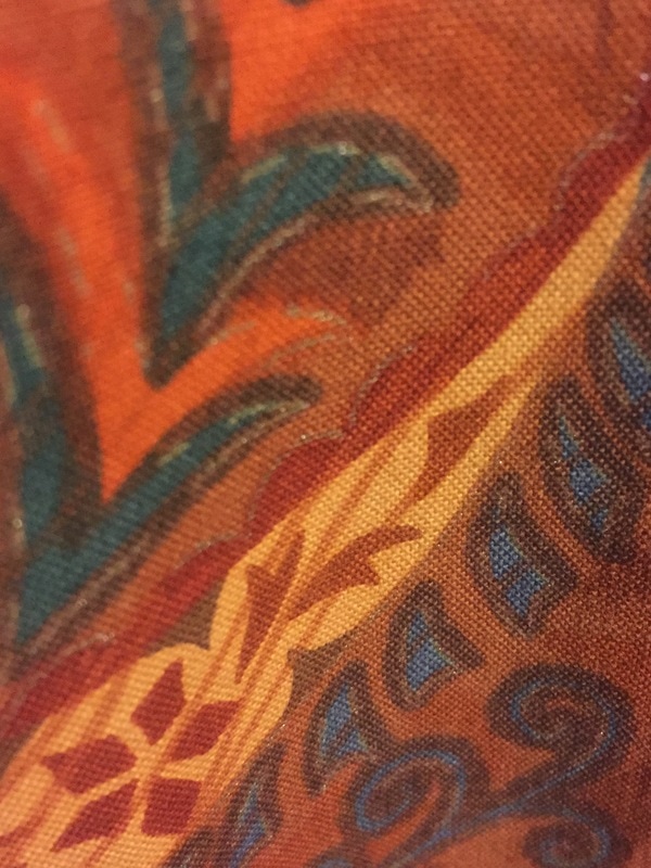
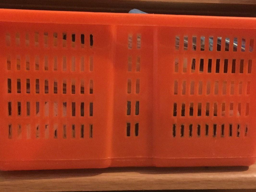
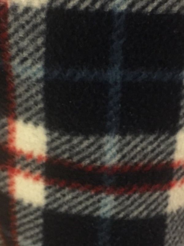
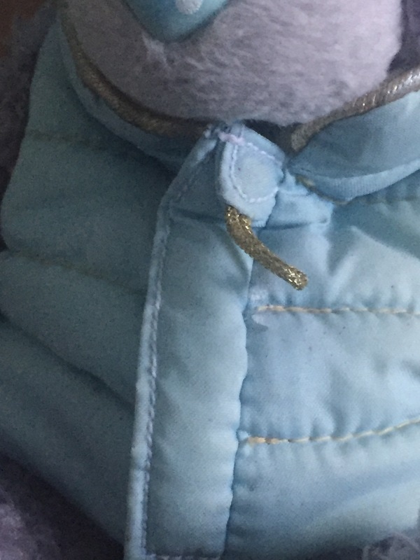
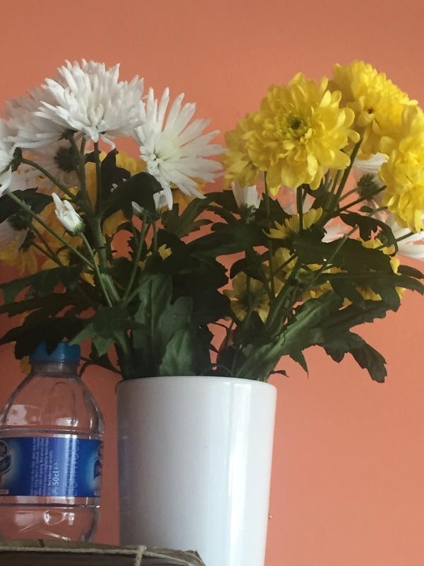
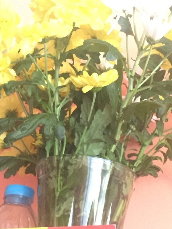
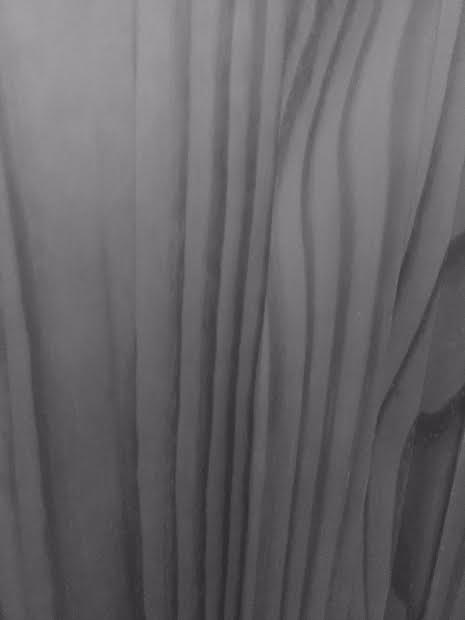
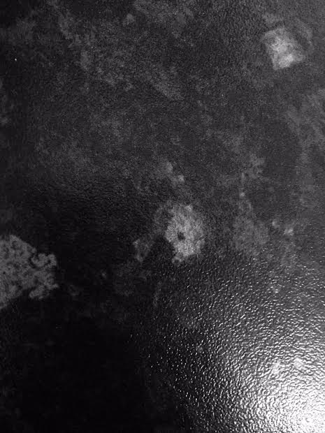
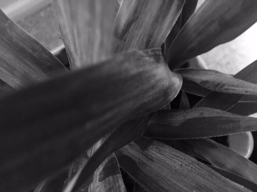
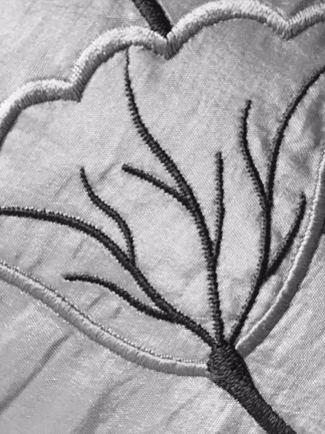
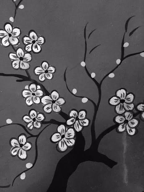
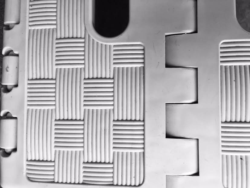
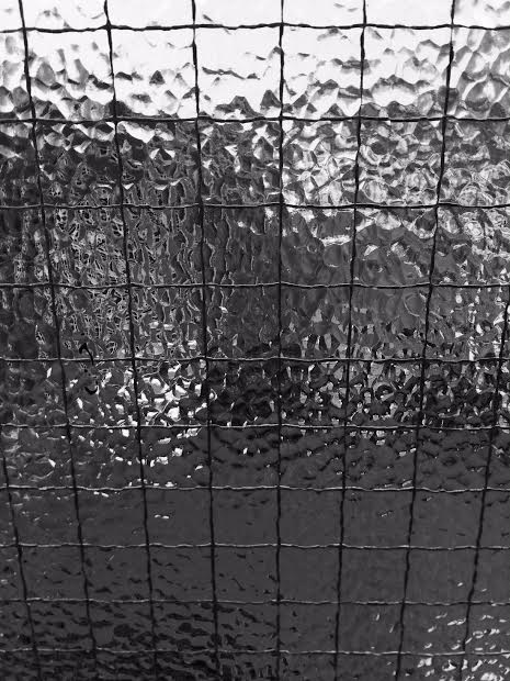
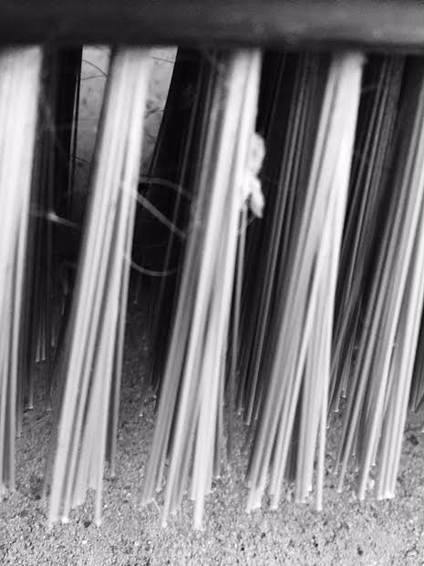
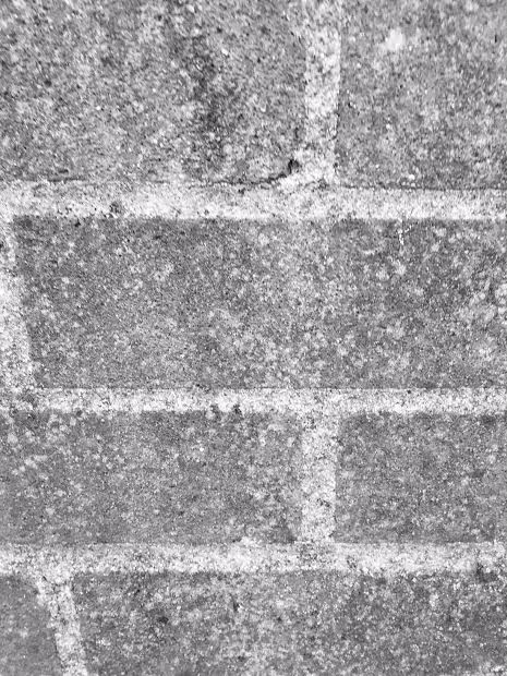
Detail images are photographs that consist of lots of features and objects that surround each other.
I chose this theme because I am interested in images that contain a lot of detail. Detail allows me to create fascinating photographs of a range of different objects, using different techniques and processes. Detail isn't limited to just one category which makes it an extremely open theme. This helps me think about different ideas and lets me experiment to see what work and what doesn't. I believe that detailed photographs can be very abstract and I've always been interested in abstraction throughout my GCSE photography life.
I chose this theme because I am interested in images that contain a lot of detail. Detail allows me to create fascinating photographs of a range of different objects, using different techniques and processes. Detail isn't limited to just one category which makes it an extremely open theme. This helps me think about different ideas and lets me experiment to see what work and what doesn't. I believe that detailed photographs can be very abstract and I've always been interested in abstraction throughout my GCSE photography life.
Research: Jo Whaley
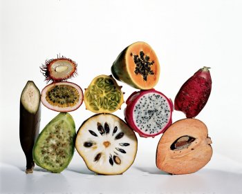
Jo Whaley is an artist that used to be interested in painting and performing arts such as theatre performances. Now, she is an artist that is influenced on the world of theatre. Whaley admires detailed colour photography which makes her an appealing artist to me because I am very interested in bright, sophisticated colours. Her work on natural objects and insects interests me because they explore the meaning of detail very well linking to oceans and human portraits.
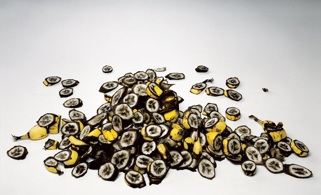
Below are some images that Whaley has made
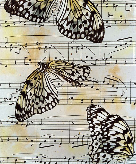
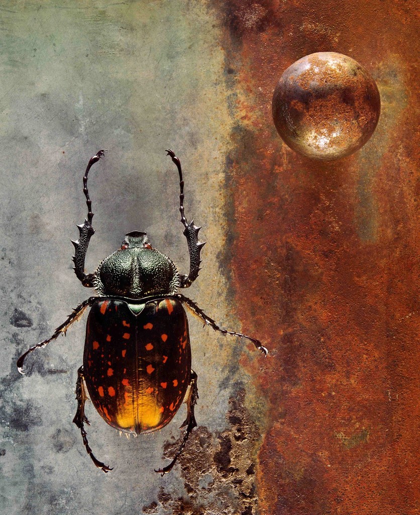
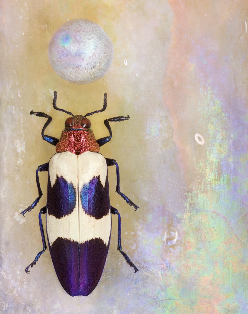
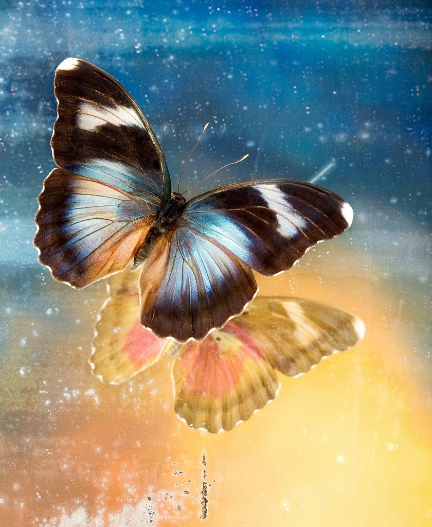
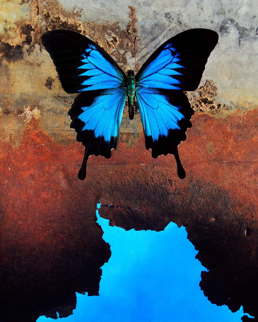
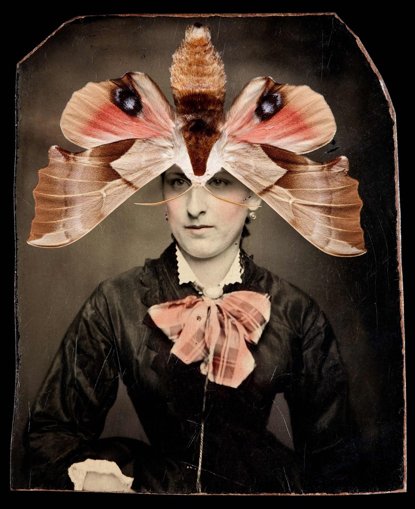
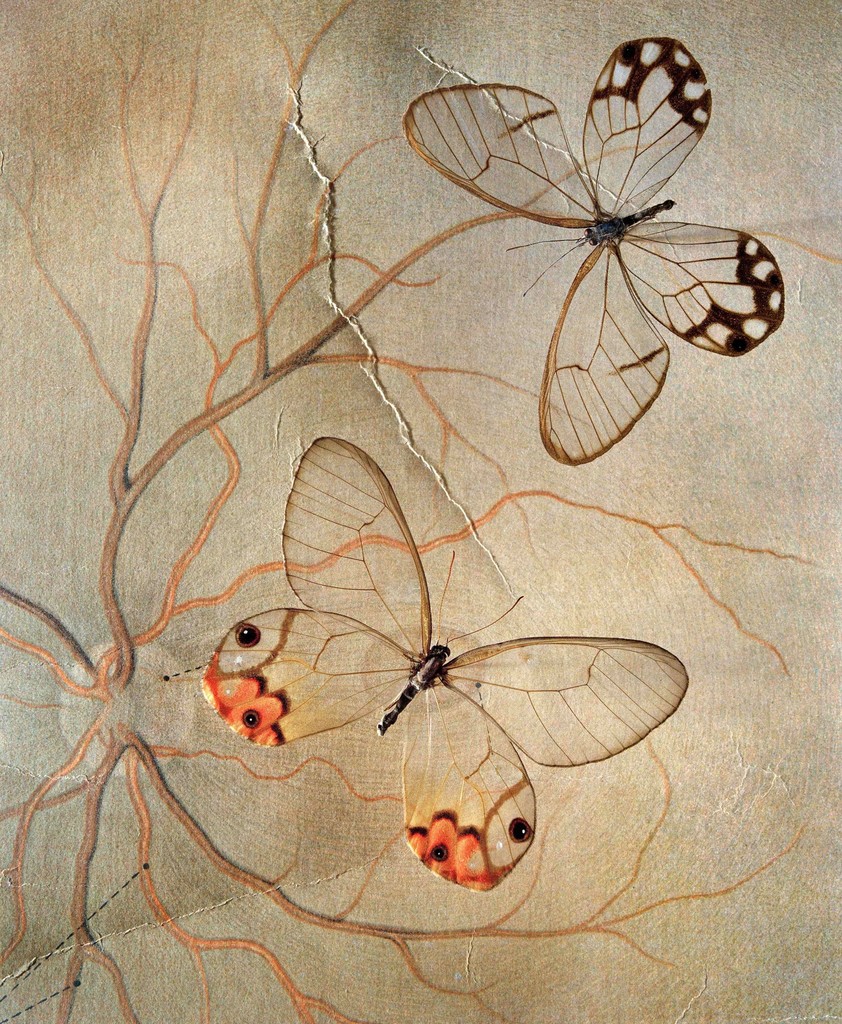
Her images enhances the detailed features of an object because they are very bright making them stand out. I really like her image of the yellow & blue butterflies because they glow which shows a very pleasant effect of their colours. The background of her insect images really fascinates me because they aren't just plain and dull, they are mixed with other colours for example the image on the 2nd row, 1st column shows a rainbow to the right of the insect.
Whaley's use of colour will influence me to make images that comprehensive. It also gives me an idea of editing the colour effects on Photoshop, of some of my images that I'll be making.
Whaley's use of colour will influence me to make images that comprehensive. It also gives me an idea of editing the colour effects on Photoshop, of some of my images that I'll be making.
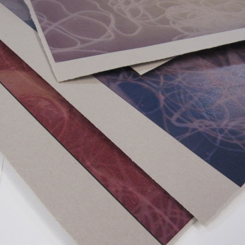
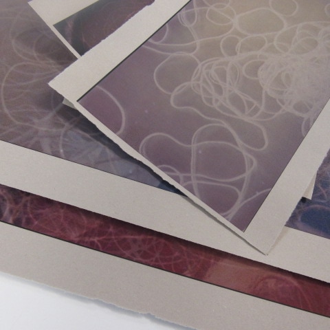
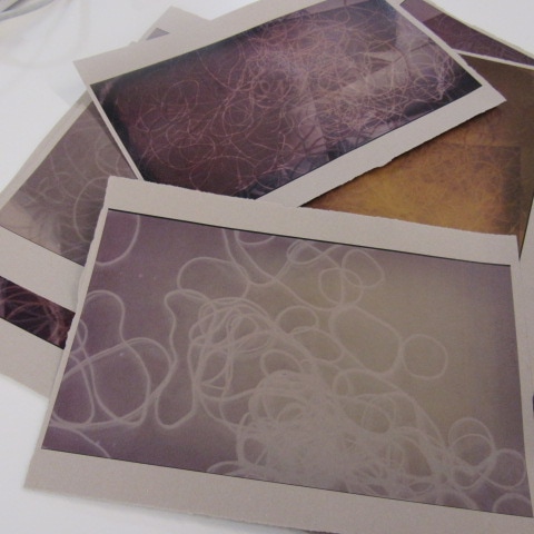
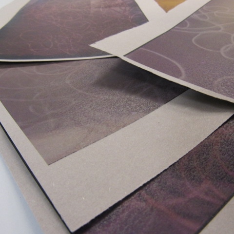
Photographs Set #1 (Response to Jo Whaley)
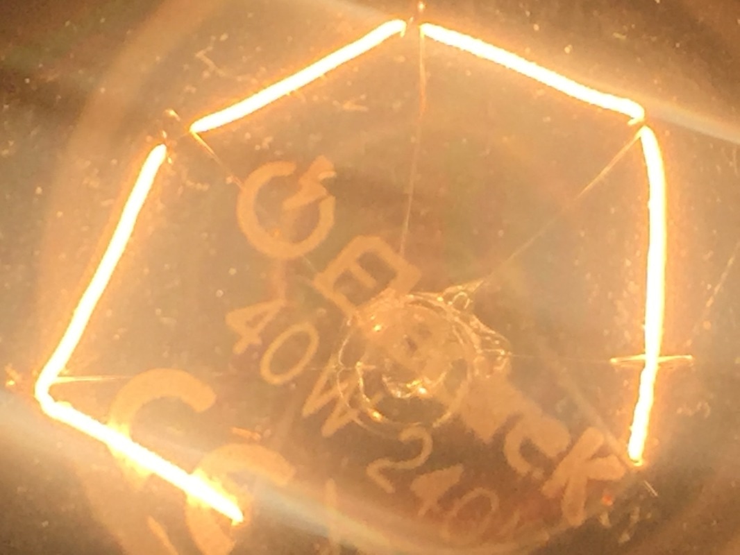
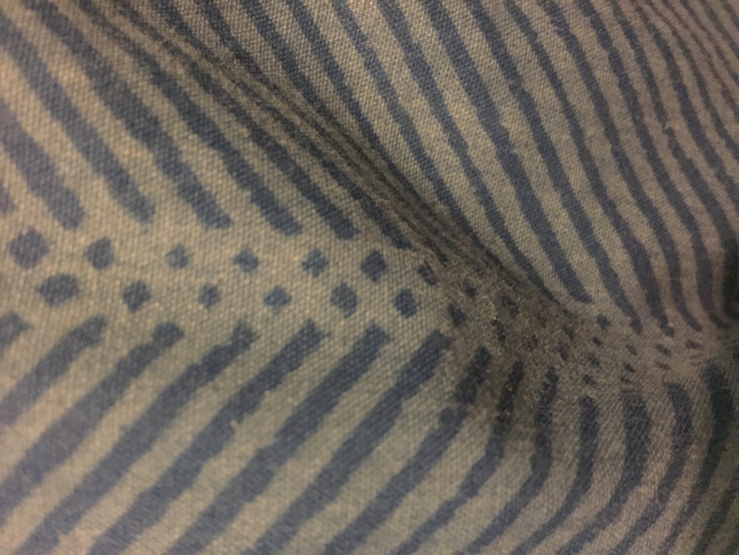
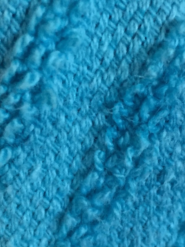
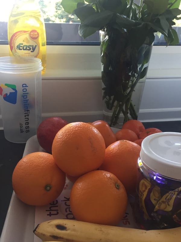
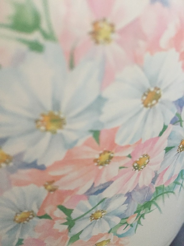


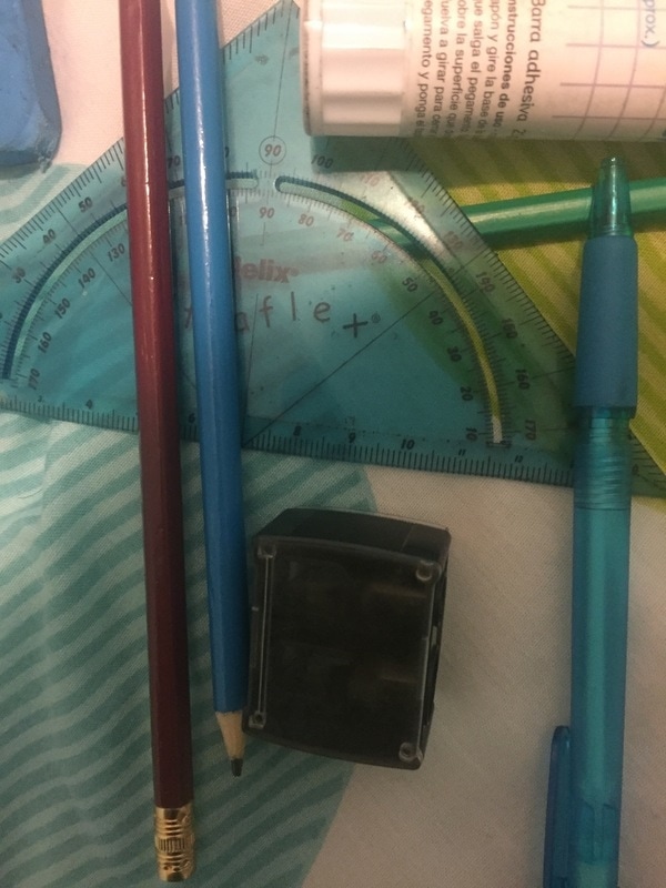
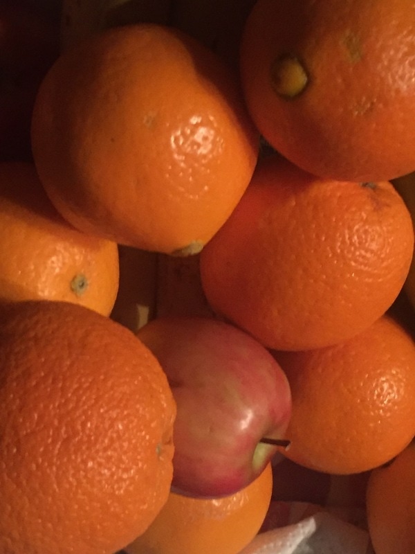
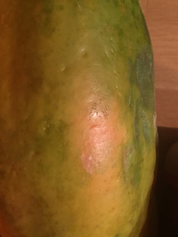
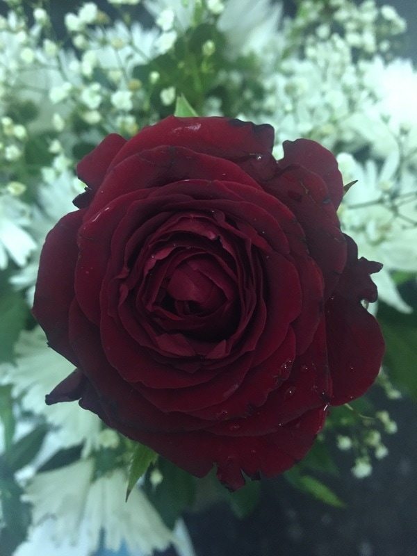
I couldn't find any insects around my area so I decided to focus on detailed images with a lot of bright colours. These images were all taken outside of school with my IPhone which shows a lot of detail in them since there are multiple/repeated features and objects in every photograph. I've learnt that zooming in allows me to get closer to certain objects and see more of the textures, lines, pattern and colour which makes the images more detailed.
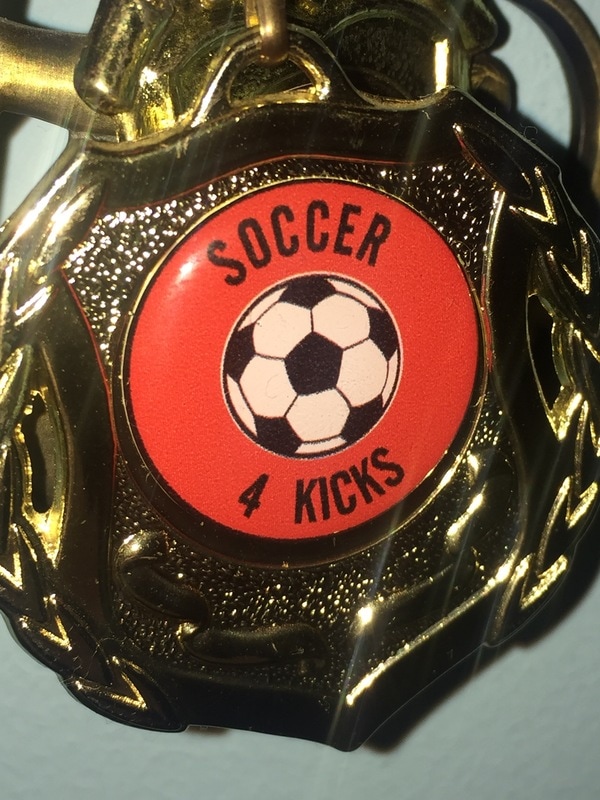
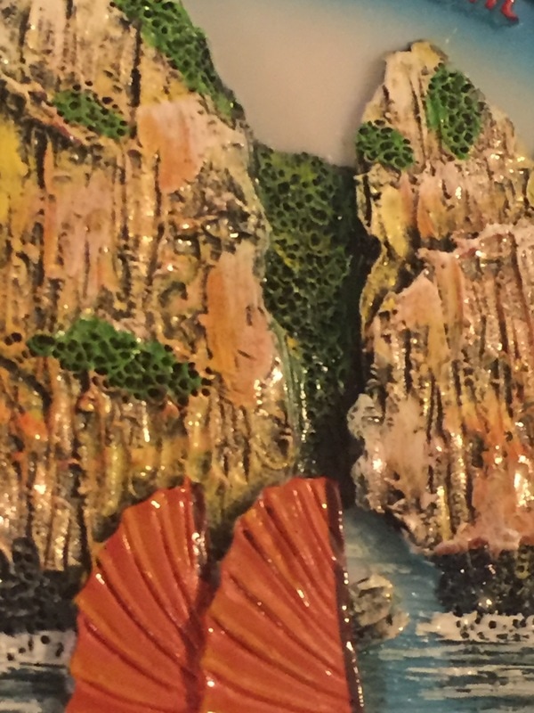
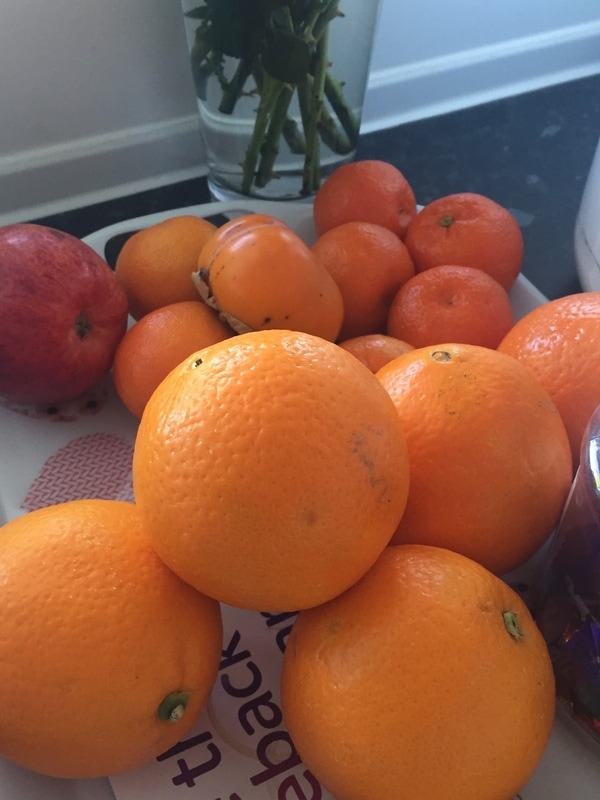
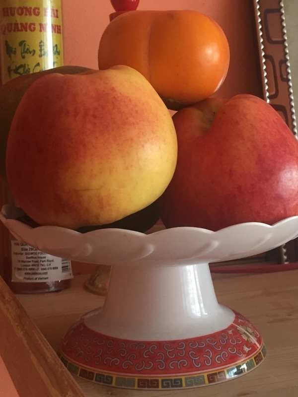
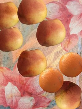
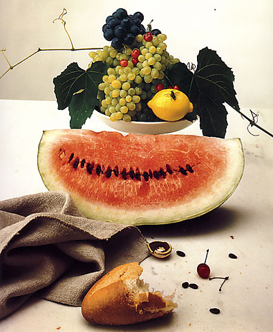
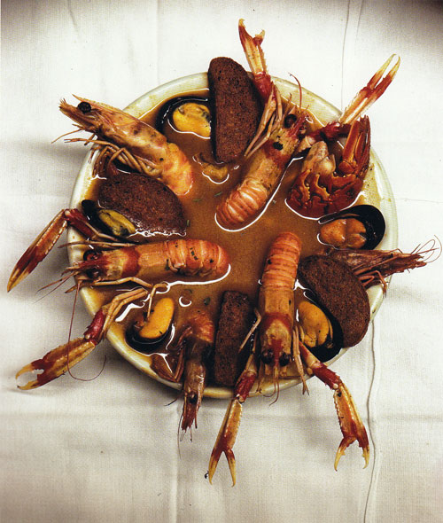
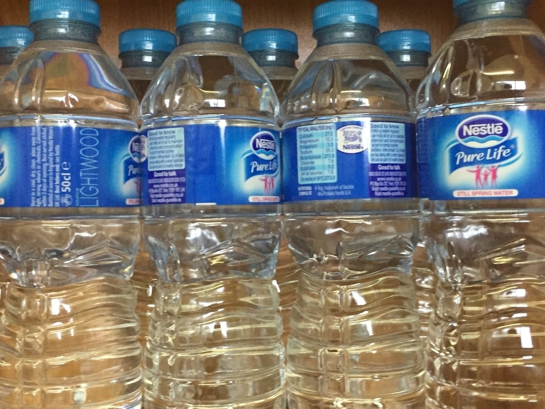
Images that were zoomed out normally consist of a range of objects such as multiple fruits and food. I really like the 2nd image on the first row because the gold stands out very well and was helped by the flash that automatically went off since it made the colours brighter. It is easy to spot the textures and shapes of the medal as well. To improve, I could change the colours in Photoshop of the images with black and white tones so that they stand out more.
Images that were zoomed out normally consist of a range of objects such as multiple fruits and food. I really like the 2nd image on the first row because the gold stands out very well and was helped by the flash that automatically went off since it made the colours brighter. It is easy to spot the textures and shapes of the medal as well. To improve, I could change the colours in Photoshop of the images with black and white tones so that they stand out more.
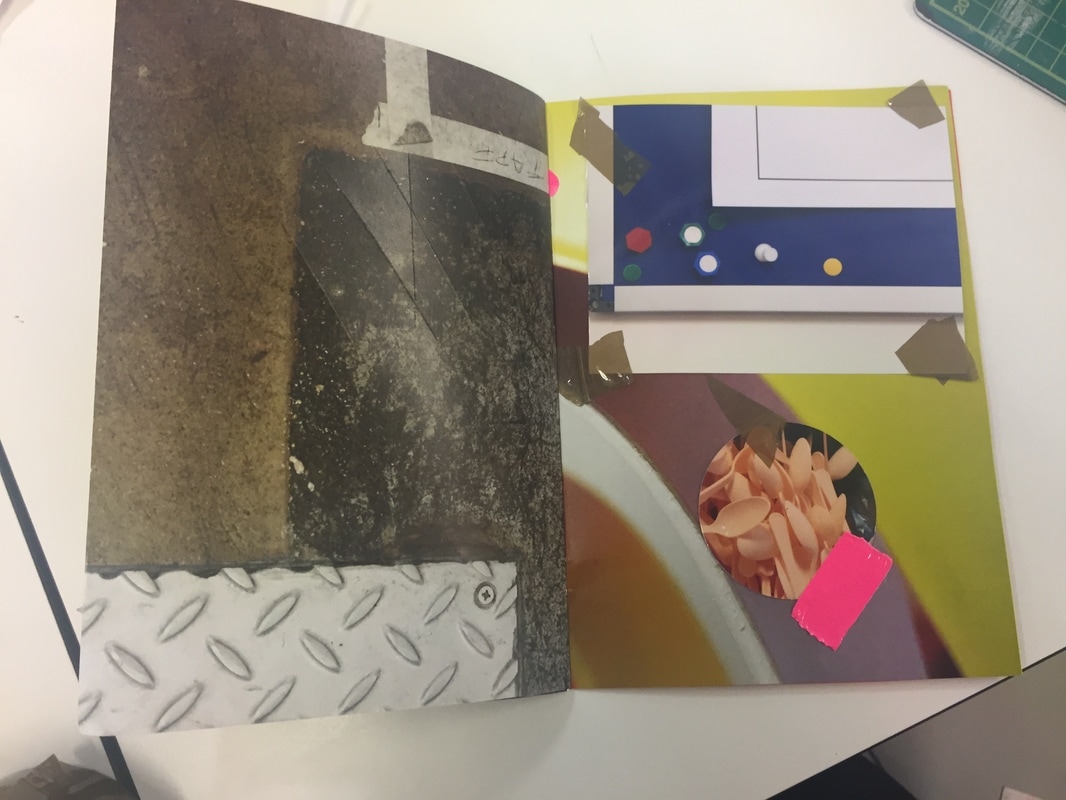
I've made a collage out of some of my detailed images that I've taken (shown below).


|
I made this collage on Photoshop by cutting up several objects of my images with the magnetic lasso tool and polygonal lasso tool (for the apples) as I found it difficult to cut the apples up with the magnetic lasso tool. I duplicated some of the objects using CMD + J and arranged them around the original image (which was the image of my floor). I changed the blending mode of the curtain image so that it is slightly translucent.
This image has been successful because it shows the textures of every subject well as they were all large. I find the curves on the apples fascinating even though it was a mistake that was made on Photoshop. The colours of the objects stand out very well which reflects the work that Whaley does. Next time I should try creating more collages using images online of insects such as butterflies. |
|
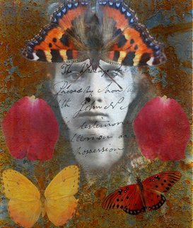
I made this image on Photoshop using abstract textures from the internet. I made this by unlocking the background layer of the abstract texture (so I can edit it) and selecting objects and butterflies to place on the collage. I then chose an image of a Victorian woman, cropped her out and placed it onto the background. I cropped the background since it was too wide and then selected some old writing to place on top of the woman. I lowered the opacity of the rust texture, adding an abstract blue texture to go under it.
This image went well as it relates to Whaley's work on butterflies and collages however I should try to use my own images next time to make this collage. |
Research: Irving Penn
Irving Penn is a photographer that was best known for fashion photography however he was also interested in still lifes and portraits. His still life images are of mainly food, bones, bottles, metal and objects that he has found. This fascinates me because these objects are a mixture of natural and man-made objects which are composed in front of a grey or white backdrop. Penn's still lifes' are extremely organised and composed in great detail focusing on line and volume of each object.
Here are some images that Penn has made
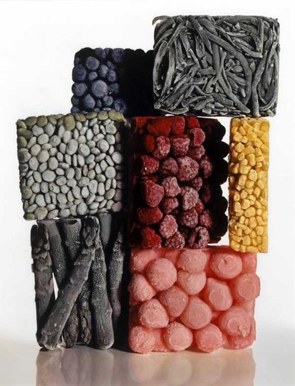
Most of Penn's still life images are in colour which I highly like because the objects stand out more. The white and grey backdrop greatly shows a contrast with the colours and the tones of the objects. I really like the first image because it shows a lot of repetition of the food (which adds to the detail of the image) and how they are scattered all over the place. The yellow contrasts with the black really well. I enjoy his image of school stationary as well since they are composed in an original way - placed in different positions showing line and shape really well.
Photograph Analysis (Irving Penn)

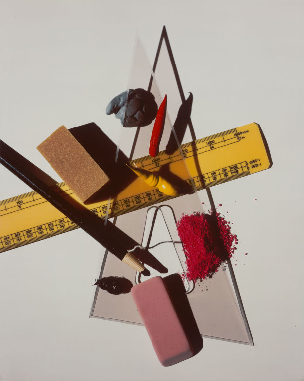
In this photograph, I can see a range of stationary equipment scattered out in different ways to make it detailed, which are placed in front of a white backdrop. The words that I would use to describe this photograph are: 'detailed', 'colourful', 'still life' and original. If I had to describe this photograph to someone who hasn't seen it, I would tell them that it is a fascinating collage of stationary equipment that is usually used for school with some colourful paint or ink that is on top of the triangular ruler. In this photograph, I recognise that there are shadows of certain objects such as the rubber, pencil, rubber and paint which makes the composition more detailed. There is an unusual red powder (which I'm unsure of what it actually is) placed on top of the triangular ruler and a normal yellow ruler placed at the bottom surface. The genre of this photograph is a still life and detailed because there are lots of stationary objects placed around each other.
This photograph reminds me of school being exciting and fun in the past because there are lots of stationary objects which are filled with paints and powders. This is a naturalistic image because you can clearly see most of the subjects in the image but it can also be interpreted as an abstract image. This is because there are some objects (such as the powder) that are hard to recognise and detect what it is since it isn't clear enough. This photograph was made with a camera because the quality is very clear. The formal elements that seem important are :line, shape, colour and tones. Most of the lines are extremely straight and pointy of each object and some are curvy (such as the edge of the yellow ruler). The bright colours of the paint and rubber stands out to me making the image more fascinating. The tones of the shadows contrast with the white background very well, making the image more abstract. The photographer has captured the play of light by pointing the camera towards the lightest objects but also made sure to include the darker objects as well. The background is completely white because it is a white backdrop. The middle ground consists of mainly the colourful objects (paint and ruler) but the foreground consists of the darker objects with the dark tones. The whole image is in focus to make sure that the viewer can see every object because every object has equal status. A DSLR has been used to create this photograph and it has possibly been edited in Photoshop to rearrange some of the objects' positions. This affects the way we view it as we wouldn't be able to see the shadows clearly and the quality could be a lot lower. This picture is different from real life because we aren't able to physically touch the objects.
The part of the photograph that strikes me as most interesting is the shadows that are under the objects because they are very abstract which makes me think a lot of what they could be. The mysterious part is the red powder - it is hard for me to tell what it is and makes me think that it could've been edited in using Photoshop. The shadow of the lines behind every object confuses and puzzles me because I'm not sure if they are actually shadows of the triangular ruler or if they've been rotated to increase the abstractness. The space of the objects are very compact - all the objects are very close to each other. If Irving Penn was here, the questions I would ask him are, 'How was this image made?', 'Why did you choose to include so many shadows?', 'Why did you choose a white backdrop?', 'Why is the spacing of this composition so compact?'.
The title that I would give to this photograph is, 'Stationary Collage'. I chose this because there are stationary equipment scattered around and I believe that the photographer has chose to make a collage out of these objects. Other titles that we can give this image are, 'Abstract Shadows', 'Still Life Stationary' and 'Still Life Composition'. I believe that this photograph is about a group of students from school who are having fun, playing with their stationary equipment since they are bored. I decided this as the image includes paint with stationary equipment which young students like to play and mess around with. If I was in this photograph, it would feel very rough since the textures of some objects are rough but smooth as well. It would be very daunting to live in this photograph because the space is very dense so I would be trapped in large objects which would make it hard to survive. I believe that the photographer has made this image because they were interested in still lifes which are man-made and they wanted to play around with different stationary equipment.
The shadows in this photograph work really well because they make the image more abstract. The colours of the paint and ruler stand out and contrast with the black and white tones. I don't really find the background that interesting because it is just plain white, if different colour effects could be added to the backdrop then the image would stand out a lot more. Other people would say that this image is very original if they like stationary equipment since the objects are arranged randomly. The red powder and shadows below every object is worth remembering about this photograph because it is the only part of this image that I can't exactly tell what it is which will keep on making me think of what it is.
Photographs Set #2 (Inspired by Irving Penn)
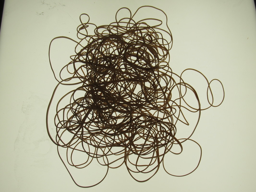
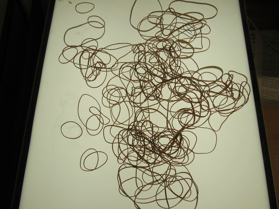
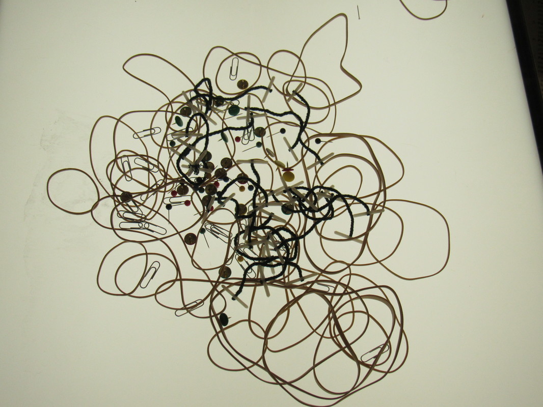
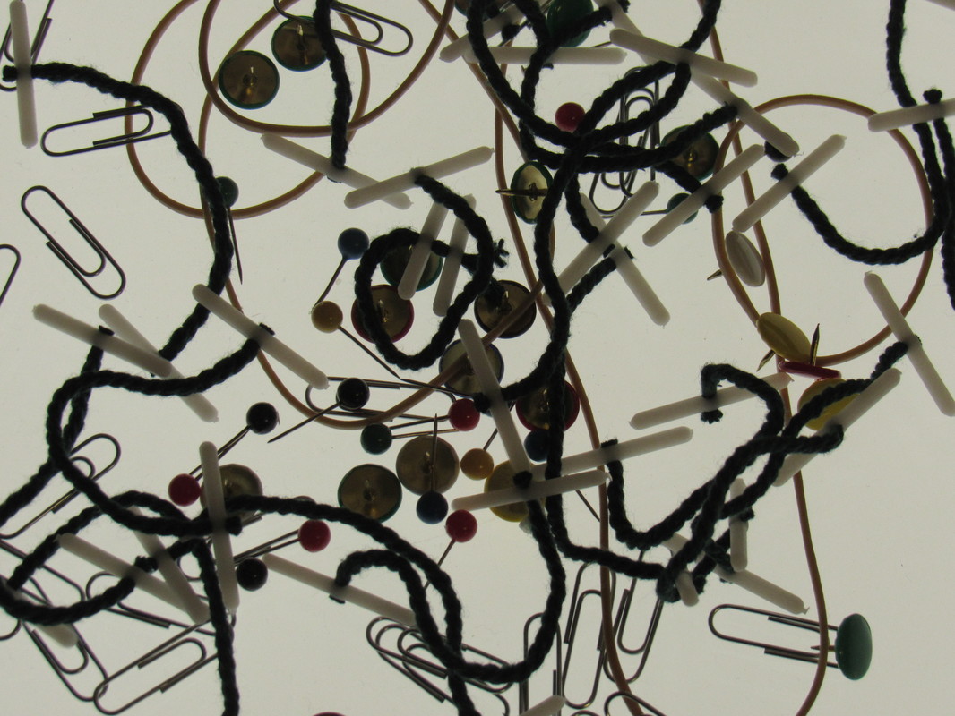
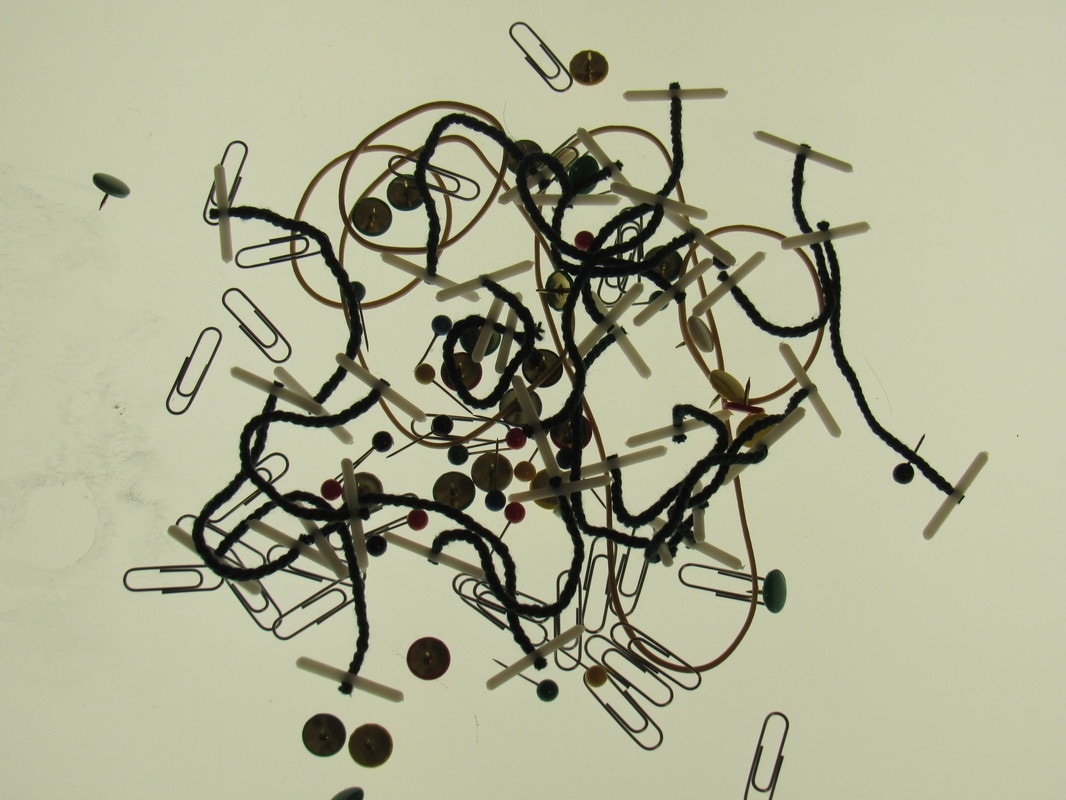
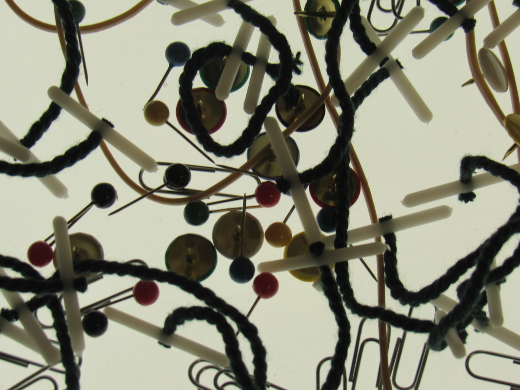
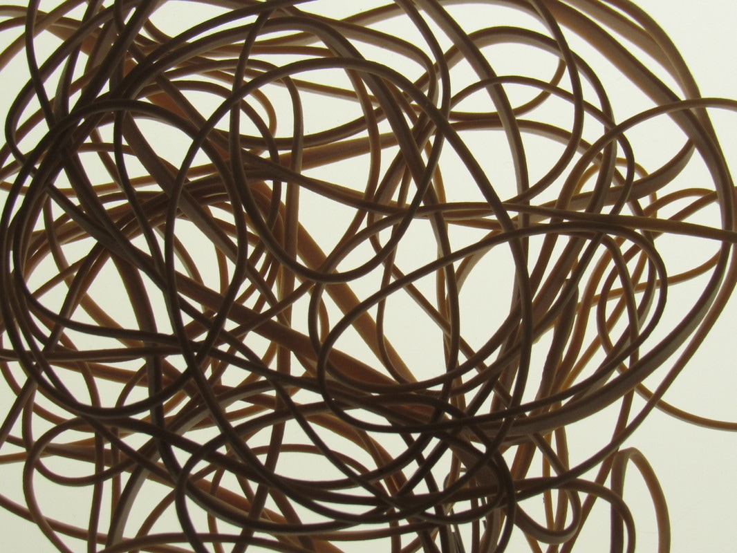
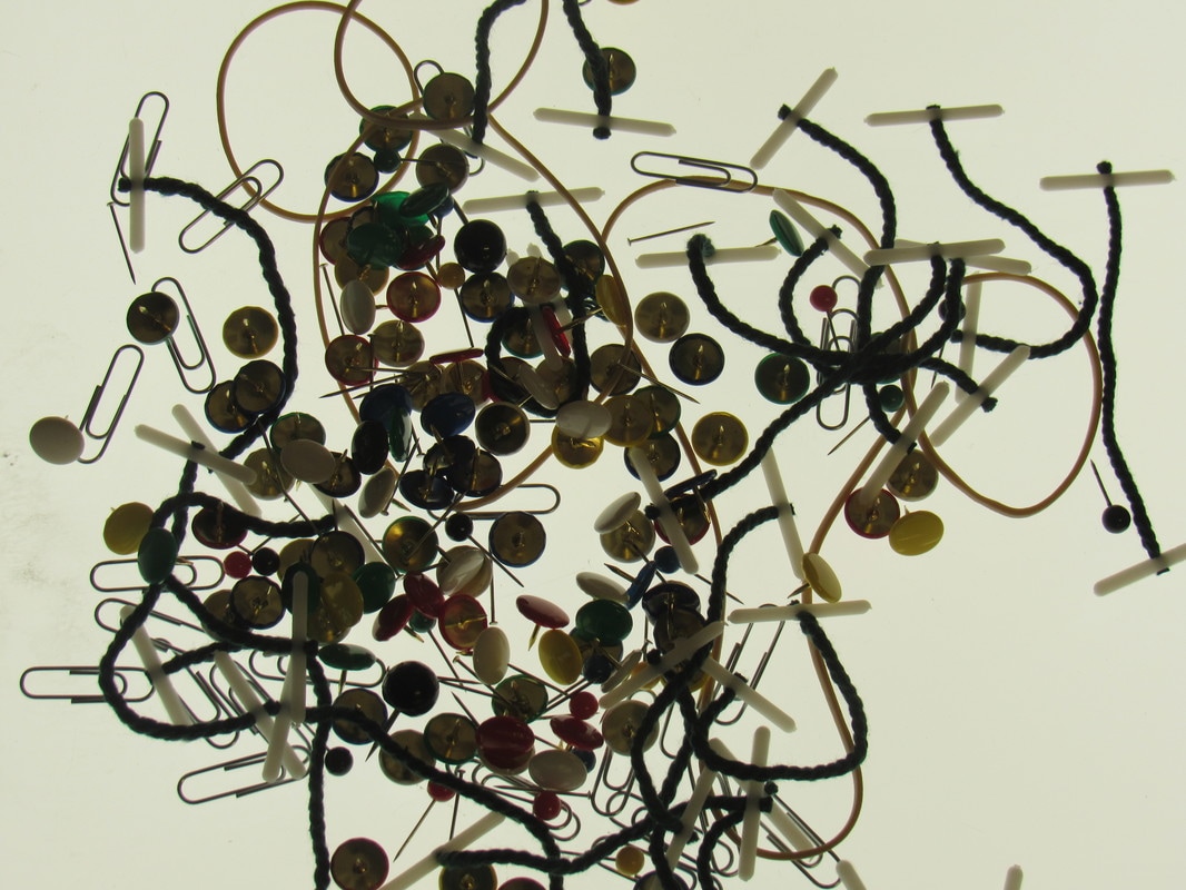
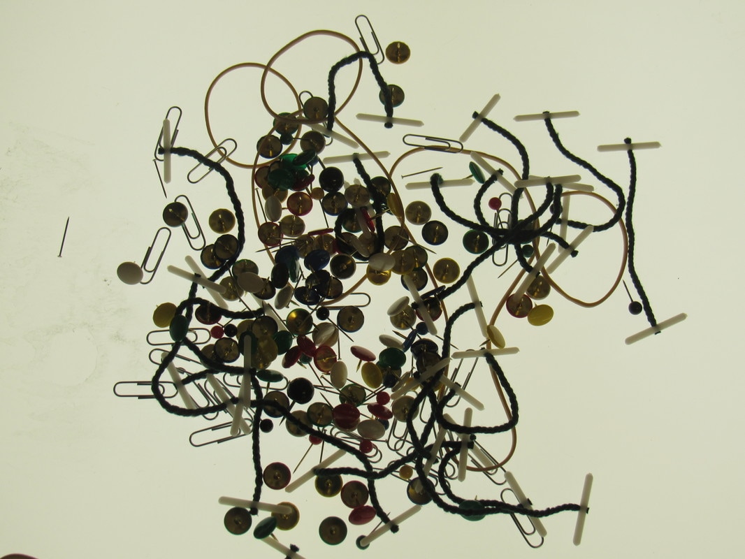


The photographs that I took using some school materials for the were scattered them on top of the of a light box. I used a range of man made still life such as rubber bands, paper clips and treasury tags to make detail images. The other images were taken outside of school which were a combination of natural and man made still lifes.
The images that were zoomed in worked out the best because it allows viewers to clearly see the detail in each object. There were lots of formal elements included in these images like pattern, shape and texture which also worked well. I could improve by adding a white backdrop to some of my images to create a closer respone to Penn. I could also combine different objects together to make a fascinating composition.
The images that were zoomed in worked out the best because it allows viewers to clearly see the detail in each object. There were lots of formal elements included in these images like pattern, shape and texture which also worked well. I could improve by adding a white backdrop to some of my images to create a closer respone to Penn. I could also combine different objects together to make a fascinating composition.
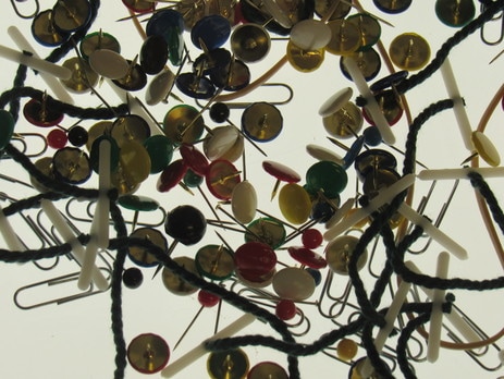
Photograms that I've made using stationary objects:

|

|

|

|
I've decided to make Photograms with the stationary objects to develop and refine my ideas from the images that I've used the light box in. This will allow me to compare and contrast both sets because the light box images are technically negatives of the photograms.
The first image didn't go too well because I exposed it for too long under the enlarger so I decided to rectify this by exposing future images under the enlarger for only 5 seconds. Some of the elastic bands weren't completely touching the paper because I randomly threw them on the paper which is why they were darker. The whole photographic paper wasn't placed directly under the enlarger for the second image which is why some of the background was white.
Overall the last image was most successful because there were repeated shapes and patterns which could clearly be seen. I moved some of the bands around during the time where light was shone which made overlaps and layers. To improve I could expose the paper to light for a shorter duration and use a range of objects such as pencils, pens and rubbers.
Compare and Contrast
Here are a list of similarities and differences between the best image I chose from the photograms and light box set
Here are a list of similarities and differences between the best image I chose from the photograms and light box set

|
|
Similarities:
Differences:
- The space between both images are very compact and dense.
- There are white parts that are present.
- Both images are close ups of objects.
- Both images are man made still life's.
- There is a lot of pattern and repetition present in both images.
Differences:
- The background of the photogram is black however the background of the light box image is white.
- A range of objects were used in the light box photo but only elastic bands were used in the photogram.
- There are pointy & straight lines in the light box image however the photogram just consists of mainly curvy lines.
Threshold Concepts Relevant in My Theme:
Detailed images can be in the form of many genres such as still lifes, nature, man made objects, portraits and landscapes.
|
There are many different techniques and processes that can be used to make detailed images without the use of a camera such as cyanotypes, photograms, chemigrams, pinhole cameras and film.
|
Detailed images can be created by selecting a range of objects and composing them in different ways. To make certain detailed collages you need to select a group of objects and arrange them in any way that is suitable for you.
|
Detailed images include lots of formal elements such as pattern, shape, line, repetition and texture. Formal elements allow viewers to clearly see if images are detailed or not. Mistakes such as out of focus and blur can make images detailed by allowing the viewer to focus on the main subject.
|
Research: Keld Helmer Petersen
Keld Helmer Petersen is a photographer who was interested in tones, pattern and repetition with his black light images. His black light images consisted of simple objects however the actual composition was very complex since he enlarges the objects. All his images are in high contrast in black and white meaning that the only tones were very dark black and white. Petersen makes a book out of his images, some objects are shown as very large on one page and on the other page the objects are very small.
Keld Helmer Petersen is a photographer who was interested in tones, pattern and repetition with his black light images. His black light images consisted of simple objects however the actual composition was very complex since he enlarges the objects. All his images are in high contrast in black and white meaning that the only tones were very dark black and white. Petersen makes a book out of his images, some objects are shown as very large on one page and on the other page the objects are very small.
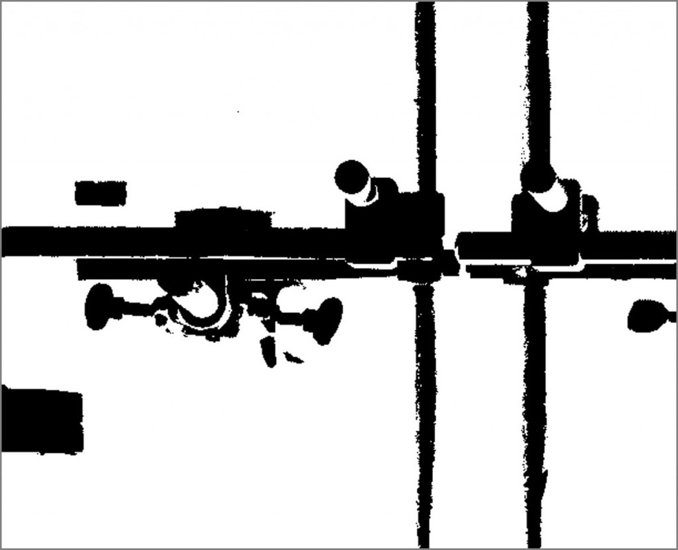
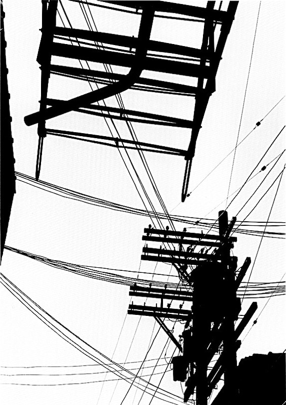
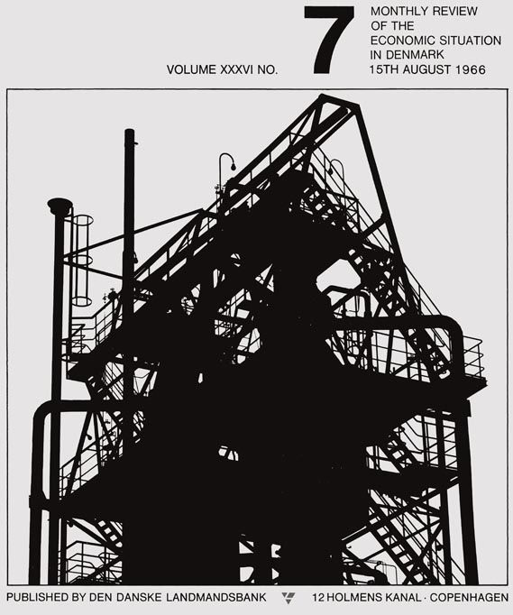
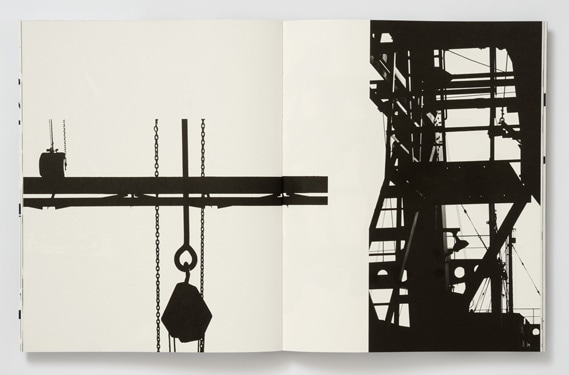
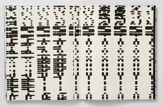
I really like the use of pattern and repetition in his images for example the one on the 3rd row, 3rd column fascinates me as it is very abstract. He makes use of a double spread page in the book by filling it with abstract patterns using one of his black light images. The contrast between the black and white tones is very high which is very vibrant. I enjoy Petersen's style of composing his images. He makes really small images vibrant by enlarging them on double pages but he also places really small text on one page as well.
Photographs Set #3 (Inspired by Keld Helmer Petersen)
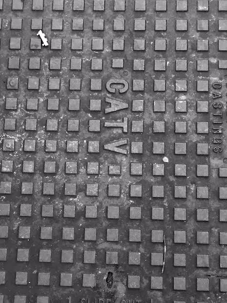
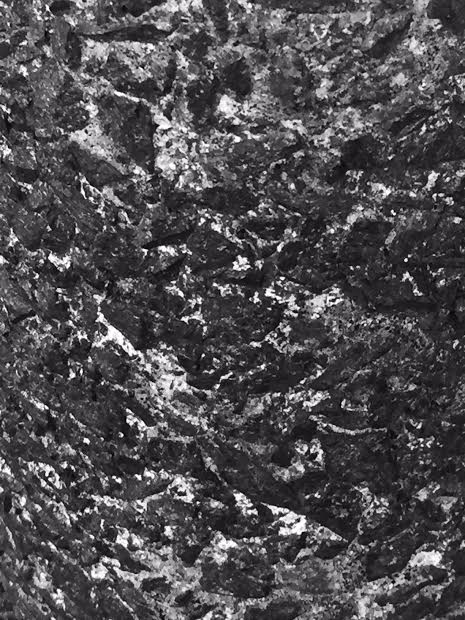
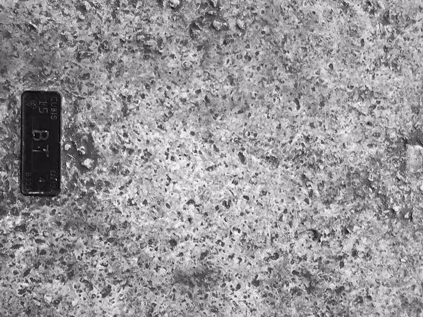
I made these images using different effects on my IPhone (Mono, Tonal and Noir). This made the images black and white which connects to Petersen's black light work. I focused on detailed objects with the following formal elements: repetition. pattern and tone. For some of the objects I realised that it was evident to fully zoom in so that as many detailed features can be seen. For others it was necessary to take the picture without zooming in such as the image of the CATV object because lots of squares can be seen.
I like the photograph of the ground because a clear contrast can be shown between the black and white tones. The textures of the image is clearly seen since I zoomed in to take take the photograph. It is very abstract because the image is not in colour and cannot be easily identified. I could improve on some images by increasing the contrast levels on photoshop to show the tones more clearly.
I like the photograph of the ground because a clear contrast can be shown between the black and white tones. The textures of the image is clearly seen since I zoomed in to take take the photograph. It is very abstract because the image is not in colour and cannot be easily identified. I could improve on some images by increasing the contrast levels on photoshop to show the tones more clearly.
Research: Man Ray
|
|
The short film on the left was made by Man Ray, another photographer that was interested in high contrast tones who liked the idea of detailed images with lots of repetition and pattern. This film consisted lots of random shots of detailed objects that were composed together because the duration of each shot was so short.
There is no actual meaning to the film but that is what makes Ray's work original and absorbing to the viewers. The contrast of the tones worked well because the blacks was extremely dark and the whites were extremely light. The repetition of textures and objects that were embedded into a film were used skilfully. As the film reaches its penultimate stage, the shots were longer. This allowed the viewer to understand the contents more and realise what was going on. |
I am thinking of creating a short time lapse with a range of detailed objects using Man Ray's film as an inspiration.
Comparison of 2 images (Jo Whaley & Keith Arnatt)
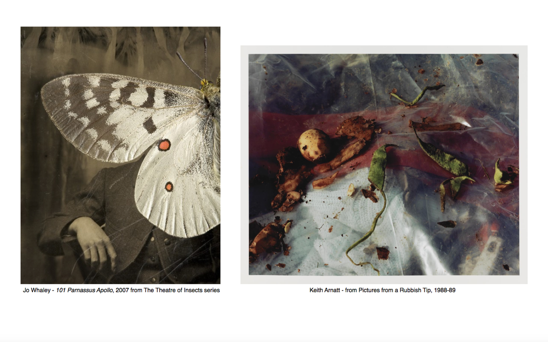
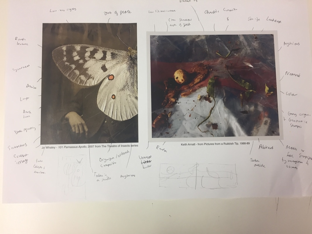
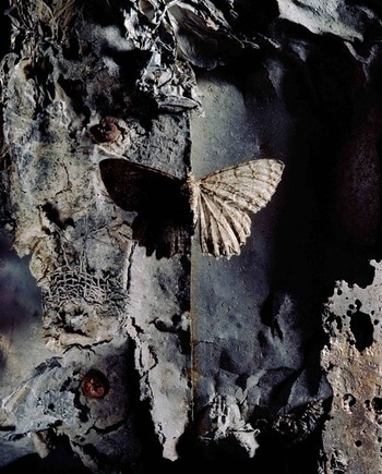
In Whaley's photograph, I can see a mysterious butterfly with a rough texture that is layered on top of a person's face. The background includes very dark tones however the butterfly includes a mixture of white and brown tones which contrast the background. In Arnatt's photograph, there is rubbish organised randomly because the image was taken outside and the photographer had no control of where the objects were. Compared with Whaley's image, Arnatt's image includes an unusual, abnormal grey border. Arnatt's image is also a landscape whereas Whaley's is a portrait.
Whaley's photograph was made with a digital software such as Photoshop because it was assembled and composed using the insect to cover the human's face. On the other hand, Arnatt's image was made with a DSLR camera however the border was edited using Photoshop. The lines in both images are generally curvy but in Arnatt's image, some lines are pointy and straight. There are organic shapes in both images but more shapes are present overall in Arnatt's image because there are more objects. Darker tones are revealed on Whaley's image that are mainly present in the background however Arnatt's image is in colour. This doesn't necessarily make them stand out because the image was shot in a low lit environment. Artnatt's image is more natural than Whaley's because there are more natural forms included such as leaves. Whaley's image is more abstract as no one can tell what the background is. The image is out of place as it's not 'correct' to have a butterfly on top of someone's face. It is hard to figure out who the person is and understand their emotions.
In Whaley's image, I'm interested in who the person is. I'm also fascinated in what type of insect is shown because only half of its body is revealed. The insect could be either a butterfly or a moth. In Arnatt's image, the colours that are blurred our interests me the most as I'm unable to define what they are. If Whaley was here, I would ask her the following questions: 'Why is there a butterfly on top of someone's face?', 'Why are there white lines that seem like scratches?'. I would ask Arnatt the following questions: 'Why are some parts blurred out'?, 'Why are the objects organised randomly?'.
If I was in Whaley's photograph, I would feel very calm and relaxed because the composition is organised and structured in an accurate way. On the other hand, Arnatt's photograph would make me feel worried and frightened since the composition is very chaotic and compact. The objects aren't organised in a linear way which contrasts my idea of Whaley's photograph. I would also feel surprised because the arrangement of the objects are mysterious and the image is abstract.
The tones of the butterfly in Whaley's image works well because they contrast extremely clearly with the background. I enjoy looking at the texture of the insect as they are very rough which also contrasts with the smoother texture of the person. The darkness of the tones doesn't work well because it's took dark meaning that the viewer doesn't get to see what is happening in the image. The colours in Arnatt's image work well as they make the image slightly brighter however they're still to dark and blurry, so it's hard to see what is placed around it. The random structure works well as it confuses me which makes me think more of what the image could be.
From exploring these images I could try to create a response using multiple layers of images including some that are found and some that are made myself. I could also try to combine old objects and images with new ones. I could also make an image of detailed litter on my streets and school making use of shallow depth of field with the subject. From exploring both images, I've learnt that images can be made with multiple layers and multiple steps of editing.
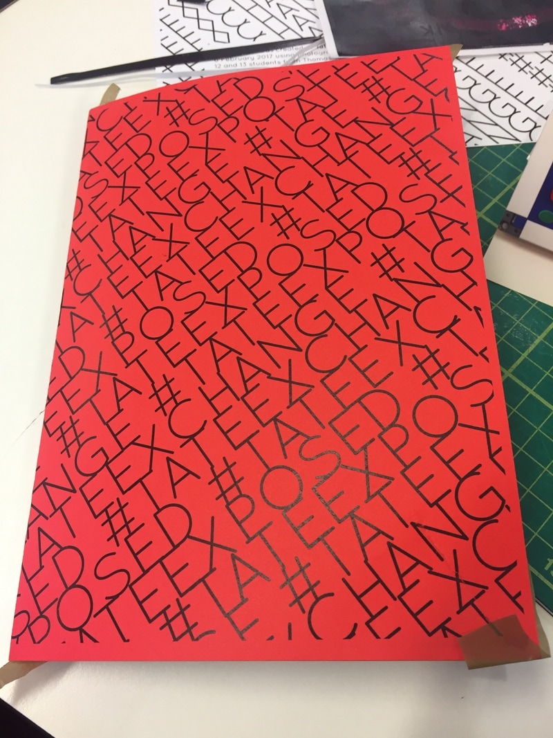
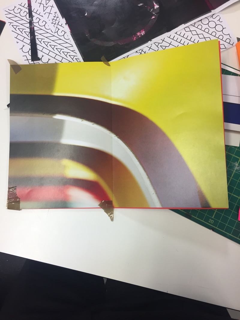
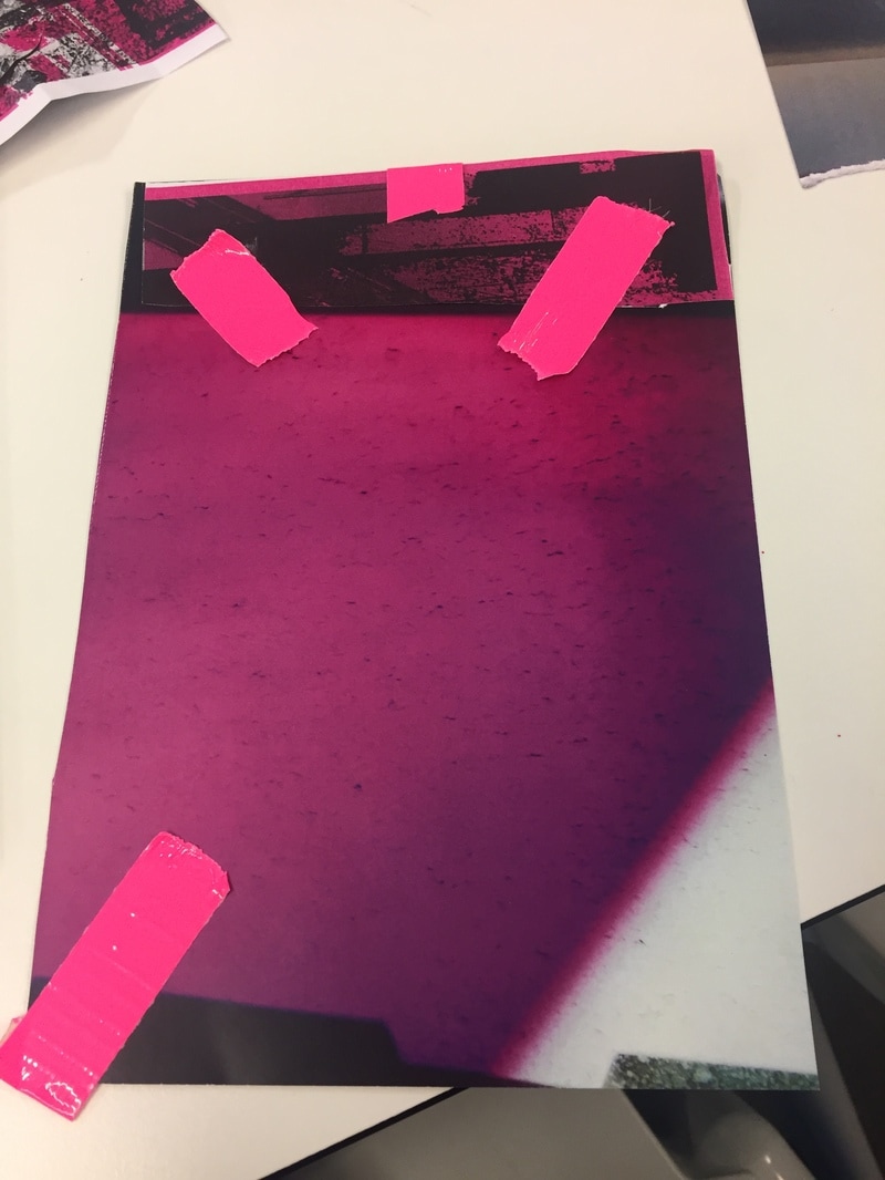
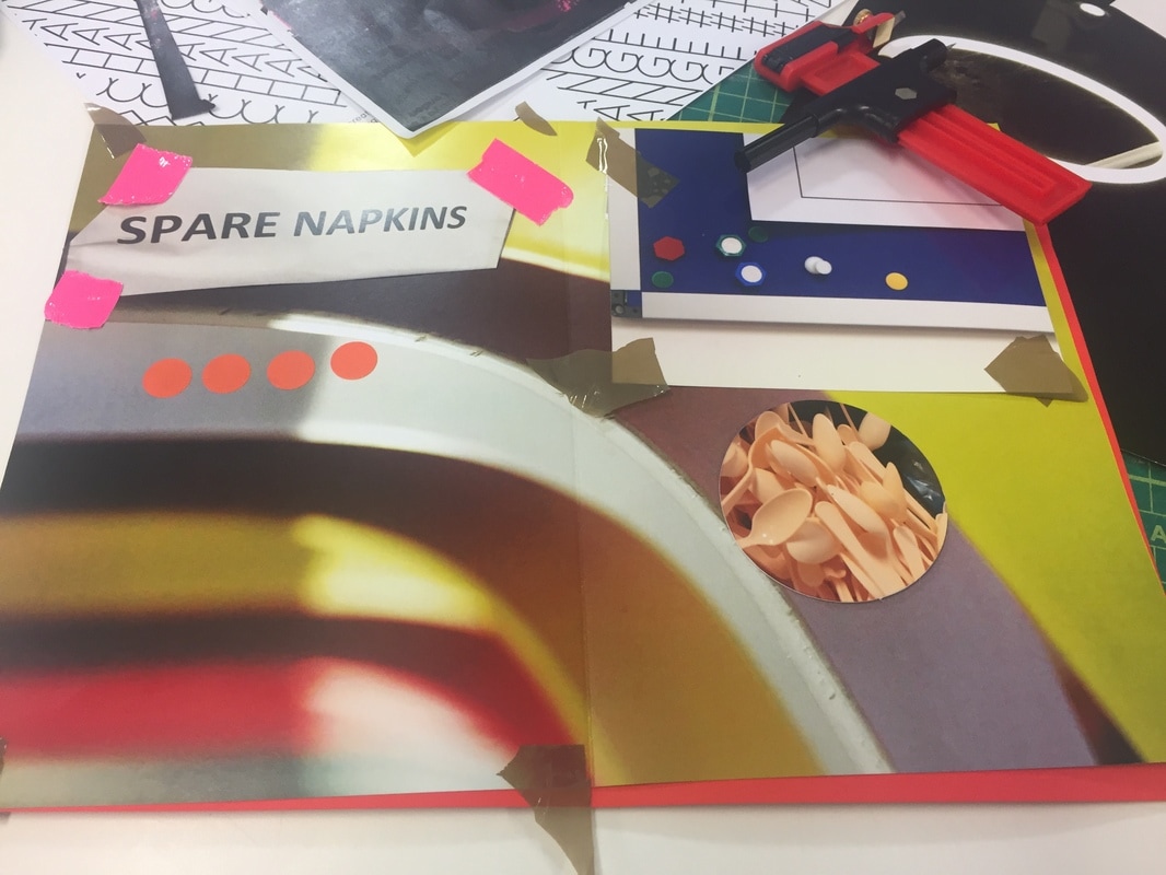
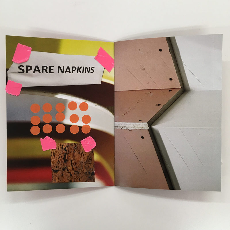
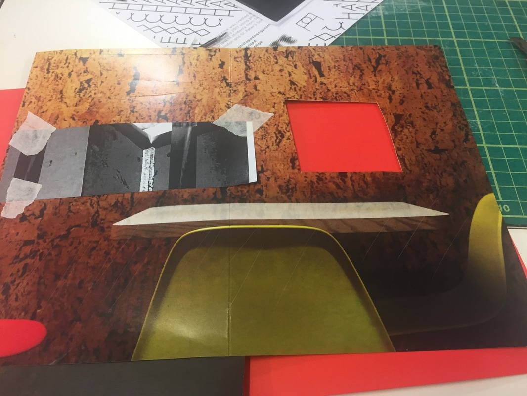
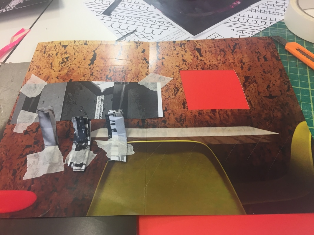
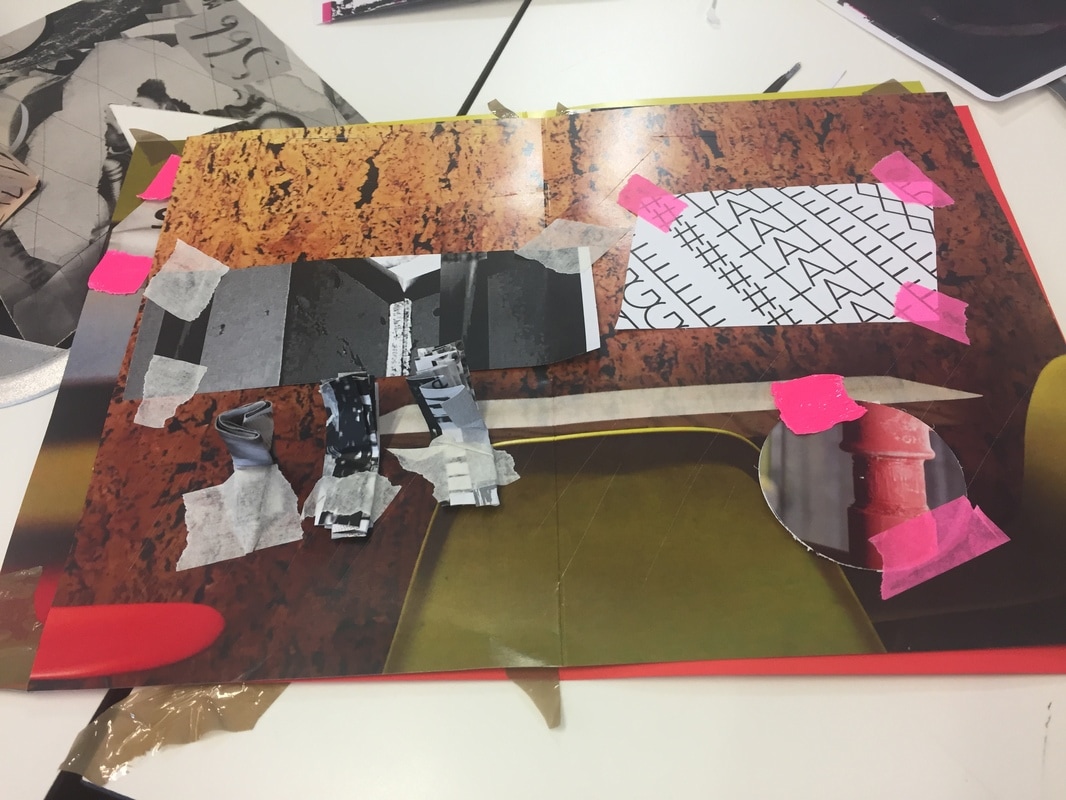
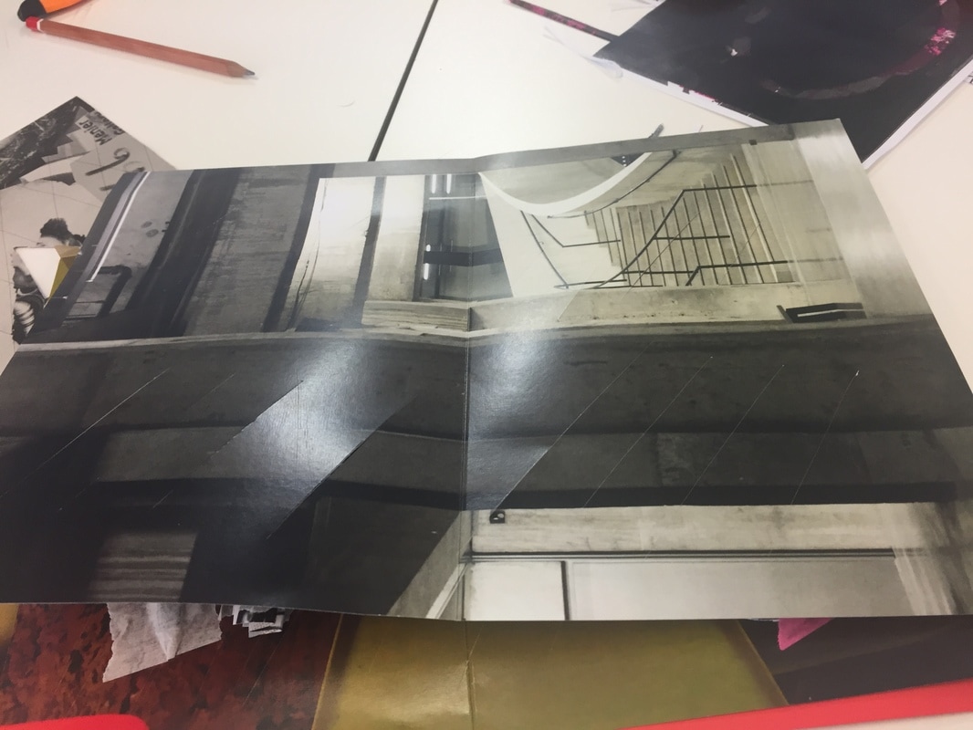
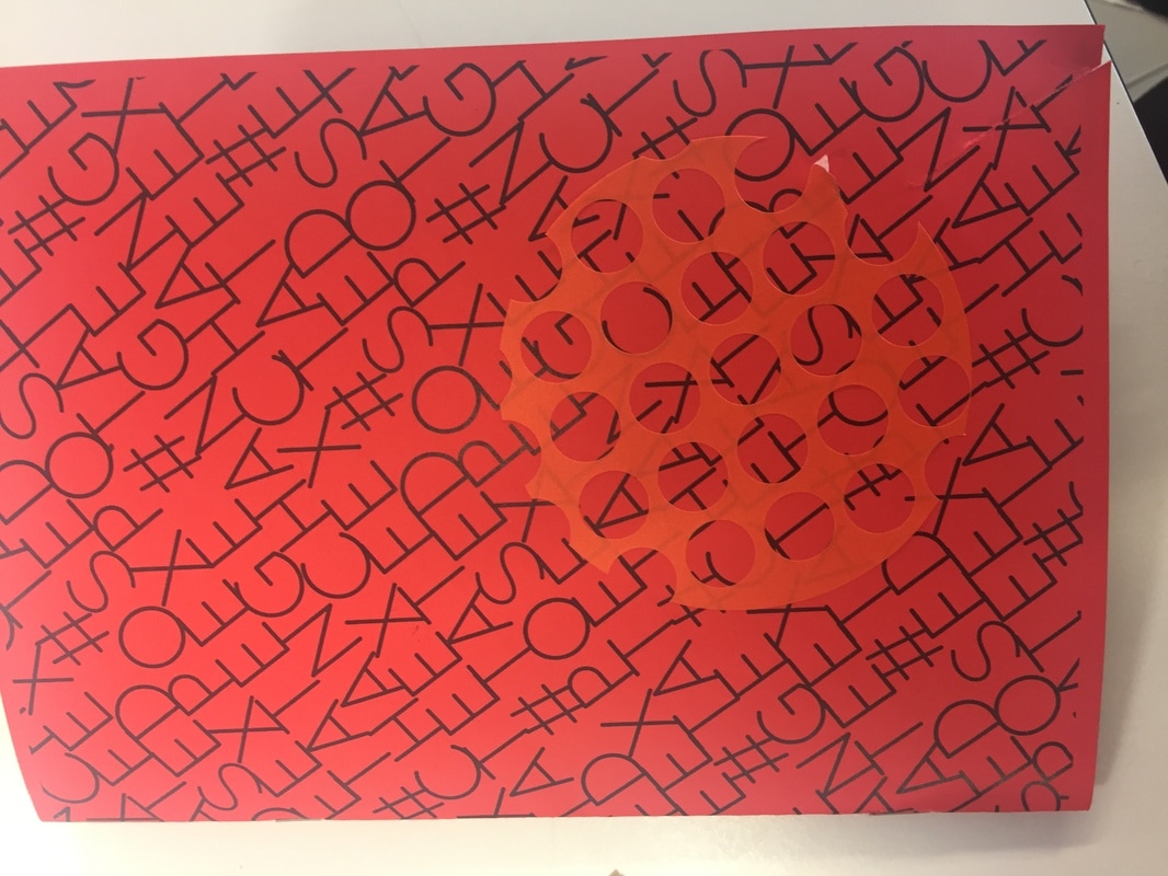
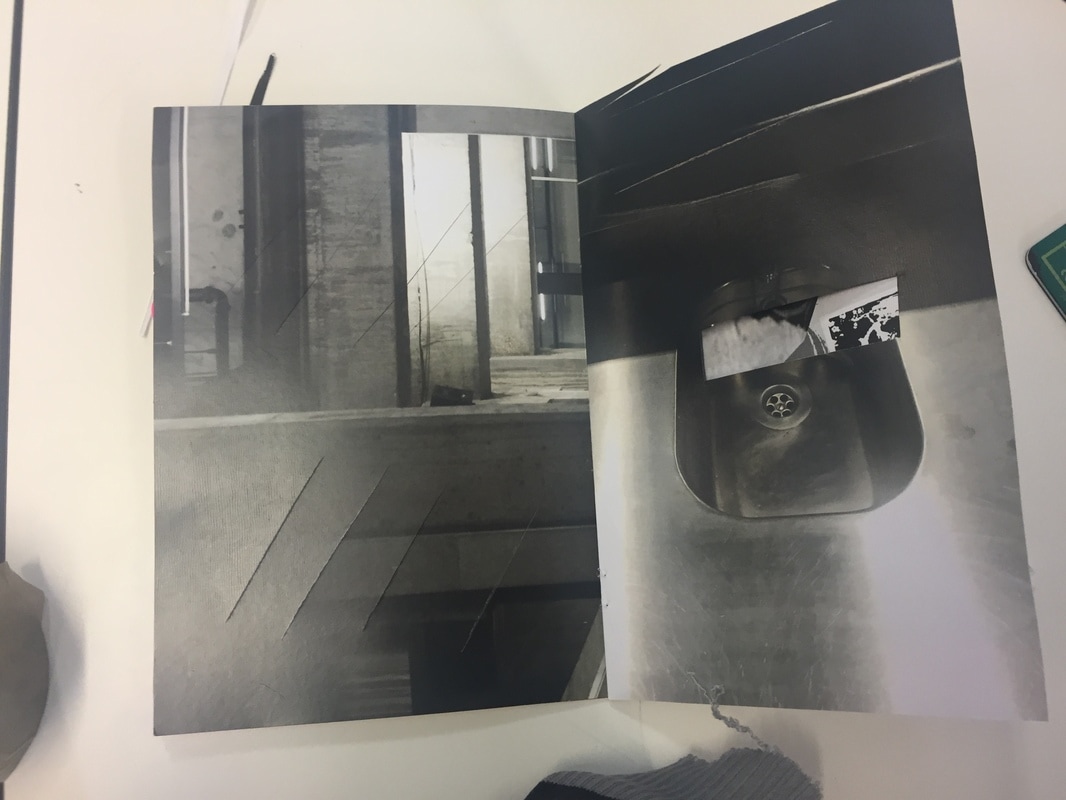
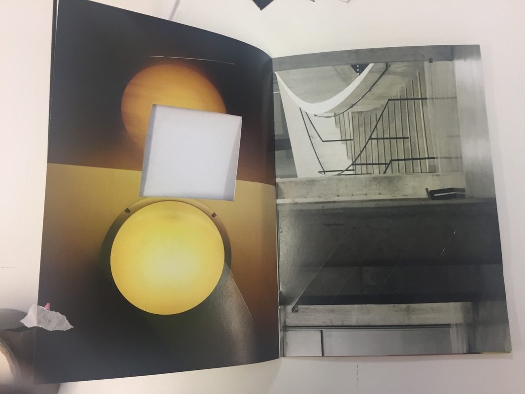
Photograph Fanzine
I've made a fanzine using a range of images and objects to explore different ways of how I can produce my final outcome rather than just mounting some images on a board. Below are the stages that I've photographed to create the fanzine.
I've made a fanzine using a range of images and objects to explore different ways of how I can produce my final outcome rather than just mounting some images on a board. Below are the stages that I've photographed to create the fanzine.
|
|
I was only allowed to use tape to stick anything on my fanzines. Inside my fanzine, I have stuck a range of objects that I've cut out using a scalper and I experimented with original ways of expressing detail such as folding a picture multiple times and leaving multiple cuts on certain pages. The backgrounds that I've chosen are detailed because they include a lot of features and characteristics for example the image of the mountain shows lots of grainy parts and rough textures.
Overall my fanzine has worked well as it shows a lot of vibrant colours through the use of different sellotapes. All the pages represent a lot of detail even if I didn't stick anything on them as the original image consisted of lots of elements. There were a range of lines included (curvy & straight). I could improve by sticking more images to blank pages such as the front cover.
Overall my fanzine has worked well as it shows a lot of vibrant colours through the use of different sellotapes. All the pages represent a lot of detail even if I didn't stick anything on them as the original image consisted of lots of elements. There were a range of lines included (curvy & straight). I could improve by sticking more images to blank pages such as the front cover.
stop motion experiment
I've made a short time lapse using some of my photograms and elastic bands. I've used a tripod to increase the height of the camera and a white board to use as the background where I can move the images and objects around. I've used a soft box to shine light directly onto the board which brightens up the scene.
I've taken over 200 shots where 1 shot is shot twice so that it could be seen on the timelapse. I moved my objects and images around after taking 2 photographs and retook them, repeating the process over 200 times .
I've taken over 200 shots where 1 shot is shot twice so that it could be seen on the timelapse. I moved my objects and images around after taking 2 photographs and retook them, repeating the process over 200 times .
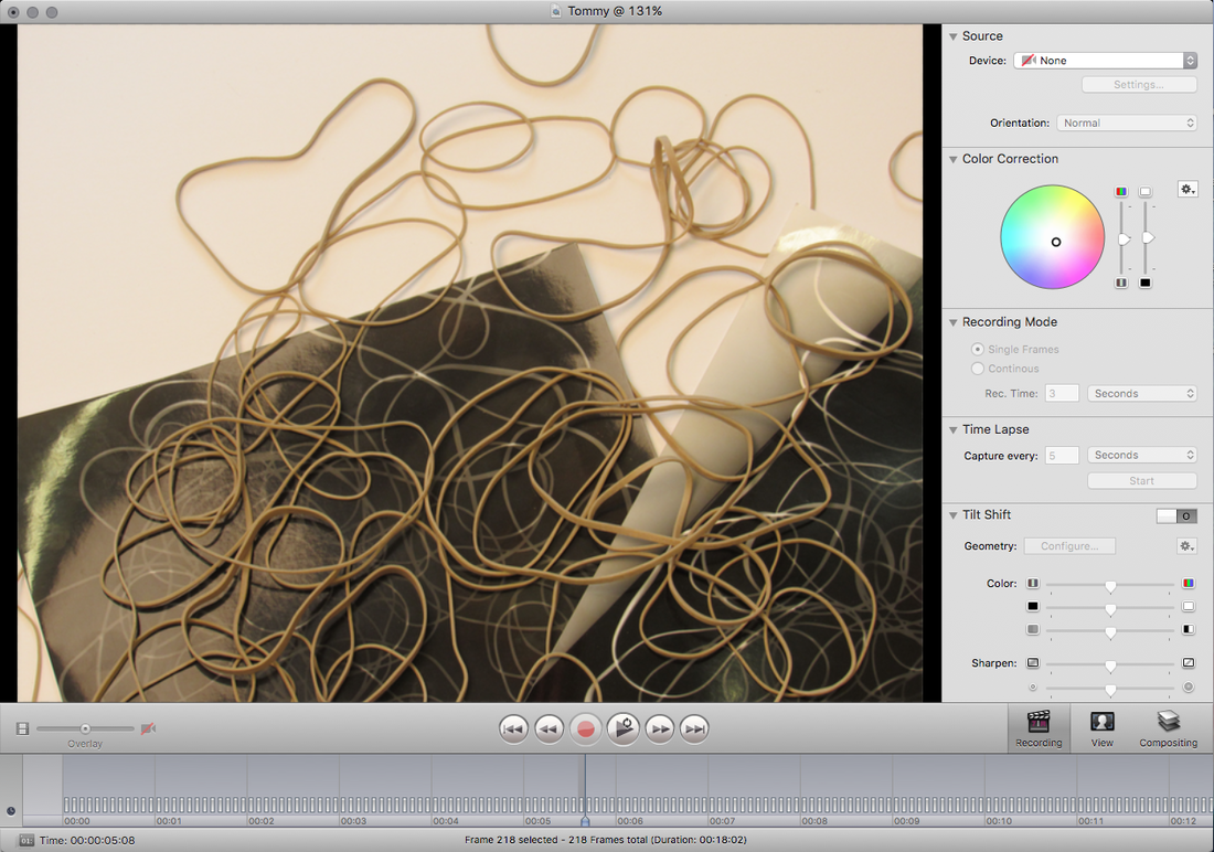
I've used Istopmotion to combine my shots together and make a short timelapse.
Overall my timelapse went fairly well as it includes loads of fast shots which show a lot of detail from the elastic bands and photograms but I could improve by slowing down the timing of the shots to make the timelapse longer.
|
|
|
|
|
|
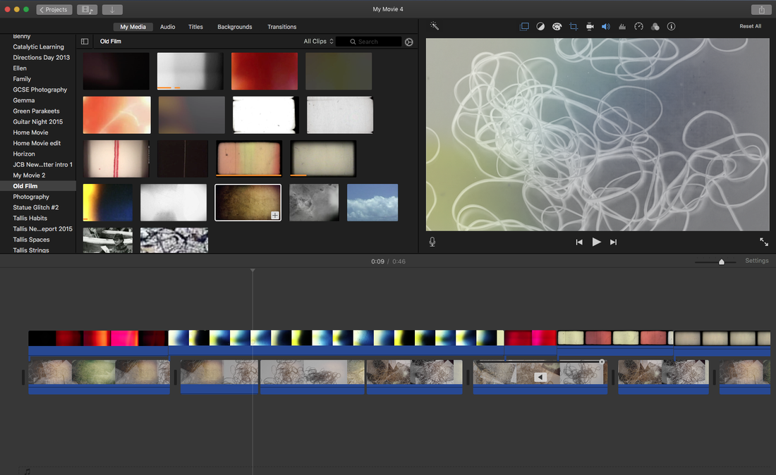
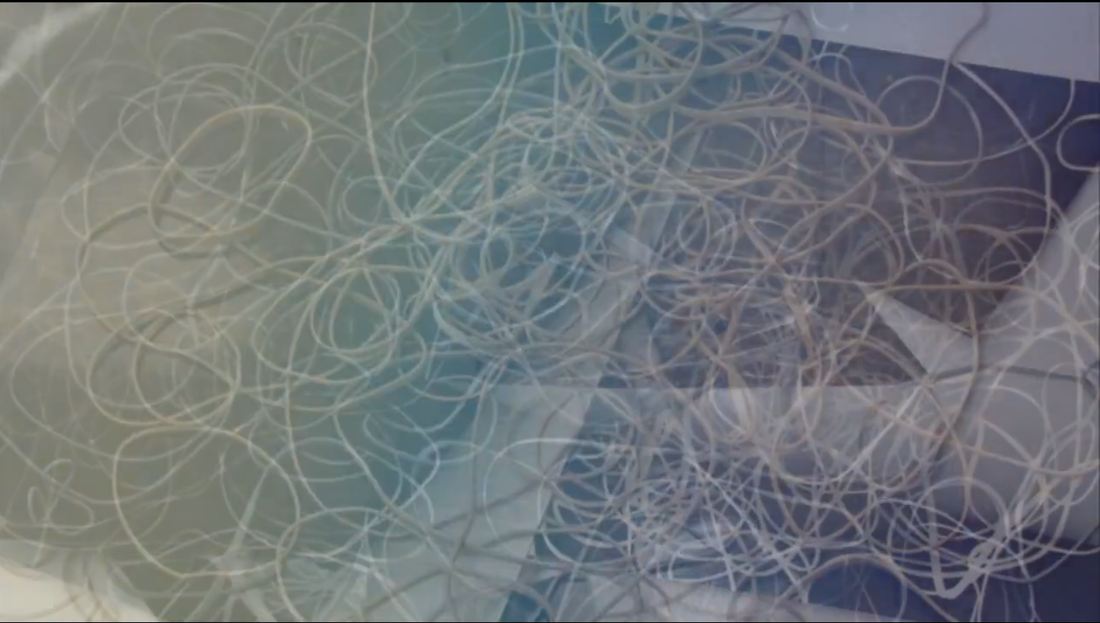
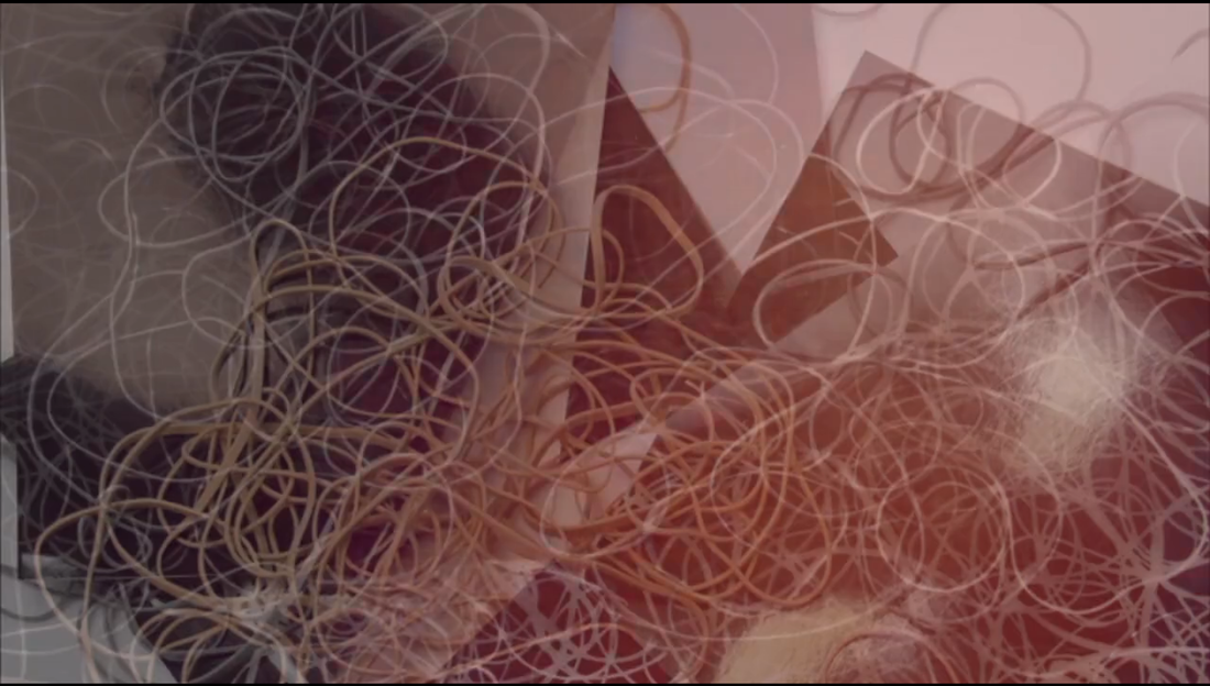
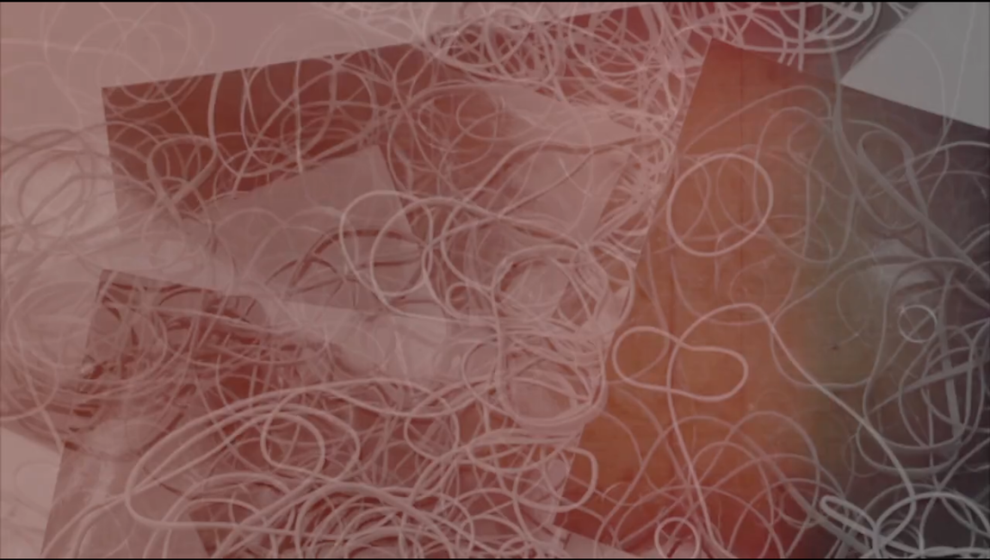
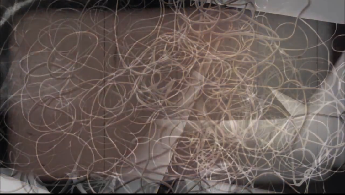
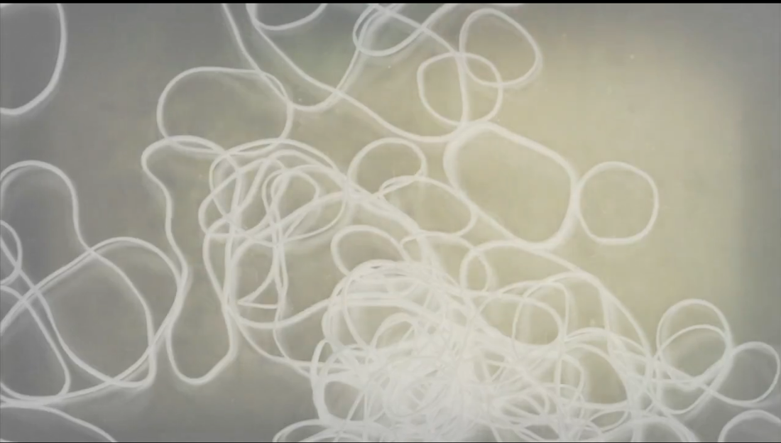
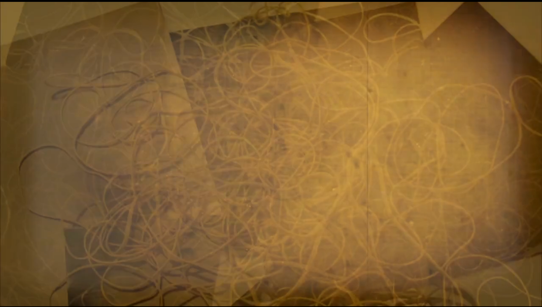
I've made these time lapses in iMovie by combining multiple random images into my original time lapse. I tried various techniques in order to refine my time lapse for example slowing it down slightly however that didn't work well because it defeats the purpose of a timelapse since they're supposed to speed up otherwise the cut in between the shots are too obvious. I found out that it was better to repeat multiple shots to extend the length of the time lapse.
I also added different effects such as negatives and different colours to make the shots more vibrant.
I like the detail of time lapse from all the images that were added - they make the composition more compact and tight. The colours contrast really well with the black and whites from the photograms and other shots. I could improve by experimenting with a range of colours and adding more shots to further extend the length of my time lapse.
I'm going to use the last time lapse as my first final piece.
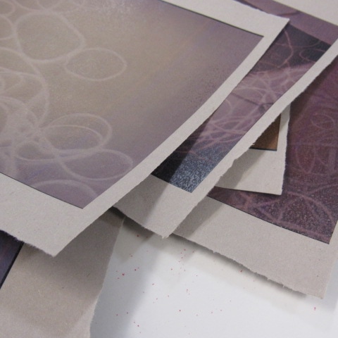
I chose to print the images of the screenshots using sugar paper which is an original way rather than just using plain paper. The colour of the sugar paper works well with the tone of the images.
|
|
Video of my first final piece
Research: Lucas Blalock
Blalock makes fascinating images on Photoshop by 'misusing' Photoshop. He takes images that he's made and edits them on Photoshop using the tools in an unusual way for others to interpret. The outcomes that he makes can be very original and abstract which is why his images are successful. The abnormal outcomes are made from tools on Photoshop that you wouldn't expect to be used such as the clone stamp tool, rubber tool and eraser tool.
Here's a video of him explaining the decisions he has made during his work
|
I like the way how Blalock creates interesting compositions through the use of unusual steps and tools which can confuse the viewers. His original ideas allows him embed a weird dynamic into how the cigarette moves and sticks to the wall. He was very influenced by other images and paintings which is why his compositions work really well.
|
I'm going to make a set of images for my final piece then edit them in unusual ways in Photoshop which is inspired by Blalock. The reason why I decided not to continue with my timelapse project is because they are very time consuming tedious to make.
I'm going to make some photograms using inverted images of my timelapses and then combine them together in a unusual way on Photoshop.
I'm going to make some photograms using inverted images of my timelapses and then combine them together in a unusual way on Photoshop.
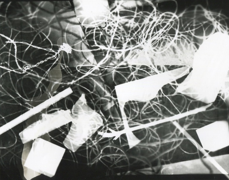
I decided to make some photograms of my original images of the timelapse. In the dark room, I placed the inverted image of my timelapse on top of the photographic paper. I then placed inanimate objects such as blocks, string and pencils on top of the inverted image, shining light to the paper for around 10 seconds. I then developed the paper by placing the paper in the developer, stop and fix chemicals.
|
|
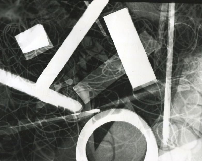
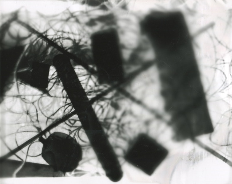
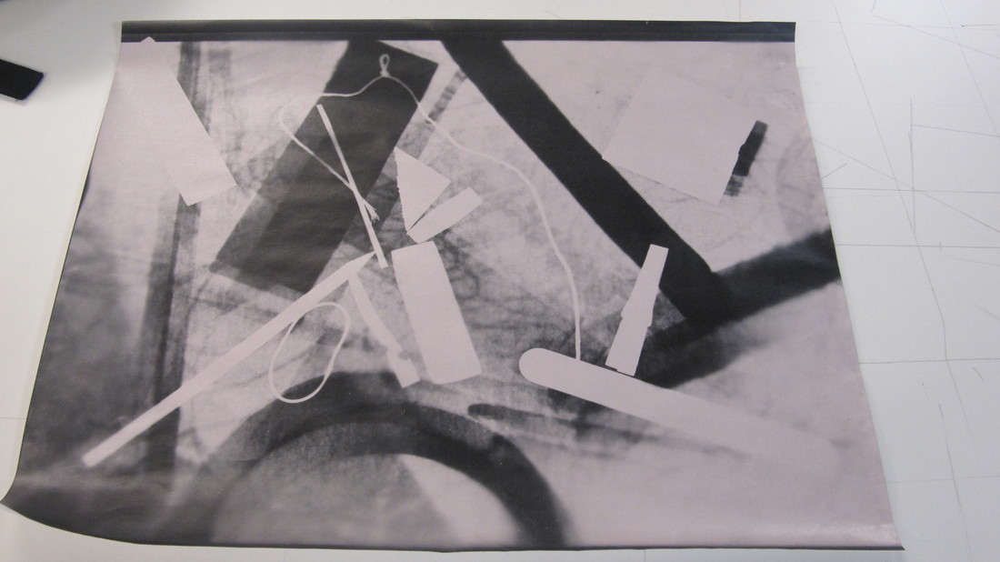
For my first 3 images, I've used a lot of string but I realised that it creates a large pixelated texture as it contrasts with the rubber bands of my original image so I stopped using it. I tried using larger objects on the 2nd image however the objects were too large which made the photogram very busy.
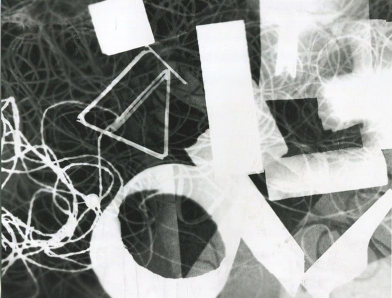
I really like the forth image as there is a clear effect that contrasts really well with the white tone. It also creates an interesting pattern as the layer on top is more opaque which creates a large contrast between the white and black tones. There is also a shadow effect that is replicated from combining the inverted image with more objects which works really well because it makes the image more detailed. This is also similar to the image after however there are more black tones and I moved objects around more.
There is a large element of chance represented through making these photograms as I don't know what the result would be until it has been produced. Most of the images went well due to the shadowy effect and large use of objects. Some weren't developed properly which causes grey blobs to appear on the image however it creates a more detailed look. I'm going to further develop my favourite photograms by using Blalock's idea of 'misusing Photoshop' by using the clone stamp and rubber tools.
I've made these Photograms using some inverted images of the original timelapse.
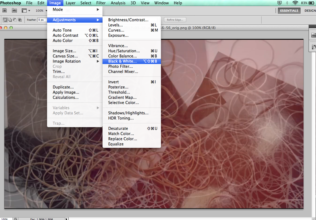
Firstly, I converted the image to Black & White by going to Image > Adjustments > Black & White
|
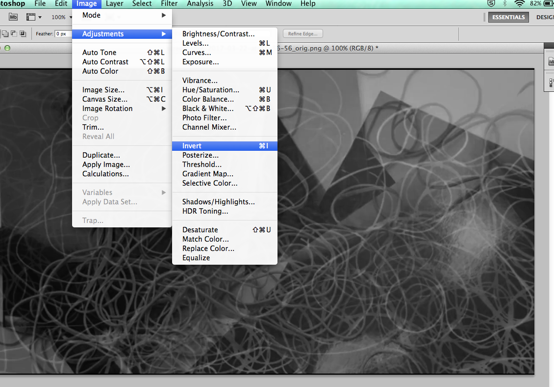
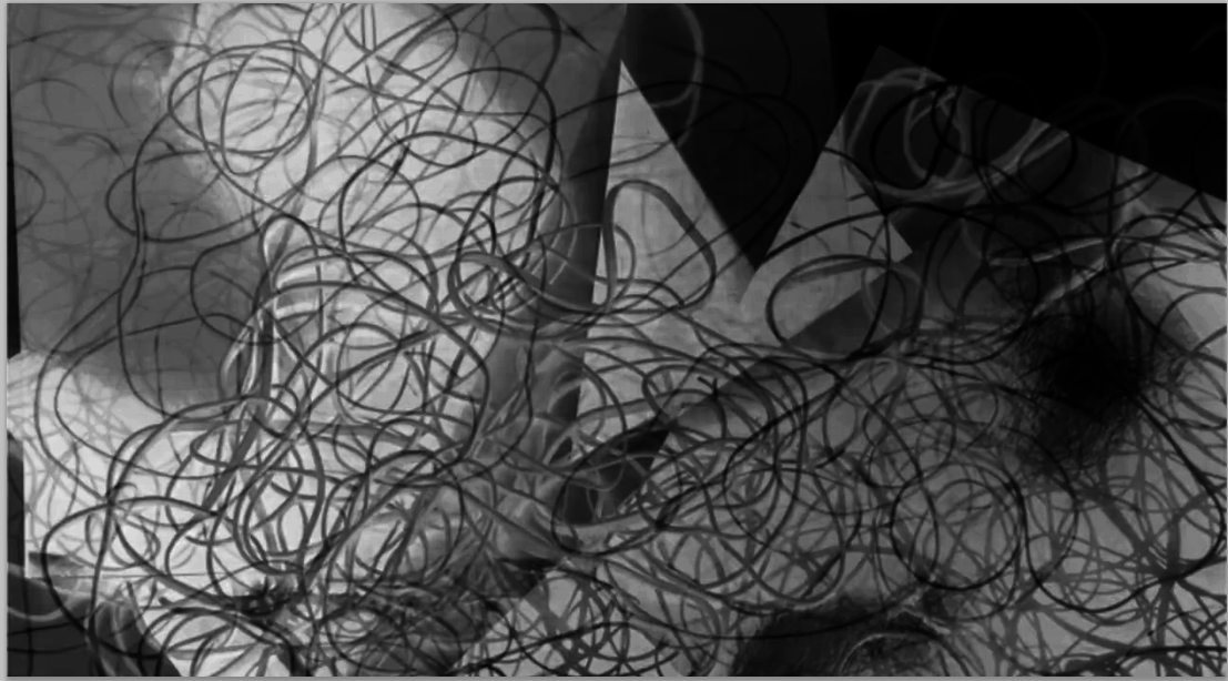
Then, I inverted the image to a negative by going to Image > Adjustments > Invert
|
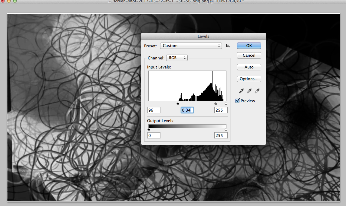
I've increased the contrast levels to show more detail when making my photogram by going to Image > Adjustments > Levels and sliding the scroll to an appropriate position.
|
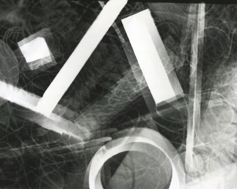
Finally, I cropped my image using the crop tool to remove the white borders.
|
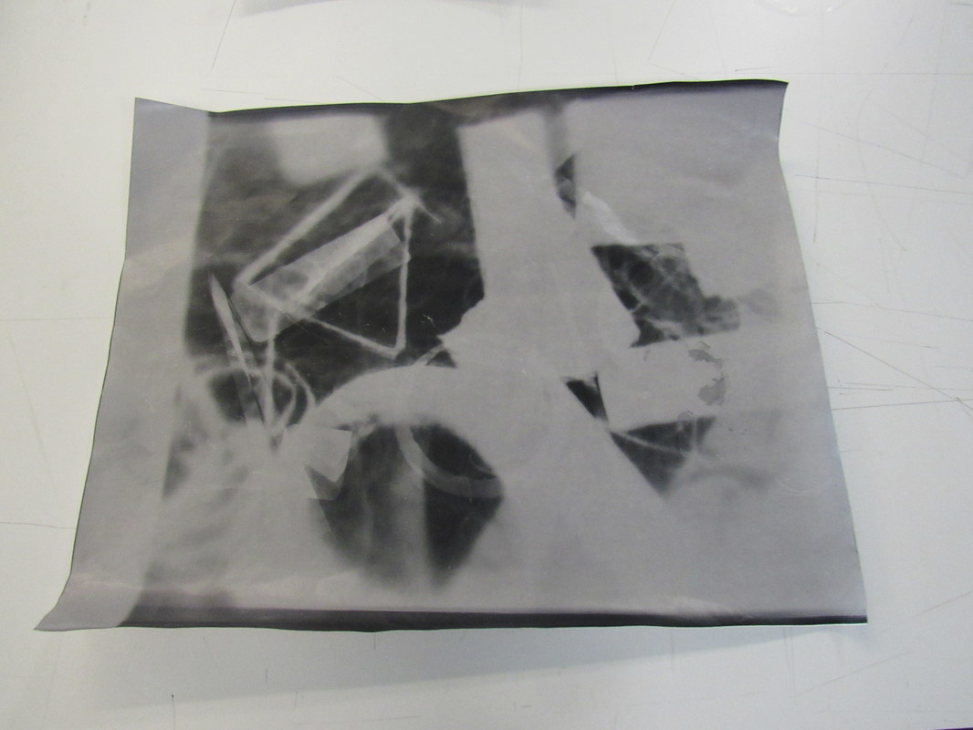
I've edited my favourite photogram using the clone stamp tool and 'painting' on the image.
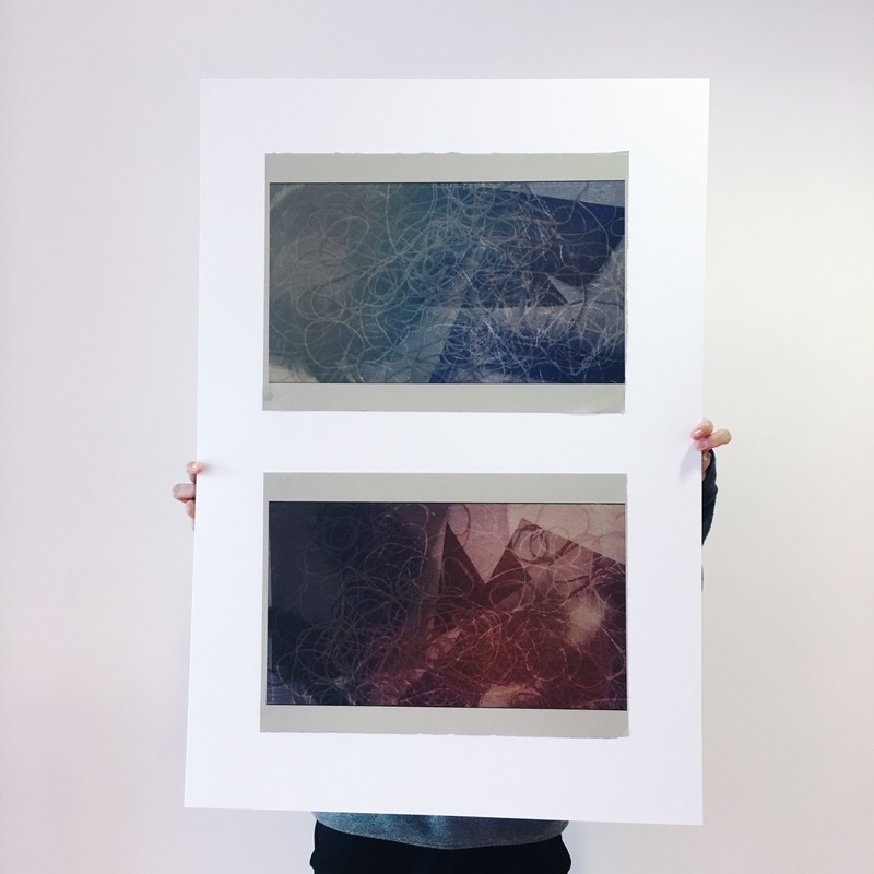
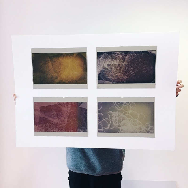
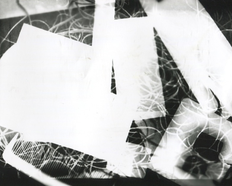
I've made some positives of my negative photograms to see how high the contrast is.
|
|
|
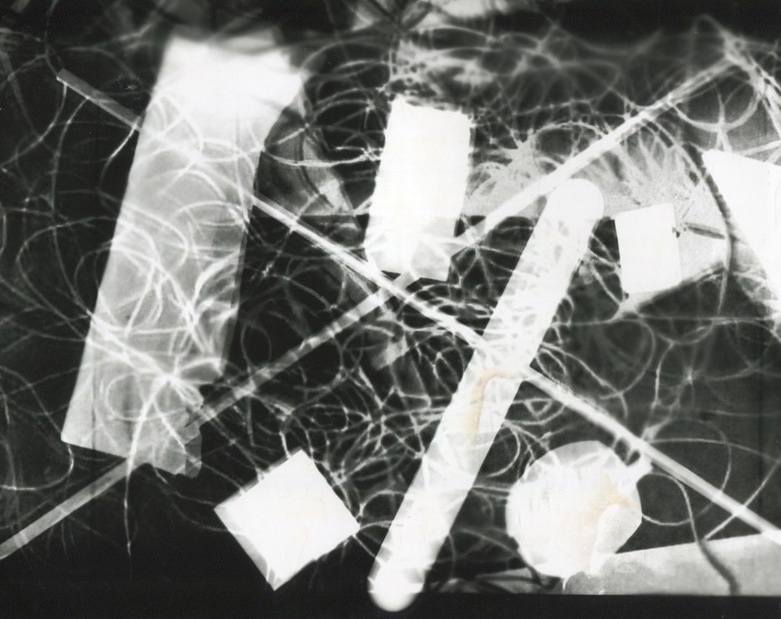
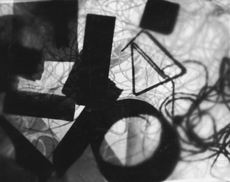
A problem with this photogram is that you can slightly see my name because I used a sharp pencil and pressed too hard on the back. This photogram is overall successful due to the amount of detail from cloning different parts of the image and placing it across the image. There are more shadows shown and the contrast is very high. The repetition of the strings and bands are very common making an interesting composition with all the opaque blocks that were used.
|
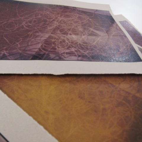
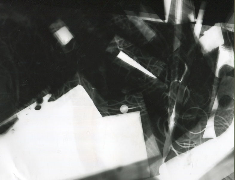
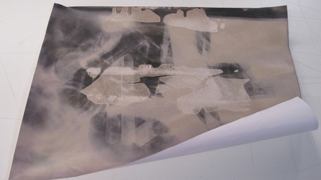
I've made the photogram below using A3 photographic paper from one of my original positives. I did this to show more detail and features of the image and clearly show the contrast between the black and white tones.
|
|
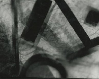
On my first try, the image didn't come out clearly as I only shone light to the paper for 8 seconds and also the paper wasn't held in place properly. I improved this by using a range of small objects and shining light for 12 seconds creating a higher contrast. I really like the shadow from the black rectangle on the left and I also like the black border which creates a sharp effect. I will therefore be using the 2nd image as my 2nd final piece.
|
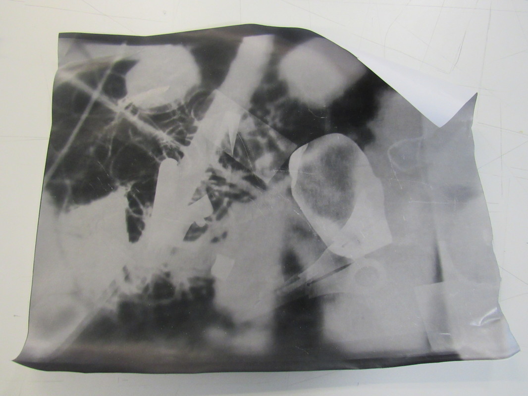
The image on the left didn't go too well because natural light was possibly shone to the paper and I didn't put the image onto the stop and develop chemicals since I made this late in the day. I tried moving objects around and this could've worked really well if the paper wasn't fogged before so I'm going to try recreating this photogram.
The splats on the image is also a happy mistake as it roughens the texture creating a more detailed effect since all the circular shapes of chemical drops could be seen. |
|
|
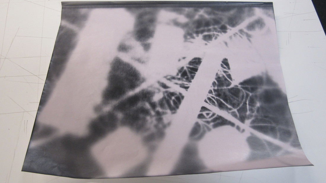
I'm not sure what happened to these 2 images, they seem to be fogged like the last one which is why some grey tones are present. The reason why there is a white line on the edge is due to the fact that the photographic paper is slightly smaller than A3 so light wasn't totally shone to the whole paper.
SECOND final piece

FInal evaluation
I chose the theme 'detail' to explore in Unit 2 because it's a very open theme in terms of photographs because a lot of objects are detailed as they include a lot of textures and a range of features.
I've researched a range of photographers across Unit 2. One of them was Jo Whaley who was interested in painting and colour photography. Whaley was interested in vibrant and sophisticated colours and made compositions and collages of insects and natural objects on an abstract background. Irving Penn was interested in still lifes and portraits. Penn makes most of images on a white backdrop with a lot of repetition of the same object. The pattern that could be seen in his work can be very random but detailed as well because it a lot of the background.
I've moved onto Keld Helmer Petersen as I was interested in making timelapses. Petersen was interested in black and white photographs which were very abstract. The contrast is very high in his black light images and I was influenced by his use of double spread pages in his book. The patterns in his abstract work can either be gigantic (from enlarging small images on double spread pages) or minuscule. Man Ray was the main artist who inspired me to make timelapses because he shows how random shots of images can be composed to make a very detailed, abstract film. Ray's films are endorsed with very short and close up shots with longer shots at the end to allow us to know what exactly is happening.
I've experimented with many techniques and processes throughout Unit 2. One of them was using Photoshop to edit my images from my photo shoots that were taken with my IPhone and DSLR. Photoshop has helped me make a detailed composition of detailed natural and still life objects to fully meet the criteria. I've also made a timelapse using a tripod and camera and composing the shots together in IStopmotion which allowed me to change the speed of the shots. I've worked in the darkroom to make photograms of certain shots of my images. I've experimented with a range of ways of making images in the darkroom such as moving objects around during the duration of shining light to the photographic paper. I also tried placing printed A3 versions of previous photograms and making positives out of them.
For my first final piece, I decided to use the timelapse that I've made and further edit it on IMovie. I added interesting effects and images to some of the shots and decreasing the opacity of the image. The images that were overlapping the shots added interesting colours which worked really well. The duration of each shot was appropriate because I tried to make it longer however it wouldn't look like an actual timelapse so I kept the length of the shots fairly short. I could further improve the piece by adding music which will add more suspense and make the timelapse more realistic.
For my second final piece, I chose to develop some of the shots of my timelapse. I chose to experiment with printing out negatives and converting them to black and white. I then made a photogram out of the inverted image and further developing it by making positives of the photograms that were made. I've also edited one photogram on photoshop and tried to 'misuse photoshop' by using the clone stamp tool and cloning part of the image to other parts. Overall my final outcome went very well as there are clear patterns and shadows represented by all the detailed layers. The geometric shapes made by the opaque objects contrast well with the black tone. I could further improve the piece by further experimenting in Photoshop with the rubber tool and adding more detail by merging multiple photograms together.
Overall, I'm very satisfied with the progress that I've made in Unit 2.
