Personal Project: Edges
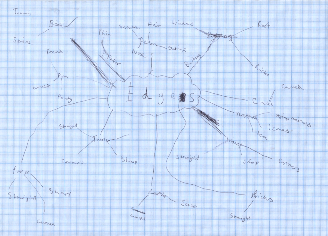
My ideas of Edges:
My Photos of Edges:


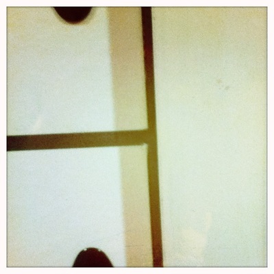
This photo went pretty well. This picture was showing the edges of a locker and I got some parts in but not all. There were straight and curved edges in this picture. To improve I can straighten up the camera so that the picture looks more straight - it seems to be bended to the left. I can also position the camera to the left more and zoom out to show more edges of the locker. |
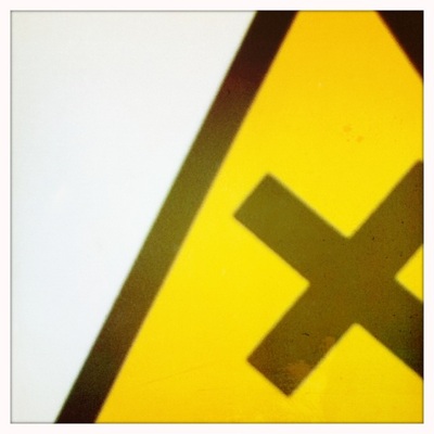
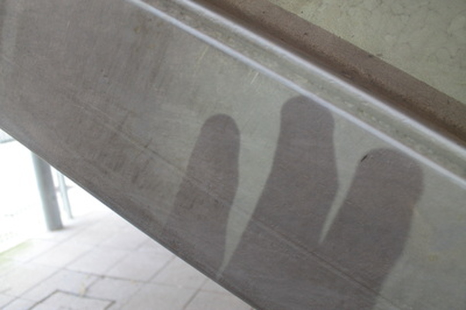
This picture is really bland, however it shows lots of edges. There are pointy and straight edges in this photo. I like the smudges on the x and on the background. To improve I can move the camera to the left more since I only wanted to show the side on the left and it looks weird hanging on the top right. |
More pictures of edges.


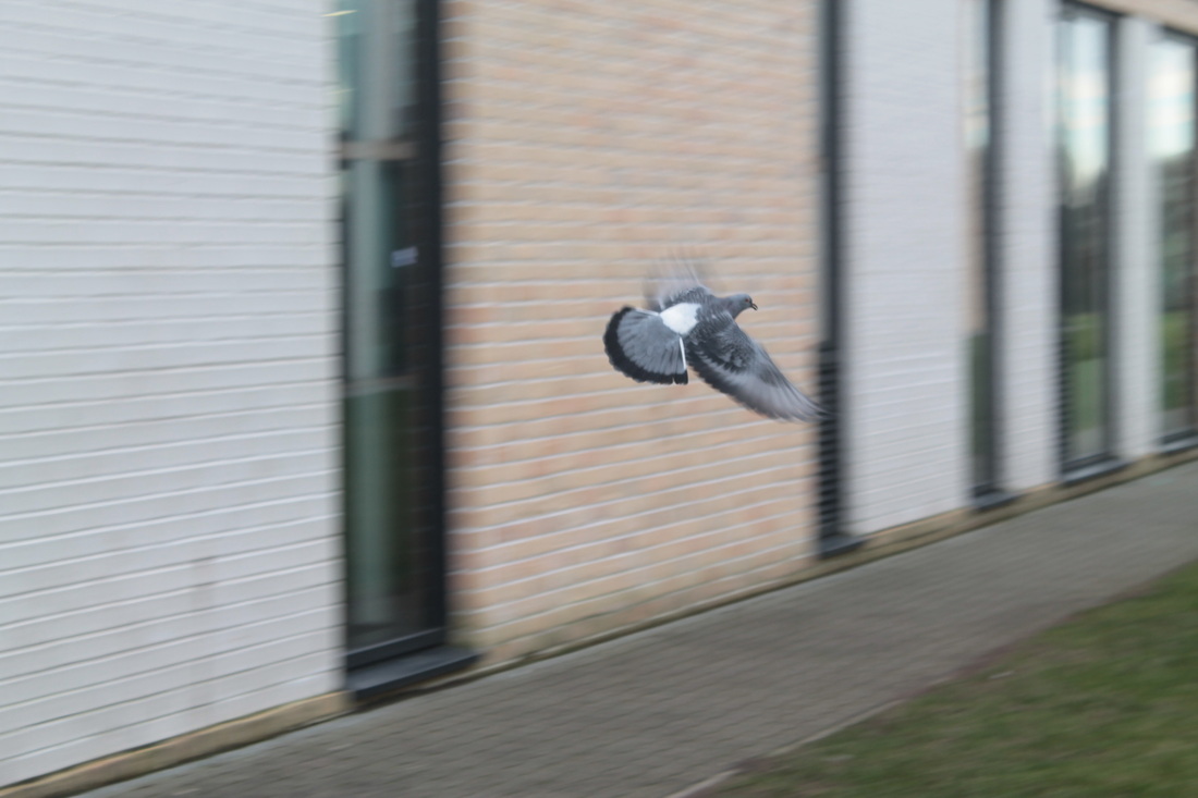
This was a very successful picture. The timing on scaring the pigeon away was really good, I like how I took the picture when it was flying away as you can tell the pigeon's wing is flapping. The timing can be a bit more better, I'd like it even more if the pigeon was closer to the middle and the background wasn't blurry.
|
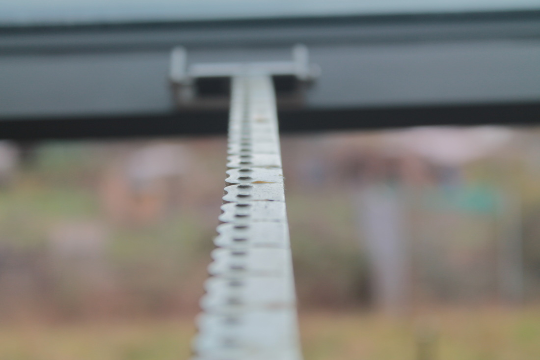
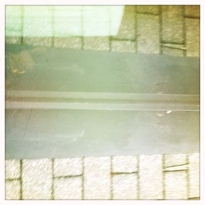
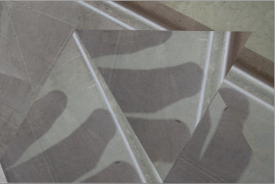
This picture shows lots of different edges. It might not be the best picture, however it is original and abstract. The picture is took inside a window and shows a chain stretching. To improve I can make the camera more straight when taking the picture and not move the camera when taking it, because the surroundings are quite blurry.
|
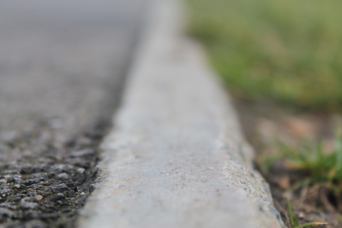
I tried something different on this picture. I bended down and tried to take the picture of the edge of the pavement and it went pretty well. I like how the grass was in the way on the right and some grass was sticking out in the middle. The picture was quite blurry because I moved during the shoot however the front quarter bit was clear. To improve I can hold the camera more steady and put the camera flat on the ground so that I can see more of the top of the picture.
|
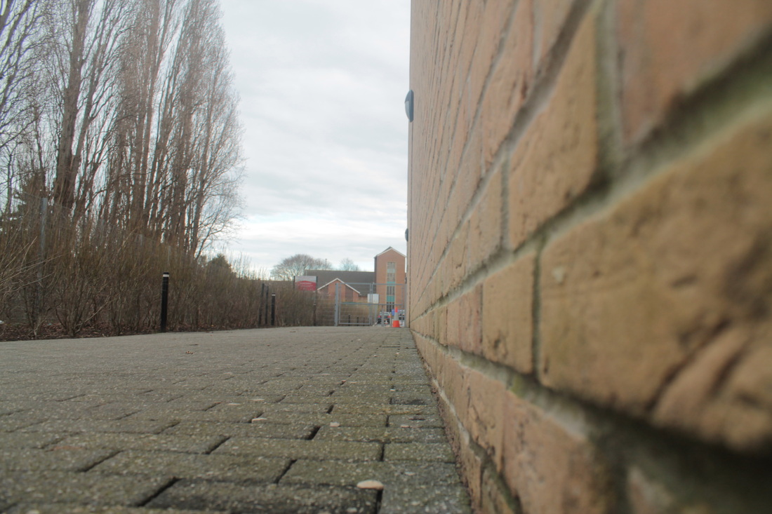
This was a similar picture to the one on the left. It was better mainly because all of the picture was clear. I think I bended down more on this picture and I like how you can see the cracks of the bricks to the bottom right, it shows the edges really well. To improve I can show more of the surroundings by moving the camera to the left a bit. I can also move back a bit with the camera so that you can see more of the cracks on the bricks.
|
More sets of pictures:


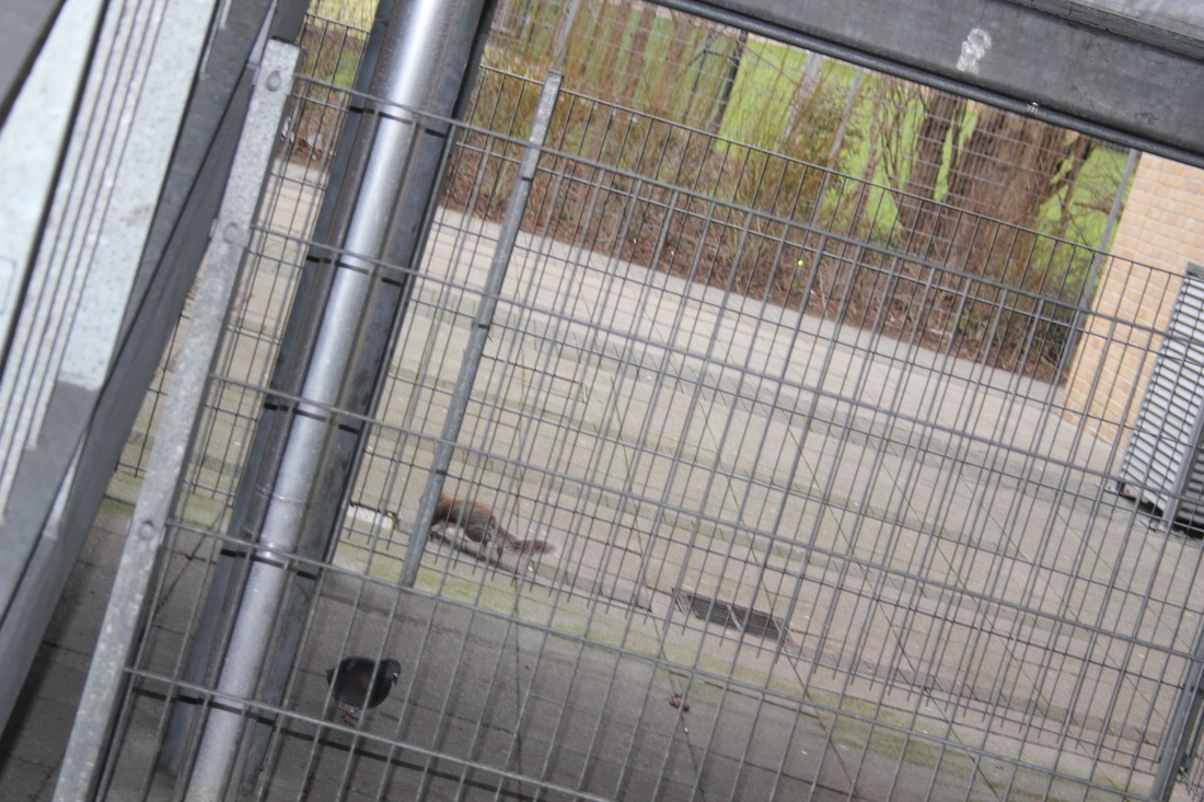
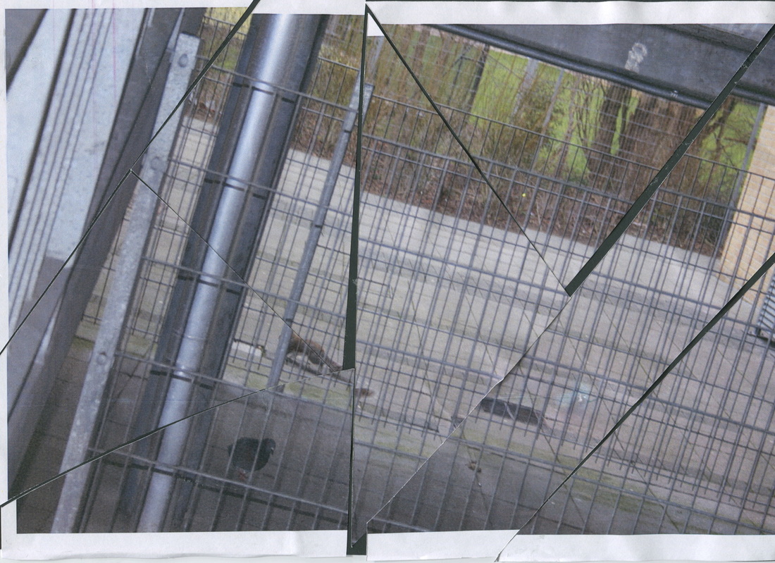
This picture was very interesting and original. I like the angle of how I took this picture at an angle. The picture went really well because I managed to fit some animals such as squirrels and pigeons. The angle is like an acute angle and the surroundings are very interesting. To improve I can move down a bit from the stairs to get more of the background.
|
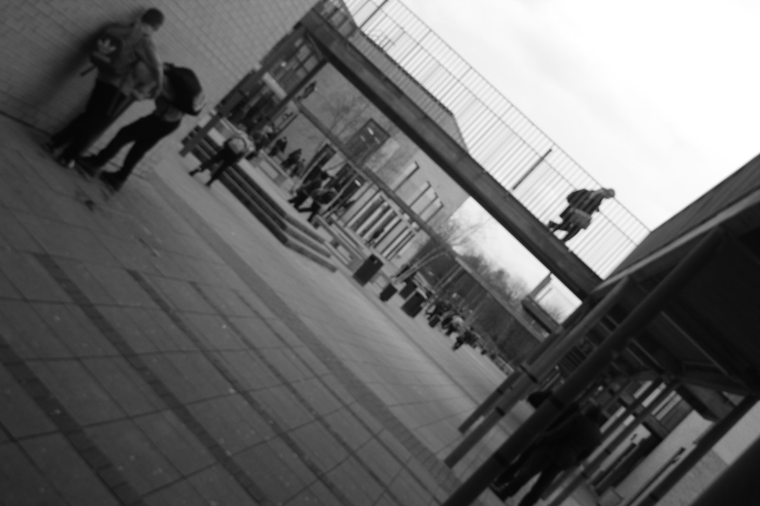
This was a similar photo to the one on the left. It was took at an angle and the angle was closer to 90 degrees. The picture was also took in black and white just for the effect. This picture shows lots of the surroundings and to improve I can zoom in more to show the buildings more because I think that was the purpose for this picture.
|
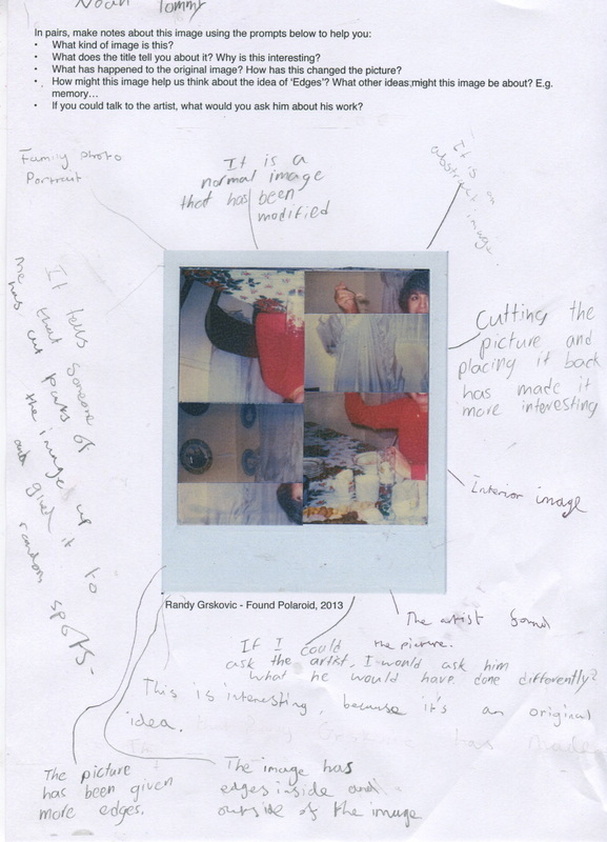
Randy Grskovic
Randy Grskovic is an artist that has made lots of types of photographs into abstract images. He takes images from the internet or charity shops and then cuts them up and glues them into random spaces on card. Each image that he changes, is carefully cut, glued, arranged and pasted without any digital media products. Randy Grskovic's images are very original, because they are abstract and hard to realise what it the original version is. Most of Grskovic's artwork are in art galleries and are linked to the 'edges' theme because they include lots of edges and you can see most of the edges inside the picture and outside of the picture (the border). Randy Grskovic usually takes pictures that have still life objects in the images and make them look different.
Here are some pictures of Randy's Grskovic pictures that he made.


|
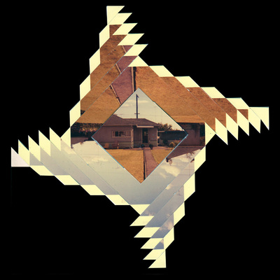
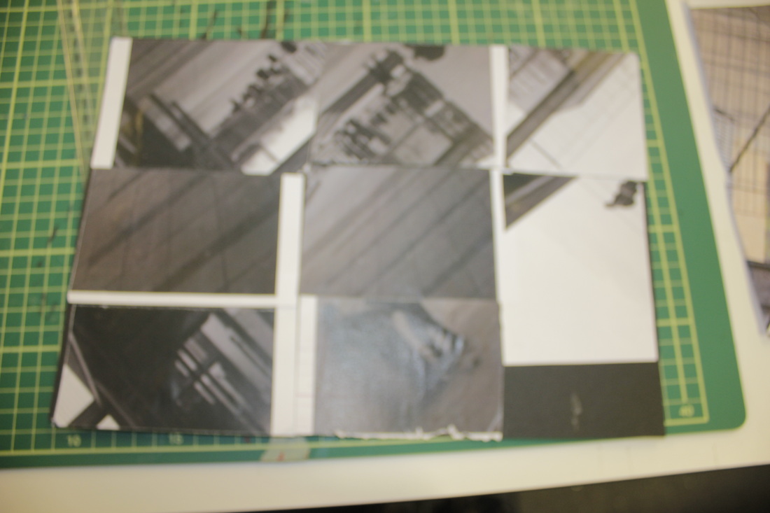
image analysisThis is an abstract image. The title ('Home Sweet Home') shows me that the image is someone's house. The image is a found photograph that Randy Grskovic has developed and made for himself. This image shows lots of edges which makes it very interesting since it's original and not easy to do. The image links to the 'Edges' theme as it shows lots of edges and a range of edges in and outside of the image. What also makes this image original is that it has a black border around it which you might not expect, you would expect a white border instead. The image has pointy, straight and diagonal edges which could make it complicated however, really original. If there was one question I would ask Randy Grskovic is, 'Why is there a black background/border?'
|
Here is a image analysis of one of Randy Grskovic's pictures.
Senol Zorlu
Senol Zorlu is a Turkish photographer whose life and background has been focused on his work. Senlo Zorlu is a Photographer that thinks of the moments, emotions and stories that he can capture with his camera when making images. He normally takes images of people's faces, looks, colours, items, landscape and environmental features which link to Edges as it shows a range of Edges and they can be quite abstract. Senol Zorlu is also a researcher for street children at the PH in Heidelberg. He seeks to explores different cultures and people on the base of scientific research methods.
Here are some pictures that Senol Zorlu has made:


Here are 20 pictures of edges I took at home


I have 10 hours to make a final piece for the theme (edges). I have experimented with some techniques.
I've tried a photoshop technique a few days ago. This image was an image of a abstract image using geometric shapes (I used Triangles).
|
Evaluation
I really like this picture that I made. It's very abstract and I like the edges of the shadows around it. Most of the triangles fit well on the picture and I like corners of the picture. The composition of the shapes was interesting however some of the triangles didn't fit well such as the one in the middle. To improve I can make the triangle in the middle smaller so that the corner doesn't stick out because it shouldn't be there. I can also remove the triangle on the top left - it is just an outline that is white, I think I made a mistake with the settings. |
Steps on how to make a abstract image using geometric images
First, I had to select the shape tool and get a triangle (it has to be white). Now select on the background and hold the shift key to draw the triangle to make it regular and then duplicate the image by pressing CMD+J (if you're on a mac). Now drag the layer above the shape layer. Hold down ALT then and hover between the shape and image layer then click. Now you can move the shape around and make duplicates of it and make a wonderful abstract image!
I used this website to help me make this image.
This was the original image:
I also tried the same technique again, however it was used with paper and glue (sticking them in and cutting them out).
I like how original this image is. I tried placing the pieces in order this time and it worked quite well. I like the edges between the gaps of the triangles. The squirrel and pigeon was in an interesting position - the pigeon was inside one of the triangles and the squirrel was in the middle of 2 triangles. The border looks interesting - there are thin and thick parts in the image. To improve I can line up the triangles neater so that there a no gaps and I can also put less glue so it's harder to see that the picture is floating up a bit.
Here's another image I made using the shape technique.
I decided to cut my picture out randomly now and putting the pieces in random places. This one went pretty well - it is very abstract and unique. I cut my picture off in squares this time so it would easier to stick on. I like the positioning of the borders and the different sizes of edges around the picture. The bit where some bits ripped at the bottom picture in the middle column actually went well as it shows different types of edges. To improve I can add something at the bottom right and be more careful with my glue because I got it in the blank space.
I've made more edges pictures with Photoshop.
|
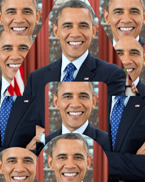
On this picture I've duplicated Barack Obama's face everywhere. It went pretty well as you can see a range of edges around and inside the picture. Obama's face was spread in nearly all of the corners and there were different shapes that was used (most were circle). The spacing were quite good.
To improve I can use more shapes other than circles and decrease the size of the triangle at the top to add more faces to the picture. I can also improve the spacing more by spreading the faces out more and giving it more space. I should cover over Obama's tie and his blazer since the picture is focused on only his face. |
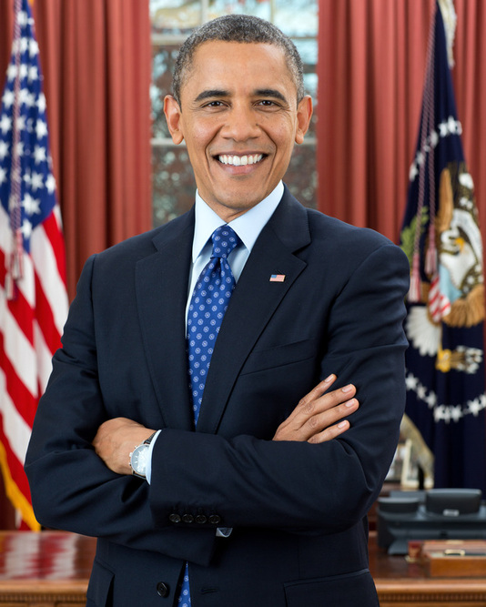
Here was the original image
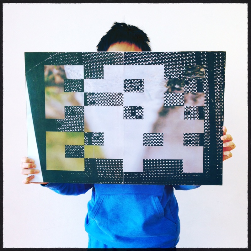
I've tried a different technique this time on Photoshop, I've got 2 pictures and pasted them into photoshop and I had to delete the background. Then I had to draw grid lines on my picture to help cut some holes inside the picture on the top layer. Here is one of my finished picture.
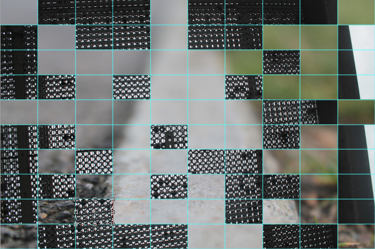
I think this image looks really good. The 2 pictures contrast really well since the one that is on the bottom is blurry and you can see both image parts really well and it looks clear. The reason why I chose these 2 pictures was because they worked well with each other and I like the holes in the background - it shows a range of edges and this will probably be one of my final pieces for the assessment with some little tweaks. To improve I can remove the holes on the border so that the border is just one image because it looks better. I should also remove the grid layers if I choose to print the picture out and use it for my final piece.
Here are the 2 original images.
|

|
Here are more images I made with this technique:
I've used a photo that was in normal colour and one that was in black and white. This balance of the images are not that good. The photo on the background layer stands out more even though the colour is dull. You can't really tell what the other image is, which makes it abstract - however I prefer both images to stand out. In my past images the colours of the pictures were pretty dull so to improve I can pick 2 pictures with brighter colours to make an image that stands out more.
Project Evaluation
During this project, I've researched Randy Grskovic. I've discovered him through my teacher during class. From studying their work, I've learnt that every picture has edges in them and I've also learnt that images of edges can be very abstract. There are a range of techniques you can do to make images of edges, the techniques can be digital or non-digital. I've learnt that you can make images of any objects and turn it into successful artwork of edges. The technique that he uses is cutting images up placing them in random order and making an abstract image. Not all images can be successful, but you can always keep trying and eventually something will go good. Images of edges can be very original and creative to make. The theme that I explored was Edges. My first thoughts about the theme were edges of life objects such as tables, walls and buildings. I've also thought about edges of shapes and bottles. As I developed my work, my ideas changed through looking at different pictures of edges and researching artists. I've looked at abstract images which shows different types of edges and it looked very interesting because I've never thought of edges being in unusual images. I've also developed other techniques and that went well that has to do with the media (working in photoshop).
I've experimented with a range of techniques during my assessment. First of, I tried Randy Grskovic's technique - which was cutting out images and arranging them in a different order, then sticking it into black card to create an abstract image. I've also used Photoshop (there were 2 techniques in Photoshop that I used). The first one was making an abstract image using geometric tools. This helps you make an image of shapes which could be abstract. The other Photoshop technique was making an image out of 2 images by cutting out holes. I've made lots of decisions to refine and develop my work. I've made my image (on the paper technique) neater so that it looks more professional and removed the glue marks around it. For the first Photoshop technique (geometric shapes), I tried making pictures with faces instead of just shapes, because it makes the image more abstract which makes people interested on what the original image is. It also stands out due to the amount of edges and faces in the picture. For the final technique (cutting holes in 2 pictures), I removed the cuttings of the borders in the pictures, because I prefer having a border of the background image as it makes the image look more professional. The 'cutting holes' technique went very well because I chose pictures that contrast with each other and worked well with each other. I found the technique where you had to stick parts of images onto paper, because my glueing wasn't accurate and I placed the parts in random orders which didn't go so well. I developed my investigation by looking at different images of edges and I just went on from using the sticking technique to the Photoshop techniques which went better since there was no glueing involved and cutting.
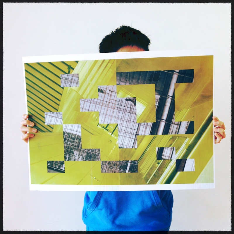
I have 2 final outcomes for this Personal Project. They both were from the same technique which was using Photoshop to cut holes out of 2 images. My first one was made with a picture took under the walkway in school and the other one was took in a path way around some grass. The path way image was blurry, because it was took when moving. The walkway picture was the foreground and the path way picture was the background. The black object with holes in them was a grill that was placed on the walkway. On my other final outcome, I chose 2 pictures that didn't contrast as well as the last one. The background was a fence in my school with a pigeon inside it. The other picture was one of my blocks in my school and it was took at an angle. You can see the stairs and the back doors of the block in the picture and the whole block was yellow. I changed the colour in Photoshop to make it darker to make both pictures work with each other. I was hoping to create 2 abstract pieces with Photoshop that shown a range of edges. This did work as it shows lots of edges to contrast with the backgrounds. I think that I have successfully explored the theme, because I created a range of images that has to do with edges and has edges in them. My drafts probably explored the theme better than my final piece, because the techniques shows more edges. The borders shown in my pictures didn't show more edges in my images than having no borders. If I had more time, I would've tried to make an abstract image in the dark room using chemicals such as stop and fix. I would've also tried to make a cyanotype with my own objects that I would've chosen, because they would stand out due to the colour and look very original. Most of my images that I used to create my work is personal and all my ideas are personal - I thought of all of them and implemented it to my design. I hope viewers will understand that Edges are in every picture and you can create loads of images of Edges and they don't have to be the best to be good.
Here are my final pieces
|
|
